5 Times Android Beat iPhone To New Features - And 5 Times They Failed

Android versus iPhone is the rivalry that dominates the smartphone world. While often centered around performance, design, and user experience, one arena where Android has consistently made waves is in the race for cutting-edge features. While Android has oftentimes been boldly leading the charge, beating the iconic iPhone to the punch, there have also been plenty of times when the green robot has stumbled in its pursuit of innovation.
As an open-source operating system, Android has long prided itself on its flexibility and adaptability, a stark contrast to the far more controlled environment of Apple's iOS. This characteristic has paved the way for Android to introduce groundbreaking features that have left iPhone users gazing across the platform divide with a mix of awe and envy.
On the flip side, for every victory Android scores, there tend to be instances where a new iPhone will have some new feature that is surprisingly refined upon launch. While Android is never too far behind the curve on Apple's newer features, there are numerous instances where a unique Android feature hasn't found its way to the iPhone for years. This back and forth has led to many mainstay features of modern smartphones that started definitively on one side or the other.
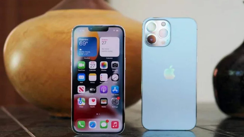
Widgets
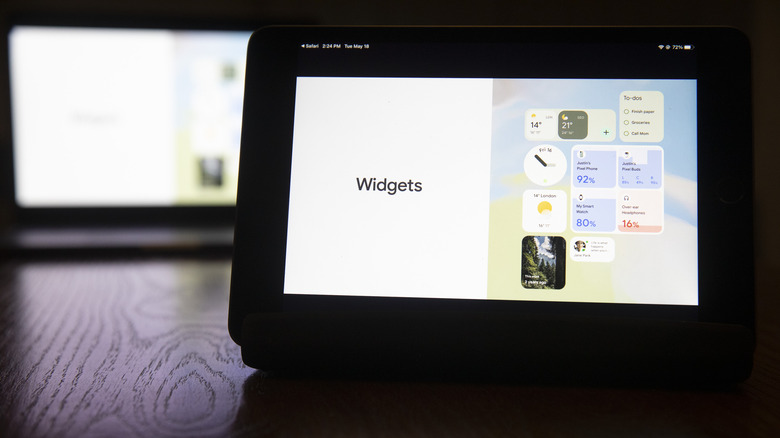
iOS widgets are fairly normal nowadays, but they are a relatively new addition to iPhones. Android's embrace of widgets dates back to its early years, with the release of Android 1.5 Cupcake in 2009. This marked the inception of a feature that would become synonymous with the Android experience and set the stage for a more dynamic and personalized user interface. Widgets allowed users to display live updates for weather, news, calendar events, and more, offering a level of customization and efficiency that was unparalleled in the smartphone landscape.
In contrast, Apple was initially skeptical of cluttering the pristine simplicity of its home screen but eventually introduced widgets much later with the release of iOS 14 in 2020. The delayed adoption left iPhone users gazing enviously at their Android counterparts, who had long been enjoying the convenience of at-a-glance information.
Android's open philosophy also allowed third-party developers to contribute to the widget ecosystem. This approach fostered a vibrant community of widget creators, offering users an expansive array of choices to enhance their daily interactions with their devices. However, Android's widget journey has not been without its challenges. The freedom and flexibility that make Android's ecosystem a playground for innovation also pose hurdles in maintaining a consistent user experience. Fragmentation, a perennial issue for Android, means that the implementation, design, and quality of widgets can vary widely across devices and manufacturers.
Notification badges
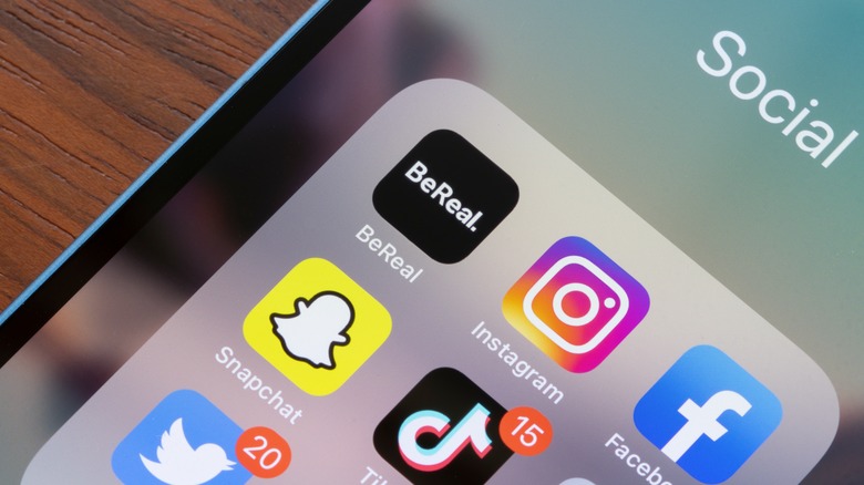
Notification badges can be traced back to the release of iOS 1.0 in 2007, marking the creation of what is perhaps the most simple glance at your notifications for any given app. The unobtrusive red circles with white numbers served as a constant, gentle reminder of pending messages, missed calls, or updates, providing a quick visual cue without inundating the user with intrusive alerts. While some definitely like to let that number get into the thousands for certain apps, when kept up with, notification badges offer an easy incentive for staying on top of notifications.
Android took a different approach initially, opting for a notification shade that aggregated all alerts in a centralized location. While this method streamlined the notification experience, it lacked the immediate, at-a-glance feedback that notification badges offered iPhone users. Android enthusiasts found themselves appreciating the convenience of a quick glance at app icons, a feature that became second nature to iPhone users.
Android eventually recognized the merit of this unobtrusive notification system, and with the release of Android 8.0 Oreo in 2017, introduced notification dots. This feature mirrored the essence of iPhone's notification badges, displaying a small dot on the app icon to signify unread notifications. While Android's implementation allowed for more visual consistency across different app icons, it was a clear acknowledgment of the effectiveness of Apple's approach.
The app drawer
Android's app drawer made its debut with the release of the Android 1.0 operating system in late 2008, just months after Apple's App Store revolutionized app distribution on iOS. The app drawer served as a solution to a fundamental challenge — how to efficiently organize and access a growing library of applications without cluttering the home screen.
Unlike the iPhone, where app icons were displayed directly on the home screen, Android's App Drawer offered a dedicated space accessible through a single tap or swipe, revealing a comprehensive list of installed applications. This allowed users to maintain a clean and organized interface, showcasing only the most frequently used apps on the home screen itself. The app drawer became a defining feature of the Android experience, embodying the platform's commitment to customization and user control by providing users with the freedom to curate their home screen without being constrained by a static grid of icons.
Meanwhile, the iPhone's home screen displayed all installed apps without the option for an App Drawer. Users had to organize their apps across multiple home screens or create folders to manage the growing number of applications, resulting in a more cluttered visual experience. However, recognizing the advantages of a centralized app repository, Apple introduced the App Library with the release of iOS 14 in 2020. This feature finally provided iPhone users with an optional view that categorically organized apps, offering a cleaner and more organized way to access applications.
Blue light filter

A blue light filter, introduced as Night Shift on iPhones when added to iOS 9.3 in March 2016, works by adjusting the color temperature of the display toward the warmer end of the spectrum during designated evening hours. This subtle but impactful shift reduces the amount of blue light emitted by the screen, a type of light that has been linked to disruptions in circadian rhythm and difficulty falling asleep.
Android eventually embraced the importance of mitigating blue light exposure with the release of Android 7.0 Nougat in August 2016, when Google introduced a similar feature known as Night Mode or Night Light. This allowed Android users to experience a warmer color temperature during specified periods, akin to the functionality pioneered by Apple.
While Android's Night Mode mirrored the intentions of the iPhone's Night Shift, the delayed integration underscored a notable instance where the iPhone led the charge in addressing users' well-being. Apple's early adoption of the feature meant that iPhone users could enjoy the benefits of reduced blue light exposure before their Android counterparts. In addition, the introduction of these blue light-filtering features sparked broader conversations about the potential impact of screen time on users' health, although recent research shows that blue light filtering might not be all it's cracked up to be.
Picture-in-picture

Android asserted its multitasking prowess by introducing picture-in-picture mode, a feature that allowed users to watch videos while using other apps. This innovative functionality debuted with the release of Android 8.0 Oreo in 2017 and was a transformative leap, enabling users to shrink video playback into a resizable window that could be moved around the screen while navigating other apps. This laid the groundwork for a seamless and versatile approach to consuming content on mobile devices that catered to the growing demand for enhanced multitasking capabilities.
The iPhone took a bit longer to embrace this multitasking marvel. It wasn't until the release of iOS 14 in 2020 that Apple introduced picture-in-picture to the iPhone. This marked a significant move towards aligning with Android's pioneering efforts in providing users with a more flexible and productive multimedia experience. Picture-in-picture not only allows users to maintain a continuous stream of content while multitasking but also elevates the overall usability of mobile devices, as watching a video while replying to messages, checking emails, or browsing the web is now a seamless and intuitive experience.
Virtual assistant
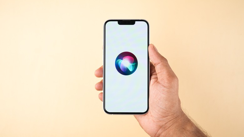
Apple once again took the lead with the introduction of Siri, the virtual assistant that heralded a new era of voice-activated interactions. Siri debuted with the release of the iPhone 4S in 2011, forever altering the way users engaged with their smartphones. This voice-activated assistant was more than a mere feature — it was a glimpse into the future of human-computer interaction.
Apple's virtual assistant was capable of understanding natural language and executing commands, a feat that captivated users worldwide. From setting reminders to answering queries, Siri's multifunctional capabilities positioned it as a digital companion, paving the way for the integration of artificial intelligence into everyday life.
Android, in response to Siri's groundbreaking debut, ventured into the virtual assistant domain with Google Now in 2012. While Google Now showcased Google's prowess in contextual information delivery, it lacked the conversational depth and personality that Siri brought to the table. The race for virtual assistant supremacy had begun, with Apple enjoying an early lead.
However, Android continued to refine its offerings. The subsequent introduction of Google Assistant in 2016 marked a significant leap forward, with Google leveraging its expertise in search and artificial intelligence to create a more conversational and context-aware assistant. However, by this point, Siri had already ingrained itself into the daily routines of millions of iPhone users despite being the arguably weaker offering.
120hz displays
The 120Hz display revolution unfolded with devices like the Razer Phone in 2017, showcasing the potential for a refresh rate that doubled the standard 60Hz found in most smartphones at the time. The higher refresh rate translated to smoother scrolling, more responsive touch interactions, and an overall enhanced visual experience. Android manufacturers, recognizing the allure of this innovation, began incorporating 120Hz displays into their flagship offerings.
Android's venture into 120Hz displays wasn't just about keeping up with technological trends. It reflected an understanding of the tangible benefits higher refresh rates bring to the user experience. The smoother animations reduced motion blur and heightened responsiveness appealed to users who sought a more immersive and dynamic interaction with their devices. Different manufacturers, from Samsung to Xiaomi, embraced this innovation, providing users with a range of choices and price points, allowing Android users to experience the benefits of high-refresh-rate displays across a broad spectrum of devices.
On the other side of the spectrum, Apple, known for its meticulous attention to detail, took a more measured approach. It wasn't until the release of the iPhone 13 Pro in 2021 that Apple introduced its 120hz ProMotion display, offering a 120Hz refresh rate for the first time on an iPhone. While Apple's entry into the 120Hz realm with the iPhone 13 Pro demonstrated its commitment to providing a top-tier visual experience, the whole of the iPhone lineup has yet to follow suit. While the recently released iPhone 15 and 15 Plus gained the Dynamic Island of the iPhone 14 Pro lineup, the standard iPhone models have yet to be given the bump to 120hz.
Do Not Disturb
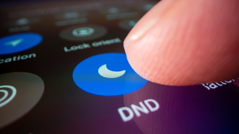
In the relentless symphony of notifications that accompanies modern life, Apple orchestrated a moment of tranquility with the introduction of Do Not Disturb. Debuting with iOS 6 in 2012, this feature allowed iPhone users to selectively silence notifications, calls, and alerts. Do Not Disturb emerged as a pioneer in the realm of digital well-being, setting the stage for a more mindful approach to smartphone usage.
The success of Do Not Disturb lies in its simplicity and effectiveness. Users could schedule quiet hours, activate it manually, or even allow critical calls to break through the silence. This level of control over notifications resonated with iPhone users seeking moments of uninterrupted focus or rest and has even evolved into Focus Modes.
Android, recognizing the growing importance of digital mindfulness, eventually introduced its own version of Do Not Disturb with the release of Android 5.0 Lollipop in 2014. However, the initial implementation lacked the finesse and user-friendly interface that characterized the iPhone's Do Not Disturb feature.
The gap in the rollout of this feature showcased a rare instance where the iPhone managed to set a standard that Android aimed to match. The evolution of Do Not Disturb on both platforms also highlighted the delicate balance between simplicity and functionality, a balance that Apple often strives to achieve in its feature implementations.
Swipe typing
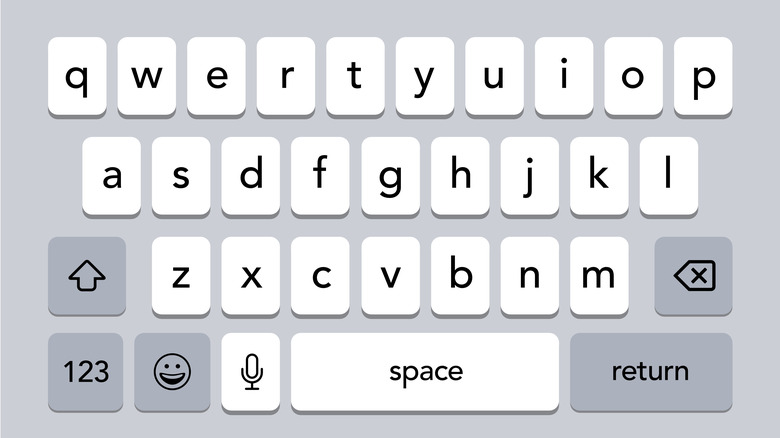
Swipe typing made its debut on Android devices with the release of the Swype keyboard in 2010. This pioneering feature allowed users to trace a continuous path over the letters of a word without lifting their finger, leveraging predictive text algorithms to accurately decipher intended words. Android's open ecosystem facilitated the integration of third-party keyboards like Swype, SwiftKey, and Gboard, providing users with a spectrum of choices for their preferred text input method. Swipe typing eventually became a native part of the default Android keyboard.
It would take until iOS 13 in 2019 for Apple to introduce its native swipe typing functionality, QuickPath. Android's early embrace of swipe typing resonated with users who wanted a faster and more dynamic means of expressing themselves through digital communication. The swiping gestures offered a sense of flow and continuity, enabling users to compose messages with greater speed and fluidity compared to traditional tap typing.
The versatility of Android's approach to keyboard options, where users could choose from a variety of third-party keyboards offering swipe typing, showcased the platform's commitment to customization. Users had the freedom to tailor their text input experience based on personal preferences and typing styles, further emphasizing Android's ethos of adaptability and user empowerment.
Gesture navigation
Apple once again took the lead by introducing Gesture Navigation, a choreography of swipes and taps that transformed the way users interacted with their devices. Debuted with the iPhone X in 2017, this departure from the traditional home button marked a bold step towards a more immersive and fluid user experience.
Apple's Gesture Navigation bid farewell to the physical home button, replacing it with a series of intuitive gestures that allowed users to navigate the interface with a natural and seamless flow. Swiping up from the bottom of the screen replaced the home button press, while a horizontal swipe replaced the need for a physical back button. The result was a cleaner, more expansive display, putting content at the forefront and simplifying the overall user interface.
Android eventually embraced Gesture Navigation with the release of Android 9 Pie in 2018. However, Android's adoption of Gesture Navigation was not without its challenges. The diversity in Android devices, with varying screen sizes and form factors, made standardizing gesture controls across the ecosystem a complex task. While Google aimed for consistency, Apple's closed ecosystem allowed for a more uniform implementation, ensuring a consistent experience across all iPhone X and subsequent models.