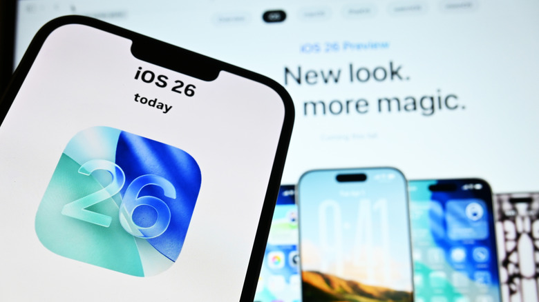
iOS 26 Pros & Cons: 3 Features We Love (And 2 We Don't)
With the exception of some older iPhone and iPad models that aren't getting iOS 26, the new iPhone OS is here for all users. The public has had its hands on it long enough for the novelty and glamor of WWDC's promises to wear off, allowing everyone to appreciate iOS 26 for what it actually gets right and what it gets wrong. I'm definitely glad I updated, but there's a long list of settings worth changing after updating to iOS 26. Some of these features have become things it would be hard to live without. But others? There's no denying that iOS 26 has been a radical change in many ways — some pretty bad — making it naturally one of Apple's most controversial updates in years. It's left some long-time users frothing at the mouth, and I really can't blame them.
To keep things balanced, we're going to look at iOS 26 from both sides: The features we love, and a couple that we think needed more time in the oven. Or, to be blunt, the things that shouldn't have been included in the first place. Consider this to be a helpful gauge on whether or not you should upgrade to iOS 26 if you've been sitting on the fence so far.
Pro: Live Translation for Messages, Calls, and in-person conversations
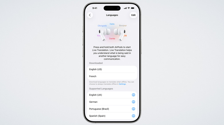
Apple may often be late to the party with features that Android has had for years, but when it does show up, it often shows up with a bang. Google Pixel and Samsung Galaxy have had translation features for years, but now Apple includes a suite of options for messages, calls, and in-person conversations — options for every situation imaginable — that work on iPhone, iPad, and Mac.
First, you can have fully translated text conversations in Messages. No longer will people have to jump back and forth between Google Translate and the Messages app, copying and pasting messages as they go. Phone calls and FaceTime video calls also get Live Translation. The new Live Translation for in-person conversations is the marquee feature. Two people with a supported pair of AirPods and iPhones can have a natural conversation with each other where the other person's words are translated directly into their ears, or displayed on the screen. Though it's currently limited to English, French, German, Brazilian Portuguese, and Spanish on Apple-exclusive apps, it's miles better than the awkward back-and-forth with Google Translate on a phone most people were doing while abroad. It might even inspire competitors (like WhatsApp) to catch up.
So early in the game, we need more time to tell how accurate and useful this feature will be. I haven't yet seen any rigorous testing of the Live Translation in a realistic environment. YouTube channel Tim Harris AI tested it, and the accuracy was fairly high with Spanish and English. I speak Spanish, Russian, and Portuguese, so although I don't need the feature when talking to my international friends, I'm going to try it and report back with my findings, and maybe use it when traveling abroad.
Pro: Call Screening and Hold Assist
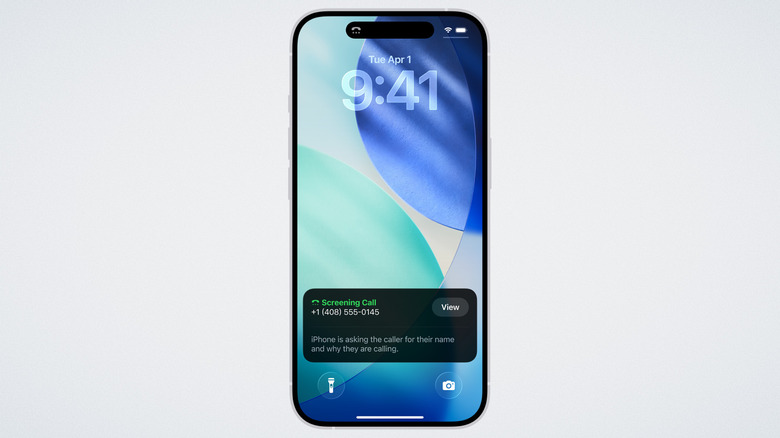
Google Pixel introduced call screening and hold assist way back in 2022. I had the Google Pixel 6 back then, and I can attest that this was a bombshell of a feature. It worked incredibly well even in the early days, stopping spam calls in their tracks and letting me multitask stress-free when calling customer service. Both of these features are now finally on iPhone. Similar to the Pixel feature, Call Screening picks up the call in the background and — like your own personal secretary — asks them for their name and why they're calling. You can then see in plain text what they said and decide if it's worth answering. It's the perfect solution if you need to answer unknown calls (such as for business reasons), but are tired of random spam calls.
Hold Assist is effectively the same as Google's Hold For Me. During a call, your iPhone detects if you've been put on hold and offers to notify you when it ends. It would appear it uses the same technique as the Pixel, listening for when the music stops and a real person starts talking. If it doesn't automatically detect a hold, you can enable it anyway. Helpfully, it also transcribes the agent's words after the hold music in case you were distracted or away from your phone.
When it comes to call screening, experts have long advised that the best way to limit spam calls is to not answer them at all. That makes Call Screening a double-edged sword; It makes it easier to filter out the spam calls, but it also means you'll likely get more. Hold Assist is an easy recommendation, though, and it works beautifully for me when I have to call my bank or other services.
Pro: the Preview app
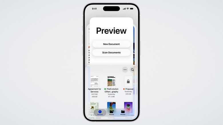
For whatever reason, it's always felt to me like the apps that handle sensitive documents (password-protected PDFs, or documents that you need to digitally sign) are also the apps with the biggest privacy red flags. Take the PDF king, Adobe Acrobat Reader. Adobe is no stranger to putting some pretty wild things in its privacy policy that allow it to treat user data like a communal candy jar. And if a PDF app doesn't have privacy issues, it has pricing ones; On iPhone, top hits in the App Store often feature stripped-down free options that lock the good stuff behind a pricey subscription. Since the iPhone's locked-down App Store prevents sideloading outside the EU, there aren't many free alternatives to Adobe Acrobat. The new Preview app solves both of those problems.
Preview benefits from Apple's stronger privacy standards. Apple does not see your files, like sensitive documents, so you can trust that big tech isn't looking over your shoulder at your blood test results or work contracts. Preview is also 100% free to use, letting you fill out and annotate PDFs, scan documents into digital files, and password protect them without having to pay a cent to unlock premium features.
Free, fully-featured apps that benefit from Apple's privacy and sync with iCloud have been one of my favorite parts of iOS, and an acceptable consolation prize to make up for Apple trapping us in its walled garden. Apple Notes is one of my favorite iPhone apps that's not on Android, and so is the iPhone Journal app, because comparable alternatives almost always have a subscription. Preview further closes the gap and saves you money.
Con: Liquid Glass
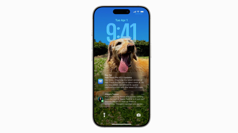
Even if you've been living under a rock for the past six months, you knew this one was coming. Liquid Glass has been, hands down, the most controversial aspect of iOS 26. Many users find it distracting and tacky, with inconsistent design and poor contrast. It causes issues with legibility, and some operations require way too many taps. Dozens of articles say they can tell you how to turn it off, but in truth, you can't. Not completely. The common recommendation is to enable "Reduce transparency" in the settings, but — speaking from personal experience — this makes everything look ugly, and some Liquid Glass UI elements persist anyway.
But here's the twist: I actually like Liquid Glass. The refraction effect looks amazing, and it's a breath of fresh air when the entire tech industry has been minimalizing their UIs into flat, soulless designs. My main concern before Liquid Glass released was twofold: that it would be too distracting, and that it would eat up the battery. I was wrong on the first count, but dead-on with the second. iOS 26 is draining your iPhone's battery, in part because Liquid Glass is too resource-heavy.
This manifests in double-digit drain when doing the most basic things imaginable. YouTube channel In Depth Tech Reviews tested two identical iPhones running iOS 18 and iOS 26 by opening and closing apps and the notification center, and unlocking/locking the phones repeatedly. This resulted in a staggering 13% battery drain on iOS 26 versus 1% with iOS 18. Operating temperatures also increased dramatically. Mind you, he didn't test any serious app usage or gaming. I am doubtful Apple can reduce that battery drain and temperature rise by much. Sadly, this may be the price we pay to enjoy iOS 26's other features.
Con: the Camera app redesign
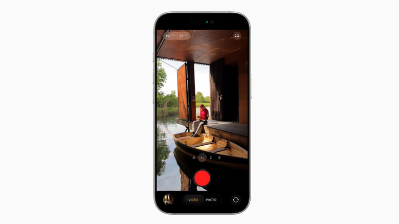
Most of my issues with iOS 26 have an upside that makes them bearable. Liquid Glass may be demolishing my battery, but at least it looks pretty slick while doing it. The redesign to the interface of the camera app, however, is one aspect I hate from top to bottom. In my opinion, the iPhone camera app was virtually perfect before: easily one of the most intuitive, easy-to-use, and best designed camera apps out there. iOS 26 downgrades it.
My main issue stems from how you change between photo and video modes. Previously, on iOS 18, you could see all the options in a rotating wheel beneath the shutter button. If you wanted to switch over from Photo to Portrait, for example, you could see Portrait right next door and tap over to it. Now with iOS 26, the extra options only become visible when you hold down and start to scroll. Then you either have to keep holding down and moving your finger until you get to the mode you want, or tap on a mode before it disappears. The former option is basically undoable when scrolling to the left to access other video modes, since you quickly run out of screen real estate runway.
I'm skeptical that the growing pains will go away when I "get used to it" in a few years, but I can extend an olive branch: The camera controls located at the top of the screen can now be accessed from the bottom. Simply tap on the currently active mode, and you can see settings for things like the flash, live photos, and night mode. Still, my gripe is one of those things I dearly hope Apple walks back in a future update.