7 Of The Best Colors The Toyota 4Runner Ever Came In (And 7 Of The Worst)
The Toyota 4Runner is a long-running line, with the original model dating back to 1983. Its name is a combination of the terms "four-wheel drive" and "off-road runner," highlighting the vehicle's utility over different types of terrain. In the first days of SUVs, the 4Runner was an early success, and today, after numerous generational redesigns and under-the-hood improvements, it remains a preeminent SUV brand.
Traditionally, the biggest weakness of an SUV is its notoriously poor fuel efficiency. The newest 4Runners improve on that front, thanks to their newfangled hybrid engines, which tack on some additional horsepower and boost fuel efficiency to more than 20 mpg.
However, none of that matters if your car isn't the right color. It may seem trivial, but when someone sees your car, the first thing they're going to notice is the color. Whether they're a gearhead or they know nothing about motor vehicles, they're still going to judge you by your choice of car color. Even the 4Runner's best years have had some dud color options, after all.
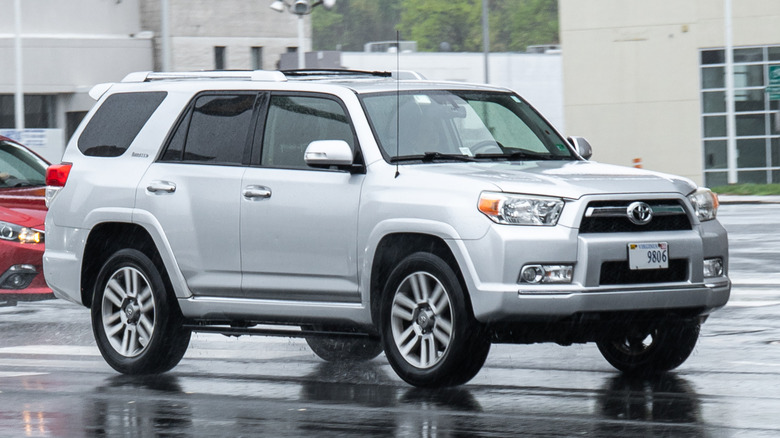
Best: Nautical Blue
The 4Runner is a large, tough vehicle, or "thicc," as the younger generation might say. With that in mind, whatever color you choose for your vehicle, there will be a lot of space for that color to make its presence known. Therefore, the Nautical Blue option is a smart choice. It's a dark color, which means it won't be too gaudy, and the blue hue will keep it from being too flat or unassuming. It's a color option with just the right amount of personality for a driver who wants to ride around in a big-bodied vehicle without announcing their presence to the entire neighborhood.
How much attention a vehicle should call to itself is a tricky subject. There's nothing wrong with being proud of your car, but if passersby can't look at your vehicle without wearing sunglasses first, you may have gone too bold with your color choice. And remember, SUVs are big cars, with amplifies the impact of your decision.
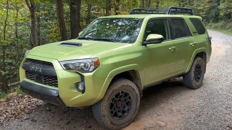
Worst: Solar Octane
When it comes to ostentatious color choices, few can compete with "Solar Octane." Even without knowing the color itself, those words evoke imagery of bright energy emitting from your SUV like it's some kind of nuclear reactor. Choosing this color for your 4Runner is only recommended if you want it to look like a giant bottle of Sunny D — it might be delicious, but it's just too much. No wonder this color stopped being offered after the 2024 model.
A color this flashy is better suited to a convertible sports car, not a big, lumbering SUV. A little color goes a long way. A lot of color is a step too far, so to speak. The problem with shades of orange is that if it's too desaturated, it looks drab and devoid of energy, but its more saturated shades are simply overwhelming.
This isn't the last we'll see of orange on a 4Runner, however. Later entries will show how the color is better suited as an accent against a complimentary shade, rather than as the central focus of an entire SUV.
Best: Supersonic Red
Supersonic Red might sound like it could be too much, but it's surprisingly not. Before 2025, 4Runners came in Barcelona Red, but we much prefer the newer Supersonic Red, even if its name feels like it's trying a bit too hard to be hip and cool. However, the proof is in the pudding, and Supersonic Red is a slick version of a classic color that feels like it was scientifically calibrated to be just bright enough without going too far.
This is the kind of red that shines bright in the sun, but doesn't quite reach the outlandish vividness of whatever shade of red the Kool-Aid guy is. It's hard to find a "subtle" shade of red, but the geniuses at Toyota managed to figure it out, and now consumers can reap the benefits of their hard work. We still don't know what "Supersonic Red" actually means, but we like it.
Worst: Lime Rush
With Supersonic Red, Toyota found the correct level of saturation for the color to shine in all scenarios, its attempt at green was not as lucky. Wait, did we say green? We meant "Lime Rush." It's strange it chose to call it "Lime," since it looks much more like, well, vomit. I'm sorry, but this is a puke color. So, if you spend a lot of time at frat house keg parties, then maybe the Lime Rush 4Runner is for you, but aside from that oddly specific scenario, this color just doesn't work.
The 4Runner is an off-road vehicle, just as suitable for dirt roads and muddy paths as suburban streets. If you drive a Lime Rush-painted 4Runner through the mud, there's actually a nice contrast between brown mud and the puke-green paint job. So, if your frat house is in the middle of a swamp and you want your car to cosplay as "Shrek," then Lime Rush is the color for you. For everyone else, though, there are much better options out there.
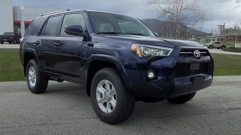
Best: Heritage Blue
At the top of this list, we sang the praises of Nautical Blue, but that's not the only great shade of blue offered for Toyota 4Runner. There's also "Heritage Blue," a special shade of the classic color that looks different under different lighting conditions. At a glance, it's blue, but it's also grey, which gives it the illusion of a metallic finish (even if it's not actually in the metallic style), and lavender undertones give it a special texture that subliminally adds depth to the color. At this point, it's no longer a color, but a portal to another world, a world of imagination and endless possibilities that lay just beyond the horizon.
Or maybe it's just a pretty color. In any case, Heritage Blue is a good color for your car if you want something that's just a little flashy, but not too aggressive. After all, if you're driving an SUV, the biggest thing on the road this side of a firetruck, you don't need any help when it comes to looking intimidating. This color says, "I'm a gentle giant." That might change if you're prone to road rage, but that's a whole other story.
Worst: Everest
On this list so far, we've seen two great shades of blue, so now it's time to balance things out with a bad version of that classic primary color. Enter "Everest," a bizarrely dark blue-green combination that looks more like a nighttime aquatic camouflage than something meant to cover vehicles built for off-road driving. I mean, off-road is one thing, but it's a car, not a submarine.
Everest is not an inherently bad color, but it's not right for an SUV. Despite its muted tone, it is surprisingly "loud," probably because of the sheer size of the 4Runner. If something like a Volkswagen Beetle or a classic American muscle car were to be offered in this color, we'd sign up for one in a heartbeat. But if it wants to sell us an Everest-colored SUV, Toyota will first have to develop a 4Runner that can function underwater like something James Bond would drive.
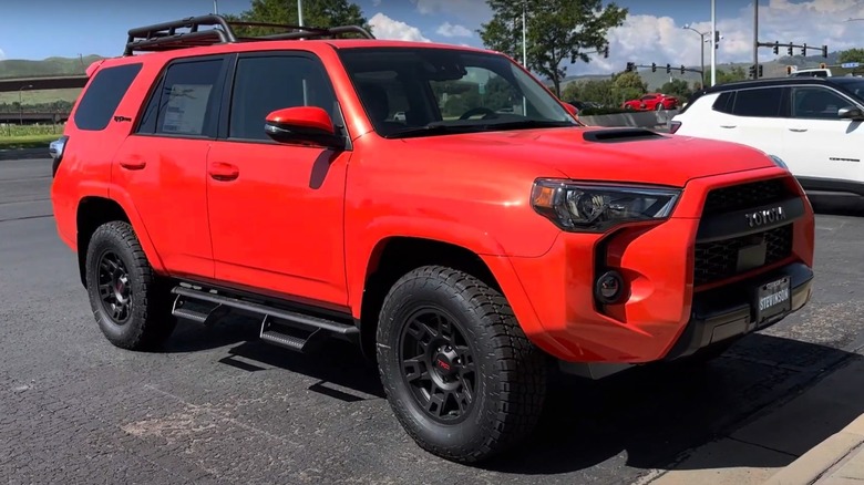
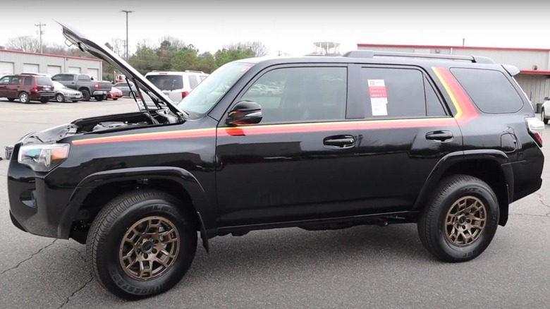
Best: Ice Cap 40th Anniversary Special Edition
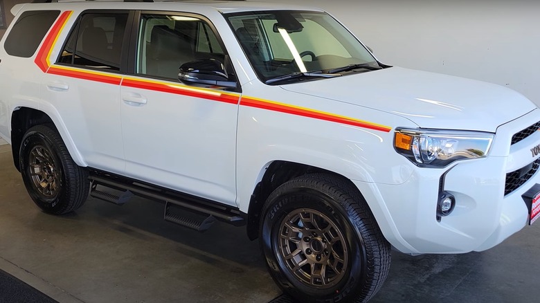
As mentioned earlier, a little color can go a long way. Having an entire SUV painted orange would be simply too much, but when it's used sparingly, as an accent instead of the main color, it can work quite well. In this case, we have the Ice Cap 40th Anniversary Special Edition paint job. As its name suggests, this was made to celebrate the 40th anniversary of the 4Runner. The Special Edition addition is little more than an orange, red, and yellow accent that streaks across the vehicle like a racing stripe.
Obviously, a racing stripe isn't going to magically transform your bulky 4Runner SUV into a race car, but it sure looks cool! We especially like how the stripe even extends to the front of the car, giving its "face" an asymmetrical edge that lends personality to the vehicle. Against the arctic-tinged "Ice Cap" white, it makes the whole vehicle look like a delicious orange creamsicle, and what's not to love about that?
Worst: Underground
A lot of thought goes into developing a car color. You don't just get some paint from the store and call it a day or pick a color from a swatch. Take, for instance, the Underground shade of black used in modern 4Runners. On the surface, it's just a slightly grey version of black, but we're sure a lot of work went into how the paint catches the light on sunny days, how reflective it is, and other factors that rarely cross the minds of everyday consumers.
Unfortunately, Underground doesn't work as a car color. It's too dark to be grey, but not dark enough to be black. It almost looks like a black car covered in a thick layer of dust. Black cars are already susceptible to showing dust compared to other colors, and Underground makes that even worse. Even if it's clean, it still looks dirty. It somehow has less personality than a grey color. It's so boring, it's not even generic. Underground looks like the baseline color of the material before it gets painted. It's not so much a color as it is the absence of color.
Best: Black
If the Underground color essentially ruined a classic, then good old fashioned "Black" is the tried-and-true color that's always en vogue. Yeah, you'll probably have to take it to the car wash more than some other colors, but when you do, it'll look sleek. Plus, if you know anything about fashion, you know that black is a slimming color, and SUVs, with their husky frames, can always benefit from a slimming color. Basically, you can't go wrong with a black car, as long as it's actually black, not whatever weird off-color facsimile Underground was supposed to be.
We can't think of many things more imposing than a black SUV. On the 4Runner, it screams "maximum intimidation." If you drive one while wearing a black suit, black tie, sunglasses, and one of those bluetooth things in your ear, people will surely assume that you're carrying some kind of VIP in the back seat. Could it be a politician? A basketball player? It could be anyone!
Best: Midnight Black Metallic 40th Anniversary Special Edition
Like we said, you can't go wrong with a black car. Thus, the Midnight Black Metallic 40th Anniversary Special Edition is a natural fit. It's a slightly different version of black than our previous entry, but most eyes would be hard-pressed to notice the difference. This is especially true when one considers the lovely 40th Anniversary orange, yellow, and red stripe, just like in the Ice Cap entry. It's a striking design that looks even better on a black car than a white one. Against a black background, the colorful stripe, despite ostensibly celebrating the vehicle's 1980s origins, actually looks to our eyes more like a visual flourish straight from the 1970s, and we mean that as a compliment.
While the Ice Cap 40th Anniversary Special Edition looked like an orange creamsicle, the black version doesn't really have a fruit-flavored frozen confection equivalent... But it still looks cool!
Worst: Army Green
SUVs are big, bulky beasts that can drive up mountains, through mud, and over reasonably shallow rivers, but they are not military vehicles. So why does Toyota sell the 4Runner in a color called Army Green? If you buy a 4Runner in this color, nobody is going to think you're actually in the army. Instead, they're going to think you're a poser who plays dress-up with their car.
If you want a military-style car, you would be better served getting a Jeep or a Hummer, which are at least civilian versions of actual military vehicles. Those vehicles can actually look appropriate in "Army Green" coloring, or olive drab, as it's more properly known. Toyota's Army Green 4Runner reads like an attempt to make their SUV resemble something other than what it is. Sports Utility Vehicles are versatile, but the army probably isn't going to drive a fleet of these onto the frontlines of a hotly contested battlefield. Overall, you're better off choosing a color that doesn't make you look like a wannabe Green Beret.
Best: Wind Chill Pearl
Just as there are many shades of black and blue paint, there are also countless variants of white. One of our favorites is Wind Chill Pearl. It's more neutral than the aforementioned Ice Cap White, but that makes it more appropriate for an SUV's broad frame, as well as for a solid color across the entire vehicle (no 40th Anniversary racing stripe here!).
A fun feature about having a white car is how it somehow gets more gorgeous when splattered with mud and dirt. Think of a white car as a blank canvas, and the road as a paintbrush. At the end of an exciting off-road drive, your car becomes a work of art. After you wash the mud and grime away, your car will never carry that pattern again. Instead, the next time you drive through the mud, the 4Runner's exterior will become an entirely different work of art. Maybe that's an overly romantic way to look at a dirty car, but then again, what's wrong with being overly romantic?
Worst: Mudbath
When it comes to off-road vehicles, the opposite of white isn't black, but brown. In theory, mud doesn't show so much on a brown car — in practice, it can obviously only mask so much. If you're driving through mud on a semi-regular basis, you owe it to yourself (and to your car) to take regular trips to the car wash, regardless of your paint job.
The "Mudbath" color is supposed to look natural in a woodland setting, driving through mud and among trees. However, it instead feels like it's trying way too hard to be rugged. SUVs are curious vehicles, in that they're capable of astounding feats of strength on off-road terrain, but they look equally at home in nondescript suburbia. The 4Runner is caught between two worlds, and if it leans too far into one world, it alienates the other. Mudbath is just a bridge too far for the 4Runner. Unless you're planning some kind of secret stealth infiltration in the woods, you're better off with a different color.
Worst: Dorado Gold
Unless it's a 1979 Pontiac Firebird Trans Am like the one featured in "Wayne," gold cars generally don't work. One of the colors originally offered when the 4Runner launched in 1984 was Bright Gold, and... Well, it didn't work. Coloring anything gold is a big risk, and one that rarely pays off. Gold can easily come across as vulgar and tasteless, and that was the case for the old Bright Gold 4Runner, as well as the subject of this final entry, the Dorado Gold 4Runner offered in the early 2000s and which is thankfully no longer available as an option.
In an attempt to make the Dorado Gold less gaudy, the color is diluted, but that only results in it looking like a muddy puddle in the rain, or a caramel latte. Caramel lattes are delicious, but I don't want my car to look like one. Then again, if it looked too sparkly like real gold, then that would be too much. Maybe, one day, the scientists at Toyota will find a perfect paint color that finds the sweet spot between gaudy gold and caramel latte. Bright Gold didn't nail it in the 1980s, and Dorado Gold missed the mark in the early 2000s. It's been 20 years, so maybe now's the time for Toyota to take another crack at a gold 4Runner.