10 Of The Worst Car Company Rebrands In History
On one hand, logos are inconsequential images that represent a company, often by turning the name into a stylized piece of art or creating a symbol to represent the aesthetics and values of the product on offer. On the other hand, when one thinks of a company, the first thing they think about is oftentimes the logo, even before the product. A logo represents a company's brand, literally, as the term comes from the old-timey practice of branding cattle or horses to identify the owner. Cars are the same way, except you can't eat them.
Logos evolve and change over time, sometimes for the better, sometimes for the worse. While some vintage car logos are the epitome of cool, the logos covered in this list are not. These companies tried to fix what wasn't broken and paid the price. From ill-advised streamlining to would-be revolutionary revisions that fell flat, here are 10 of the worst car company rebrands in history.
Kia
A good logo should be easy to understand. The classic Kia logo may not have been the fanciest symbol around, but it got the job done, with the K-I-A letters set within a red oval shape, with subtle lighting adding depth and modernity to the image, while the lack of the middle line in the letter "A" adds a touch of abstract artistry, since cars are not only useful tools, but also representations of self-expression for their owners.
The new logo, on the other hand, is unrecognizable as Kia. Literally, it's unrecognizable as the letters K-I-A. Ask anyone what the new Kia logo depicts, and they'll all say the same thing: the letters "K" and "N," but the "N" is backwards for some reason. The "A" is buried so deep in the abstract design that it's virtually invisible, especially since it's still lacking the line that bridges the two prongs of the letter. While logos can serve many roles, they only really have one true, immediate purpose: to identify the designated product. At this basic task, the Kia logo fails. For some reason, Kia has kept the new, ugly logo since 2021, perhaps because bad publicity is still publicity and at least everybody knows about the new Kia logo, if for all the wrong reasons.
Are Kia cars any good on the road? Are the engines powerful or weak? Will they spontaneously combust? Nobody knows, since all we can do is talk about that godawful logo.
Rover
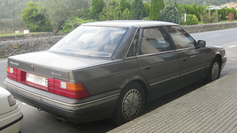
The Austin Rover Group built some pretty unremarkable cars for the European market, including the Rover 800. For some reason, when the Rover 800 was brought to American shores in 1987, it rebranded the vehicle as the Sterling. While the car was initially successful, selling over 14,000 units in its first year, that number dropped to under 3,000 by 1991. The British luster wore off, and the vehicle was slammed with negative reviews due to its poor build quality.
In hindsight, it almost seems as though the Austin Rover Group tried to trick Americans into buying a crummy car by renaming it, effectively disguising the Rover 800 as the Sterling, much like the Greek army using a Trojan Horse to invade the city of Troy. The only difference is that the Rover wasn't a winner. It was a bad car, and Britain should feel bad for trying to foist it on unsuspecting Americans by changing its name.
Buick
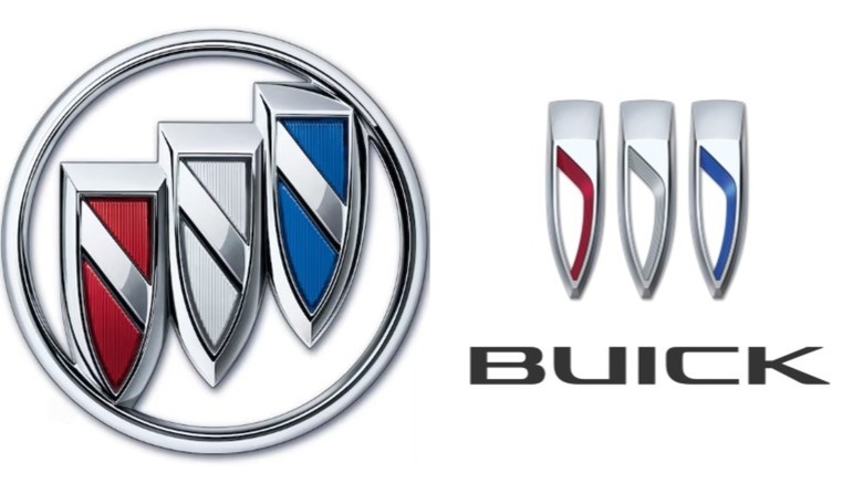
Buick, one of the great American car brands from General Motors, has one of the most iconic, instantly recognizable logos in the industry. Or at least, it did. The classic Buick logo, introduced in 1959, featured a striking triple-shield design, side by side with staggered verticality, resting within a circular badge. Honestly, it felt like the kind of logo that one could proudly carry out onto the field of battle. The red, white, and blue coloring of the shields evoked American culture, while the unusual design of the shields conjured images of speed, resilience, and innovation.
And then, one day in 2023, everything changed. The staggered layout of the three shields was equalized, the colors were made minimal, and the circular badge was removed. Now, the logo doesn't feel like three shields resting on a larger shield. It just feels like three misshapen shields that can't protect an unfortunate wielder. Without the circle surrounding the logo, it doesn't feel like a single, unified image, but three separate shields placed side-by-side. Perhaps the designers at Buick would have been better off using one of the shields and finding a way to integrate the red, white, and blue color scheme into a single shape. Or better yet, maybe they should have just left the perfect logo as it was!
Daewoo
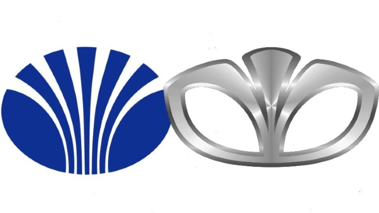
The Daewoo logo was always a little weird. In the 1960s, the logo consisted of a D and a backwards D facing each other, which is strange, since the word Daewoo only features one use of the letter D. The logo was changed in 1974 to a new, striped design, which is nice, but also looks oddly similar to the logo for Shell Oil.
Then, in 1994, the logo was changed yet again, combining the two previous logos with a more abstract sensibility, creating a brand new shape that integrates both the double D of the old logo and the striped pattern of the second one. Unfortunately, this new logo looked like a diaper. Surprisingly, this new logo remained the de facto logo for the rest of Daewoo's life. Unsurprisingly, the company went bankrupt in 1999, likely because customers were turned off by the idea of driving a car that was represented by the image of a diaper. Actually, it went bankrupt in the wake of the 1997 Asian financial crisis, but that horrific logo surely didn't do the company any favors.
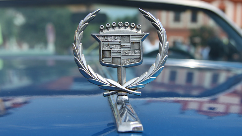
Cadillac
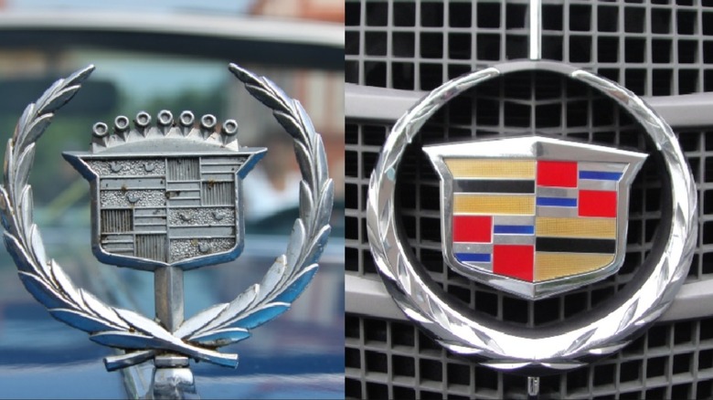
Bring up the iconic Cadillac logo to a true motor enthusiast and they'll ask, "Whatever happened to the ducks?" Bring it up to the die-hard Cadillac aficionados, and they'll say, "They weren't ducks. They were actually merlettes. And I miss them dearly."
The classic Cadillac logo dates back to the company's founding in 1902. It's based directly on the Coat of Arms of Antoine de Lamothe-Cadillac, the man who founded the city of Detroit in 1701. It's said that the automobile industry is the lifeblood of Detroit (or at least it was, once upon a time), so it's fitting for one of the city's most prolific companies to pay tribute to the history of the land in this way. Part of the Cadillac logo included ducks, actually merlettes, French ducks with no feet or beaks. However, in 1999, the logo was changed to remove the ducks and replace them with ... nothing. The Cadillac logo lost its medieval chivalric sensibilities in favor of empty stripes. The stripes feature pretty colors, but they lack the charm and symbolism of the old ducks.
Bugatti
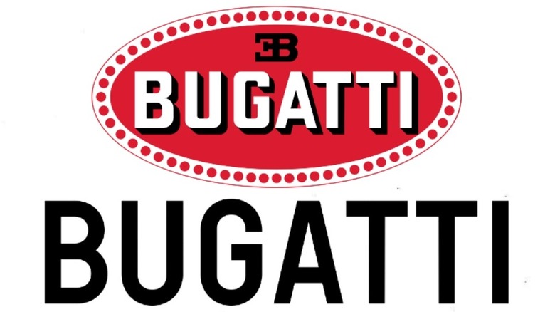
To paraphrase the immortal Britney Spears, you want a Bugatti? You'd better work. If Ms. Spears is singing about how a Bugatti is something to work towards obtaining, then you know it's a high-end vehicle that's absolutely worth the effort.
The Bugatti logo is simple, but elegant, with white lettering on a red background that allows the imagination to fill in the blanks. The oval shape of the badge evokes a bottle cap or an ink stamp, and the letters cast a subtle shadow that projects strength and durability, traits everyone wants in their vehicle. That's why it came as a surprise when, in 2022, the logo on Bugatti's website and official documents was inexplicably changed to ... just text. It's the same font as before, but with no red background, no shadow, and no depth. It's the word Bugatti in plain white letters.
Fortunately, the cars themselves still maintain the iconic red oval, which just makes it more baffling why they would strip the character out of the website in favor of something so unremarkable. We can only imagine Britney Spears would not approve, and neither do we.
Oldsmobile
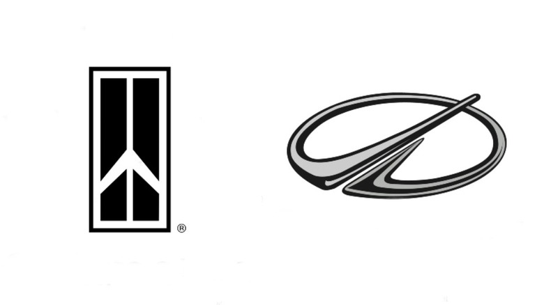
Let's get real here: A company named Oldsmobile is never gonna be hip with the young people. The word old is right there in the name. For generations, Oldsmobile ran with that, channeling the strength of its roots as a rocket engine company with its iconic logo. From 1963 to 1999, its logo was a variation on the classic rocket ship design. Some were more abstract than others, but the image was a bold, easy-to-identify signifier that your car might not look flashy, but it'll get you where you want to go with the aerodynamic efficiency of a military rocket, except it won't explode when you arrive at your destination. Probably.
The logo was revised for the new millennium, and the result could only be described as pre-iPhone chic. That doesn't sound so bad, but when it comes to futurism, Oldsmobile is the wrong company. Oldsmobile is supposed to be tried-and-true, no-frills, reliable, and old-fashioned. The new logo wasn't bad, but it was a terrible mismatch. The imagery was still slightly rocket-inspired, but only if you squinted and looked really hard. We can't say for sure that the logo is what single-handedly caused the Oldsmobile company to go defunct in 2004, but it certainly didn't help!
BMW
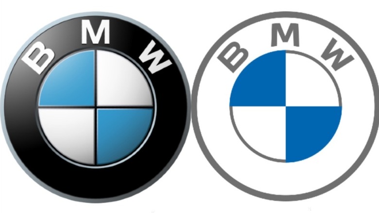
When it comes to German engineering, few brands are as respected as BMW, and few logos are as instantly recognizable as BMW's black, white, and blue shield. The white and blue come from the colors of the Bavarian flag, but inverted to avoid copyright issues. The logo went mostly unchanged from 1917 to 2020, though it was streamlined here and there, losing the gold lining and adopting a more three-dimensional look that evolved the logo from looking like a sew-on patch to having the appearance of a pin or badge. It's simple, it's iconic, it's arguably perfect.
Or at least, it was. While the classic logo remains on the cars, the logo on the website and for brand communication has been changed for the worse. In 2020, BMW unleashed a variation on the logo. While the blue and white core of the shield remains intact, as do the B-M-W letters on top, the black outline around the logo has been removed, or, to put it another way, hollowed out. This changes the logo from a righteous shield to a flimsy sticker. Stickers can be fun for decorating laptops or bass guitars, but a classy car brand like BMW deserves better.
Audi
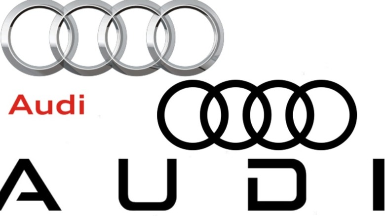
Audi's classic logo is four interlocking rings. Originally, each ring represented four German companies that merged to form the Auto Union, which would later evolve to be known as Audi. The four interlocked rings and the strength they represent became an iconic symbol for the car company. Since 1932, before Audi was even known as Audi, the four rings have been the centerpiece of nearly every iteration of the logo.
From 1995 to 2016, the rings were thick and silver-colored, with a reflective sheen and embossed look, like it wasn't just a shape, but a badge or medal that could be pinned on one's chest. However, in 2016, the logo was revised for the worse. The silver badge of rings was eschewed in favor of a simple black and white version that, like several other entries on this list, looked more like a PNG made on Adobe Illustrator than a proper logo.
In 2024, a Chinese revision of the logo was revealed, replacing the four rings with the word Audi in a stylized silver font. Alas, it looks terrible, like rejected concept art from Will Smith's i,Robot movie. Without the legendary four rings, is it even really an Audi? No rings, no sale.
Fiat
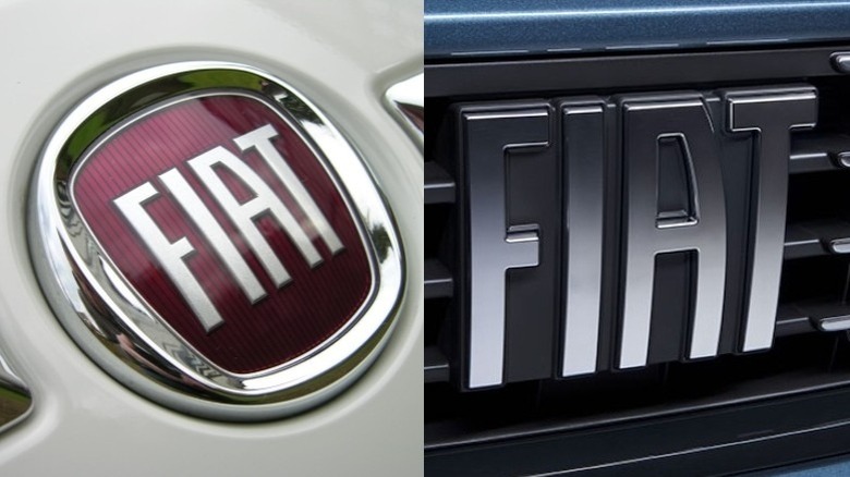
A good logo needs to have an element beyond just the name of the brand being represented. In the case of Fiat, its modern logo featured the word Fiat against a red background, placed within a chrome badge, giving it the appearance of sitting with a precious gemstone in the center. The typography is stylized, but still readable, and its utilitarian appearance is buoyed by the red and chrome trimming. It's not the fanciest logo in the world, but it feels like a genuine emblem, a symbol of the company.
In 2020, the Italian motor company altered this logo, effectively removing the setting, leaving the word Fiat bare. While it maintains the original font, it's missing the additional element that made the logo, well, a logo. The current Fiat logo is just a word. It's plain and boring, and nobody driving around the Italian countryside wants to be boring. A logo needs finesse and impact, and the modern Fiat branding has neither. At this point, it may as well just slap its cars with a nametag sticker that reads, "I am a Fiat."