

Why Do Some App Icons Look Blurry On iPhone?
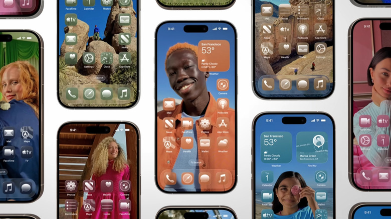
Whenever a new iOS update comes out, iPhone users tend to be extra vigilant about spotting cool new features. In the case of iOS 26.5, notable upgrades include RCS messaging with end-to-end encryption, automatic pairing for Magic accessories, and improved Suggested Places in Apple Maps. However, it's not all sunshine and rainbows — the release of iOS 26 has been riddled with mishaps, including one where some app icons may appear blurry or out of focus to some users.
This likely has something to do with Liquid Glass, Apple's new design feature that rolled out with iOS 26, which makes user interface elements like app icons appear, as the name implies, glassy and somewhat translucent. You also have an added option of choosing between two Liquid Glass looks for your app icons: "Clear" to make them appear see-through, or "Tinted" if you prefer a bit more opacity and contrast.
If you've recently updated your iPhone software to the latest version of iOS 26, your app icons should automatically adapt to the new look. However, some iPhone users online have noted that not all app icons have the glassy aesthetic. If you come across one that appears low-resolution, distorted, or just not like the others, it's highly likely that it's a third-party app that has not yet updated its icon to be Liquid Glass-compatible.
Some potential fixes to try
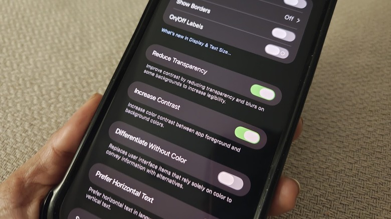
If the glassy appearance of your iPhone app icons is bothering you — especially at night, when eye strain from prolonged iPhone use can be heightened — or if you feel like the app icons you access the most don't look uniform enough, there are a few settings you can tweak. First, you can pick the less transparent Liquid Glass option:
- Launch the Settings app.
- Go to "Display & Brightness."
- Tap "Liquid Glass."
- Select "Tinted."
If this doesn't improve it enough for you, you can try enabling a few Accessibility features on your iPhone next:
- Go back to the main page of the Settings app.
- Head to "Accessibility."
- Tap "Display & Text Size."
- Enable the toggle next to "Reduce Transparency."
Turning this particular feature on should improve the contrast between the foreground and the background colors. In addition, you can also enable "Increase Contrast" if you need a bit more sharpness around your icons' edges.
Finally, you can stop your iPhone app icons from moving slightly every time you tilt your mobile device — a built-in effect that probably wasn't as noticeable before the Liquid Glass rollout — by doing the following:
- Go back to the Accessibility page of the Settings app.
- Select "Motion."
- Switch the "Reduce Motion" toggle to the on position.
Do note that leaving "Reduce Motion" enabled may affect not just the app icon animations, but also some transitions, animations, and effects within certain apps as well. Based on our testing, there is no direct way of disabling the Liquid Glass feature completely on a compatible iPhone. However, turning on a combination of the settings mentioned above appears to be the closest you can get to a more manageable iPhone app icon appearance that seems less blurry.