Android 12's Biggest Visual Change May Be Emoji
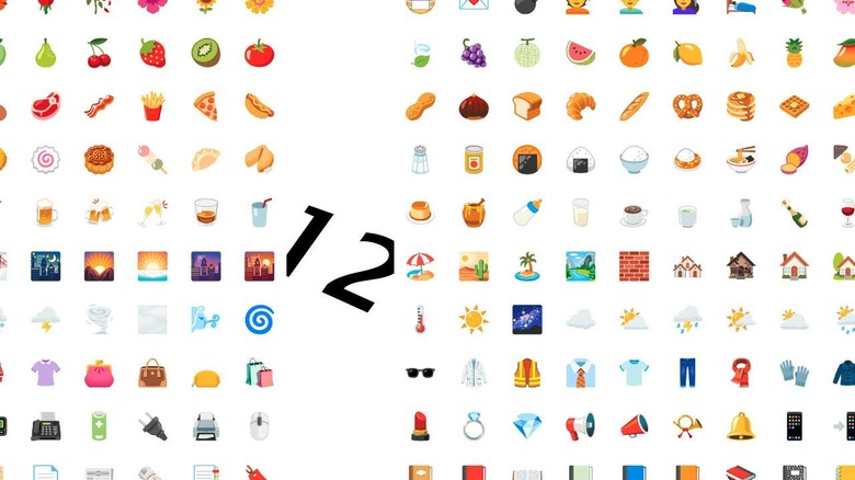
One of the biggest visual changes to Android with Android 12 appears to be in emoji. While the emoji system itself will not change, Android 12 Beta 1 alone introduced a whopping 389+ updated emoji designs! Designs are refined in several key ways, including smoothing, flattening, and a conglomerating of color pallet. If we look at the collected changes made in Android 12, the otherwise most recent set of emoji look positively mish-mashed and Web 1.0 in style.
With Android 12, Google introduced a a new wave of Material Design. At Google I/O 2021, Material You was revealed, blurring the boundary between one-way-only and "theme however you like!" With Material You, Google's aim is to allow users the freedom to have their own visual experience to a degree, while remaining squarely in the Android universe with a solid set of visual rules in movement, size, and preferred combinations.
The Android 12 emoji collection reflects that vision. As shown in a chart made by the folks at Emojigraph, Google's design choices make the whole collection feel more solid, like their part of a single set. They look like they've all been designed by a single team.

This doesn't seem to mean that all emoji have the same sort of border, the same size lines, or the exact same set of colors. Instead, it's more like the design team that refined the Android 12 emoji collection separated all emoji into categories and designed from there.
Take for example the set of emoji shown below, courtesy of Emojigraph. Foggy, Night with Stars, Cityscape at Dusk, and Sunset were previously using the same basic set of buildings. Cityscape at Dusk was a full square, while the others were images with unique shapes.

Now, in Android 12, the same set of buildings is used for Night with Stars, Cityscape at Dusk, and Sunset, and they're all represented with a square image. Foggy is now a completely different image that makes the essence of the word far more clear than it was before – and it's in a square.
The vast majority of icon changes reduce clutter and refine iconography to more clearly represent the word associated with the emoji. What do you think so far? Do these changes look like they'll make Android a more user-friendly experience? Have you seen Android 12 on your own phone yet?