Windows 11 Just Fixed One Of Its Biggest Problems
Consumer sentiment for Windows 11 has been on a downward trajectory of late, at least if the reactions to Microsoft executives are any indicator. Although it's hard to quantify broad user sentiment, backlash to Microsoft's roadmap for Windows, combined with an unusual uptick in Linux installations as Windows 10 expires, suggests widespread frustration. Using the operating system is often a battle against Microsoft's AI ambitions, which some feel have eclipsed any preexisting concern for the user experience. While CEO Satya Nadella begs people not to refer to his company's 16 different versions of Copilot (the company's also-ran AI product) as "slop," Windows is pushing out updates that break people's computers.
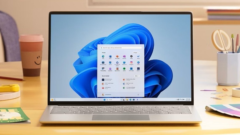
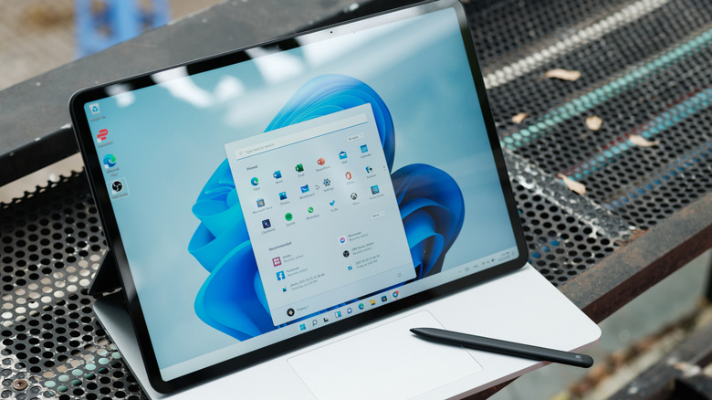
The Start Menu has become emblematic of this perceived degradation. It is the core element of the Windows UI, and always has been since Windows 95 was launched more than 30 years ago. In theory, the Start Menu is a simple and effective app launcher. But ever since a radical Start Menu redesign in Windows 8 was poorly received, Microsoft has never returned the Start Menu to its original function. Windows 10 reversed the Windows 8-era decision to make the Menu a full-screen array of Live Tiles, and users were mostly happy with it. Then, in Windows 11, things got inexplicably bloated. Under a small section of pinned items, half of the Start Menu was taken up by a Recommended section that was seldom useful. There are even ads in the Windows 11 Start Menu, which cheapen the experience.
Now, Windows 11 users are receiving a redesigned Start Menu that atones for some of its own sins. While it doesn't fix every user complaint, the new app launcher experience is far more streamlined, making it much easier to navigate. Here's what's changing, and what isn't.
The Start Menu is finally, mercifully useful
The redesigned Start Menu returns the app launcher to its platonic ideal. After over a decade of Live Tile shenanigans and Recommended bloat, users finally have control over what they see in the Windows 11 app launcher.
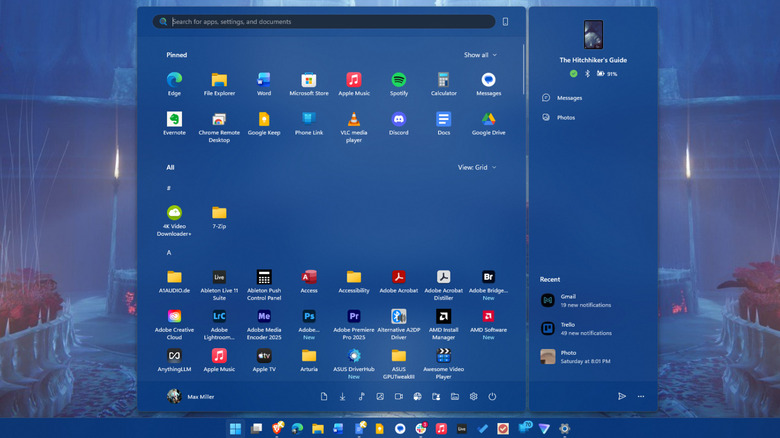
The new Start Menu is wider than before, allowing it to show eight apps per-row instead of the previous six. The search bar remains atop the new Start Menu, with pinned items still beneath it. But whereas before, you needed to scroll through multiple pages of pins to see them all, they can now be expanded or collapsed with a toggle into one large grid. Below that, the Recommended section remains enabled by default, but mercifully, it is now one of the Windows 11 annoyances you can turn off in Settings.
In another welcome change, the full list of installed apps sits just below the Pinned and Recommended sections, allowing users to scroll through all three in a single pane. Previously, the app list could only be accessed via a frustratingly tiny button at the top right of the Pinned section. Apps can also be arranged in one of three ways: in an alphabetical list, an alphabetical grid, or in folders sorted by category.
If you use Phone Link to access content from your smartphone, quick access to some of those features still remains in a panel to the right of the main Start Menu. Links to Microsoft account settings remain in the bottom left, and toggleable shortcuts to various libraries, Settings, and the power menu remain on the bottom right. Together, all the changes add up to a much more coherent experience driven by the ability to scroll seamlessly through different areas of the Menu. However, it still has some lingering annoyances.
The new Windows 11 Start Menu is an improvement, but issues remain
Microsoft has addressed a number of longtime user complaints in its Start Menu update. It's the clearest signal users have received in quite some time that the company is listening to us at a time when its singleminded focus appears to be on shoehorning AI into every nook and cranny of Windows 11. But things still aren't perfect.
For one, running a search from the Start Menu still brings up all the usual unnecessary cruft, from web results to apps in the Microsoft Store. These can only be weeded out by making a number of custom tweaks to the system and aggressively changing settings. Speaking of which, turning off the Recommended section of the Start Menu (which can be done in Settings > Personalization > Start) removes additional functionality. It will also remove the ability to see recently accessed files in File Explorer, as well as in Jump Lists when you right click a program icon. This feels like nothing short of penalizing users who dare to opt out of invasive bloatware.
The new update also does not include the ability to resize the Start Menu, a feature many users feel should have carried over from previous versions. On Windows 10, users could drag the edges of the Menu to enlarge or shrink it, which was especially useful on smaller displays. On a related note, there's still no way to section your pinned items and folders into different categories, as was the case in Windows 10.
Even with the welcome improvements it brings, the new Start Menu is still carrying baggage for Windows 11 as a whole. This redesign is a step in the right direction, but there's a long road ahead.