The Flip Phone Samsung & Motorola Should Be Worried About (And No, It's Not From Apple)
The battle over flip-style foldable dominance is not over — not nearly. The U.S. has two dominant flip phones at the moment in the Moto Razr Ultra and the Samsung Galaxy Z Flip7. Both of these phones offer very unique experiences from each other, reflecting their different philosophies on how exactly to utilize the cover screen of the phone. The cover screen, which has grown in size over the years, now encompasses the top half of the phone, and both Motorola and Samsung have different ideas on how to utilize them. But there's one other phone on the horizon that has a different idea, and boy, it's a very good idea.
Motorola prefers to let you do pretty much whatever you want to do on the cover screen. It's a "try it and see if it works" philosophy. Add apps to your launcher, and if they work (and they usually will), then it's, "Hey! Great for you!" Samsung, meanwhile, prefers to curate the experience by working with developers to build a great experience on a handful of apps. From there, you can install other apps, but there's a guardrail that prevents all but the most determined to add further apps to your cover screen launcher.
Both of these ideas have pluses and minuses for sure, but I went hands-on with another phone maker who has a different idea, which is almost a combination of the two. At the Honor V5 launch event, I managed to go hands-on with that company's Honor V2 Flip, and the cover screen is a delight to use. There are lessons that Motorola and Samsung could learn.
This cover screen is great
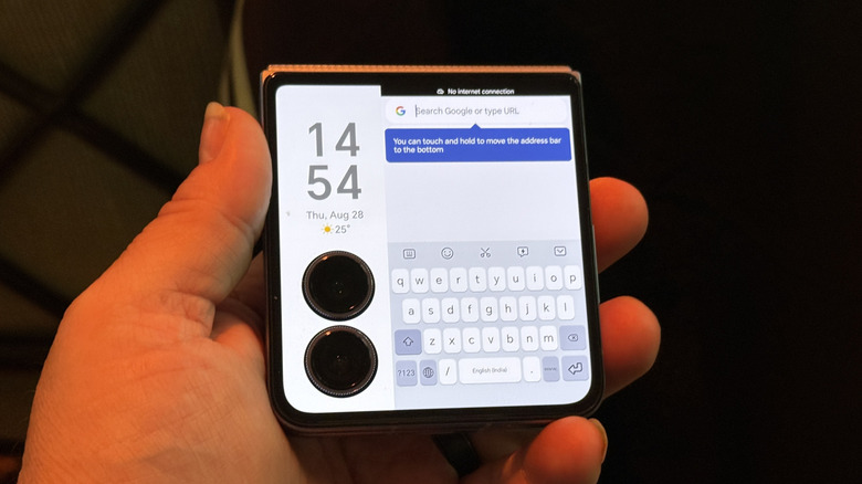
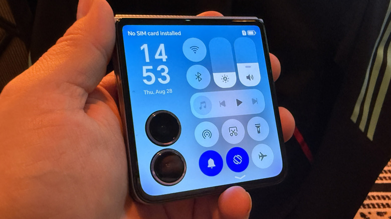
The first thing Honor did with its cover screen design is to arrange the camera modules vertically instead of horizontally. At first this seems counterintuitive. Horizontal space is typically more valuable than vertical space — you can always scroll up and down, but scrolling left and right is not as productive.
From there, you can select most apps to run on the cover screen, including weather, Instagram, etc. It's important to remember that this phone is currently a China-only release, so Google Services won't necessarily work very well, and by extension, the app selection on the device I looked at was not vast — or at least not the apps most of us are familiar with. But a lot of them worked on the cover screen. Now, here's the cool part.
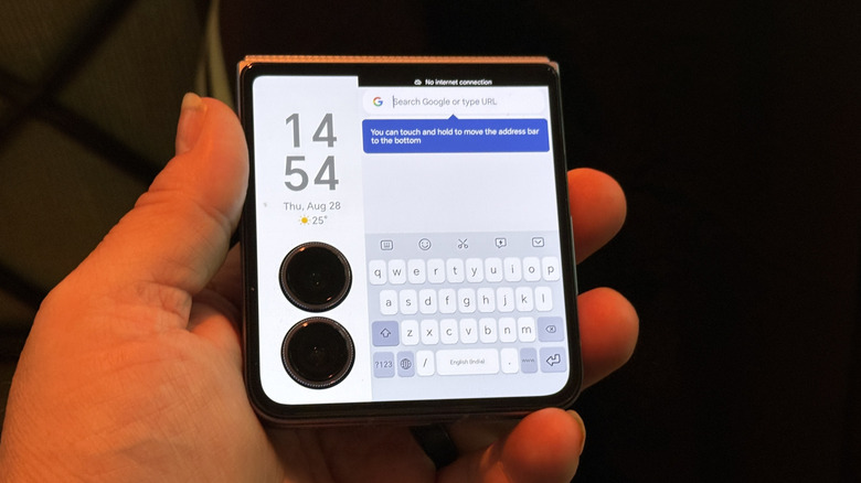
When opening an app on the cover screen, the area of the screen where the cameras reside is blocked off with a vertical bar. Above the cameras is a simple clock/date. On the right side of the screen, you get the app launcher, the settings screen, or the app itself. Even the virtual keyboard is shrunk down to fit in that box, which admittedly is the least ideal part of the concept. It's all really elegant, and I love it, and I'm sad I can't have it...yet.
It's time to learn
This is exactly the kind of concept that Samsung and Motorola need to pay attention to when it comes to future designs. This is a competitor that will likely never see U.S. shores, but that doesn't really matter. Good is good, and this design is lovely.
It's at this point that I should fully disclose that this opinion of mine is based on about five minutes spent with the device. I didn't exactly put it through its paces. I know some other reviewers have or will soon, so I will leave it to them to break down all the goodies, but for my part, I was smitten with the design and functionality.
I would love to see either Samsung, Motorola, Google, or Apple bring this design and implementation to the states if Honor can't or won't. Great artists steal, after all, and this is one concept that absolutely needs to be stolen.


