Why Did Cadillac Remove The Ducks From Its Logo?
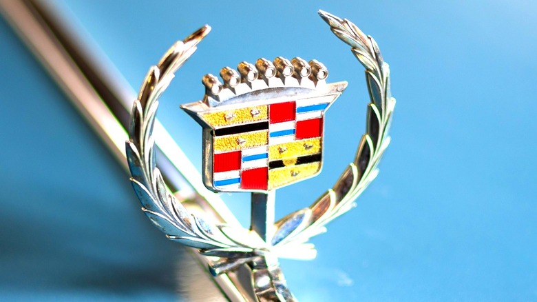
Those little "ducks" on the old Cadillac logo aren't ducks at all. They were actually merlettes, which are mythical birds from French heraldry. Unlike real birds, merlettes have no beaks or feet. The idea behind this is that they never land, representing constant motion and the pursuit of excellence — not a bad symbol for a high-end automaker to adopt while giving the brand logo itself a more interesting hidden meaning.
It might seem strange for mythical French birds to appear on a luxurious American automaker's symbol, but there is a good reason for it. When Cadillac adopted its first true logo in 1902, it leaned heavily on the coat of arms of Detroit founder Antoine Laumet de la Mothe, sieur de Cadillac. It wasn't just about the ducks either, as this original Cadillac crest came loaded with old-world symbolism. The merlettes, stripes, a crown, and a coronet with pearls all suggested valor and nobility, providing the brand with a powerful message.
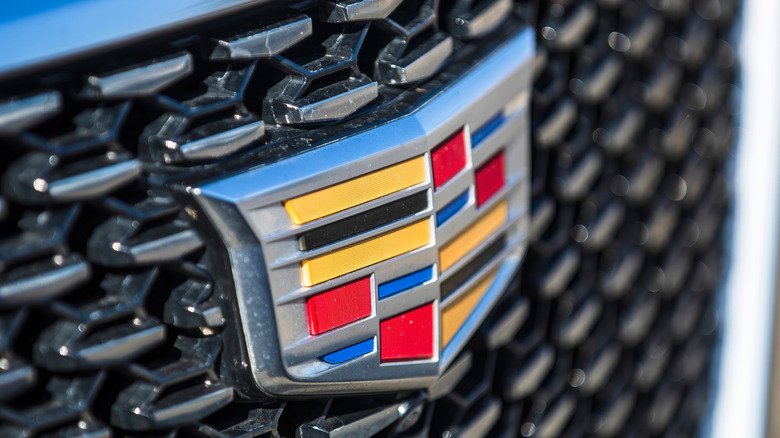
As the years went on, Cadillac grew into a symbol of American luxury that boasts a history of high-performance models. Although those medieval touches stuck around for decades, times do change, and by the 21st century this old-world logo was a little out of date. So in 2000, the brand opted for something cleaner and more modern. It's at this point that the merlettes — or ducks — disappeared.
Cadillac's logo has enjoyed constant evolution
In place of the so-called ducks came black and gold stripes and the redesign stuck. Later updates that followed in 2014 sharpened the badge even further and those mythical birds never returned. This change wasn't so much about erasing history, but rather streamlining the logo for a contemporary look, which a medieval coat of arms didn't portray all that well.
This wasn't the only time Cadillac made changes to its logo. In fact, the emblem evolved constantly, with around 30 different iterations introduced over the course of a century. While the crest remained throughout this time, its setting has shifted wildly, from perched atop triangles to ringed in a laurel wreath. The only real break from this tradition came briefly in 1914, when a short-lived version dropped the coat of arms entirely. Otherwise, the emblem remained the centerpiece across every design era.
By 1999, Cadillac opted for one its boldest redesigns yet: streamlining its logo for the new millennium with a sharper and more polished look. In 2014, the laurel wreath disappeared too, leaving only the bold, geometric shield, a move deemed by many as one of the worst car rebrands in history. However, even if the old-world details — like those ducks — are long gone, the later emblem is still unmistakably Cadillac. Any whiff of French nobility is now firmly in the brand's past, and the logo is more befitting of a luxury American automaker.

