Nothing Phone (3) Hands-On: Beauty Is In The Eye Of The Beholder, I Guess
Ever since Nothing hit the scene, I have found its products to be at the very least interesting and at the very best great. One of the foundational principles of the company is its exquisite taste in design. This was evident from the first set of earbuds that hit the shelves. Nothing's transparent design has been lovely to behold. Then 2025 happened.
Don't get me wrong; it's not like Nothing took a (major) turn for the worse. But when I reviewed the Nothing Phone (3a) Pro, I noted that the back of the phone, while still retaining its transparent roots, sported a massive round camera bump that didn't seem to do anything except account for the camera modules. Previously, everything Nothing did from a hardware and software standpoint had purpose. That didn't seem to be the case with the Nothing Phone (3a) Pro's camera bump. The Nothing Headphone (1) that I reviewed also sports a divisive design, evocative of a 1980s cassette tape. Whether or not you like the design is decidedly a matter of opinion. It's definitely...a design.
Finally, we have the Nothing Phone (3), and it is definitely...you know...a phone. Keeping in mind I have only spent an hour with this device, I have some initial gut reactions. I'm hopeful that perhaps the design might grow on me, but I'll have to spend a lot more time with the phone before I can figure that out. Here's what you'll get if you pick one up.
Skin deep?
Let's start off this conversation by pointing out that design is subjective. You are allowed to like what you like. You may think the Nothing Phone (3) is the greatest thing since whatever came before sliced bed. I will disagree with you, but that is also okay.
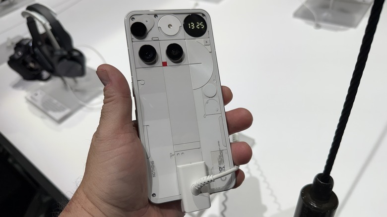
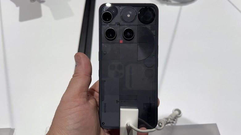
When the renders first came out of the Nothing Phone (3) I was not enthusiastic. I'm not a huge fan of the camera layout, nor the grid pattern that surrounds the cameras and other doo-dads on the back of the phone. It's divisive. I get the sense I will feel less and less strongly about it as I spend more time with the phone. Honestly, by the end of that first hour, I won't say I liked it, but I started to get it a bit. It's different; that's for sure.
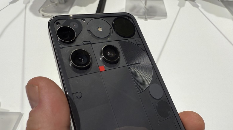
What I can say with confidence is that the design looks better in the black colorway than the white. I think something about the black cameras on the white background really make them stand out, and not in a pleasing way to me. Black on black on the other hand is not as jarring. As a personal rule, I hate photographing black phones, but I dig this one. I will have more fully formed opinions when my full review comes out. For now — eh.
Flagship specifications
Nothing is calling this phone its first "true" flagship and for the most part, it's bringing the specifications to match. The one corner that Nothing cut comes in the Snapdragon 8S Gen 4 processor powering the whole kit n' kaboodle. I don't hate this call. Putting the Snapdragon 8 Elite in this phone would mainly be for bragging rights.
Of course, Carl Pei, CEO of Nothing has been comparing his company to Apple from pretty much the first day, so adopting the processor that finally beat Apple's phone processor would have been a nice coup for the company. That being said, that would have been a pure — and expensive — "bragging rights" move. I'm totally at peace with this choice. Of course, we'll see how things shake out during the full review, but one thing at a time.
The biggest place where Nothing is punching hard is in the cameras. There are four 50-megapixel cameras on this phone, starting with the selfie camera on the front, and continuing to the back of the phone. The main camera, the 3x optical camera, and the ultrawide are all 50-megapixel shooters. The last big deal spec comes in Nothing's first silicon carbide battery at 5,150 mAh. This is the trend that the industry is starting to adopt en masse, so it's not a surprising move, but it is a pleasant one.
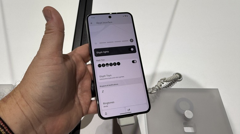
Enter the glyph matrix
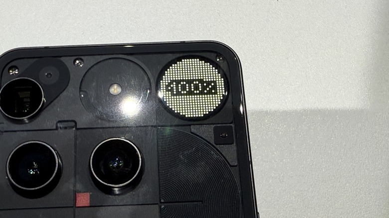
The change I'm arguably most excited about comes from the glyph. Glyphs have been a part of Nothing phones from the beginning, but this time around we're getting a fundamental change. Instead of LEDs lighting up around the back of the phone, Nothing has brought a dot matrix interface screen to the back of the phone.
The screen is a little larger than the camera lenses, and it has a number of uses. No longer are you just getting a flash pattern for certain callers. Now you can get full on pictures and graphics on the screen. It's smaller, so less "in your face" but it's much cleaner.
The screen is a dot interface, like most other things Nothing makes, and, in addition to caller patterns and whatnot, you can also play little mini games like "Spin the Bottle", "Rock, Paper, Scissors" and "Magic 8-ball". It's adorable and I love it a lot. It also comes with the "...and we can't wait to see what the developers do with it" caveat. Nevertheless, it's the feature I'm looking most forward to playing with.
Nothing OS improvements
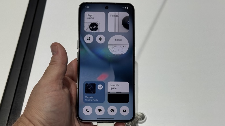
Finally, there's my favorite part of any Nothing phone — the software. Much of Nothing OS is the same OS you know and love. This summer will see the launch of Nothing OS 4 built on Android 16, but we didn't get a ton of details about that. But there are still things to talk about.
One of the more potentially underrated features is Nothing's Essential Search. Nothing launched the Essential space on the Nothing Phone (3a) and Nothing Phone (3a) Pro. Essential search is a separate thing, and it signals what Nothing seems to be calling it's AI features. Essential search is similar to a universal search, but it adds some AI into the mix.
You can search for your contacts, and your favorite web pages, and the like, but you can also search for answers to questions answered by AI without having to launch and app. That's potentially handy. A lot of AI friction involves the need to open a separate app and do what you need to do. With this acting more like a universal search it's possible that might make AI features like this more accessible.
One fatal flaw
What all that boils down to is that this is a phone that has improved in a lot of meaningful ways. The only fatal flaw comes from the design that doesn't feel intentional. It just feels like a lot. Again, design is subjective, so if you like it, you're golden.
I'm excited to try out all the rest of the phone — the cameras, the essential search, and darn it, I'm looking forward to trying out those min games on the Glyph interface. It's adorable and you can't change my mind of that.
All of this comes at a pretty decent price point at $799, and you can buy it in the U.S. without having to sign up for a beta tester program. IP68 dust and water resistance are also on board. In every way, this is a true flagship, but the proof will be in the pudding when the official review drops, so stay tuned.