The Interesting Origin Of Buick's Car Logo Explained
Buick is hardly the hottest brand in the U.S. market at the moment, with models like the Encore crossover lacking the unique features and driving dynamics to compete with the best in the segment. The brand has also been unable to appeal to younger buyers in its home country, with a 2018 study by CarMax finding that Buick had the second-oldest buyers on average, behind only Cadillac. However, despite its middling performance in America, Buick is doing very well in certain global markets, with China standing out as a particular area of success in recent years.
Buick is now pivoting further towards catering to Chinese consumers and is also in the process of making the leap from internal combustion to electric drivetrains. As a result, its branding has also been subject to significant change, with a new Buick logo unveiled in 2022. The logo is one of the most instantly recognizable features of any carmaker, yet Buick's logo has been subject to a series of drastic alterations over the years. Taking a trip back through the brand's previous identities, however, shows a few common themes and design motifs, and it's these motifs that shaped the latest transformation of Buick's signature badge.
The early years: 1903-1936
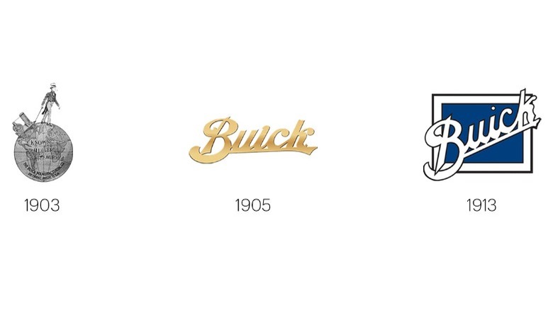
Formed in 1903, the original Buick Motor Company logo looked nothing like the one adorning the front of the brand's cars today. It was a depiction of Uncle Sam walking on top of a globe, with the slogan "Known all over the world" written across the center of the globe. A little ironic, perhaps, given that David Dunbar Buick's new company was little more than a plucky unknown startup with no recognition in its home country, let alone across the world. This first logo didn't last for long, and by 1905, it had been replaced with a simple stylized version of the Buick name.
Various iterations of the Buick name logo were used throughout the following years, with the next big design change coming in 1913. A square background was introduced to better frame Buick's signature typeface, with various versions of this framed logo sticking around until 1930. Then, once again, Buick reverted to simply using a stylized version of its name, but it was around this time that the company's designers would notice a motif in its founder's history that would come to define the brand.
Introduction of the shield: 1937-1959
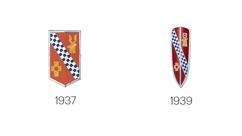
The first iteration of the Buick shield badge was introduced in 1937, after it had been first discovered by a General Motors researcher named Ralph Pew sometime in the mid-1930s. It was modeled after a historic Buick family crescent originating from Scotland, where the company's eponymous founder had been born before moving to the United States at a young age. The shield had been recorded in a book on heraldry published in 1851, and featured a red shield with a silver and blue (or azure, to be more specific) line running diagonally through it. A gold cross was also featured on the shield, which had a hole in the center, with the red of the shield showing through. Pew took the design and added his own spin, eventually creating the initial Buick company shield logo.
The shield design was tweaked a number of times over the following decades, being narrowed in 1939 to better fit the profile of Buick's cars at the time. It was widened again in 1942 and placed within a black circular background as Buick temporarily switched to making military equipment in the Second World War. By 1947, when regular production resumed, the logo reappeared without the background, and continued to be used up until the end of the '50s, when GM designers suggested a major change.
The first tri-shield era: 1960-1974
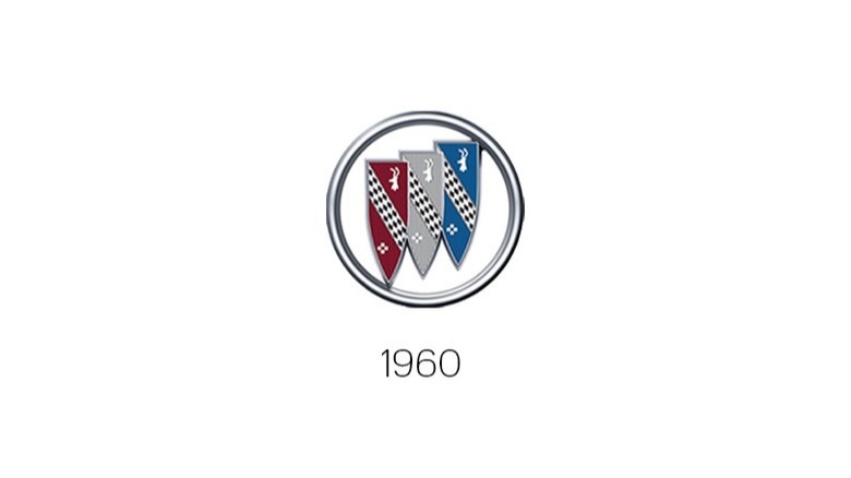
Introduced in time for the start of the new decade, the Buick logo was redesigned for the first time with three shields rather than one. This tri-shield design represented the three models in Buick's range — red for the LeSabre, silver for the Invicta, and blue for the Electra. This branding proved to be very popular, and continued throughout the '60s and into the '70s, even after Buick's model lineup had expanded.
The tri-shield meant that Buick's logo was no longer as directly based on its founder's ancestral heritage, although the three primary colors from the original shield logo remained. The cross and deer head present in the previous design were also carried over, occupying a smaller position on each shield, but now appearing three times each as a result of the redesign. This era formed the basis of the modern Buick logo, and even after the design was changed again in the mid-1970s, the tri-shield still appeared on various cars inconsistently throughout the late '70s and '80s.
Happy the Hawk: 1975-1989
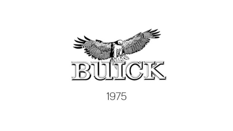
In what would turn out to be the last deviation away from the tri-shield design, GM designers introduced the Buick Hawk concept in 1975, with a hawk logo. The hawk proved so popular that the design spread to the rest of Buick's lineup the following year, and a red-tailed hawk called "Happy" was even featured in commercials over the following years to reinforce the new branding. However, this was only successful to a point — by the mid-1980s, Happy the Hawk ended up taking a proverbial backseat to the traditional tri-shield logo.
During this period, Buick was making some remarkably futuristic cars, but executives decided that emphasizing the brand's heritage was the best way of maximizing sales. By 1989, the Buick Skyhawk car was about to be retired, and GM bosses decided it would be a good time to officially retire the hawk logo too. Happy was axed along with the Skyhawk itself, and Buick returned to the tri-shield as its sole logo the following year.
The return of the tri-shield: 1990-2015
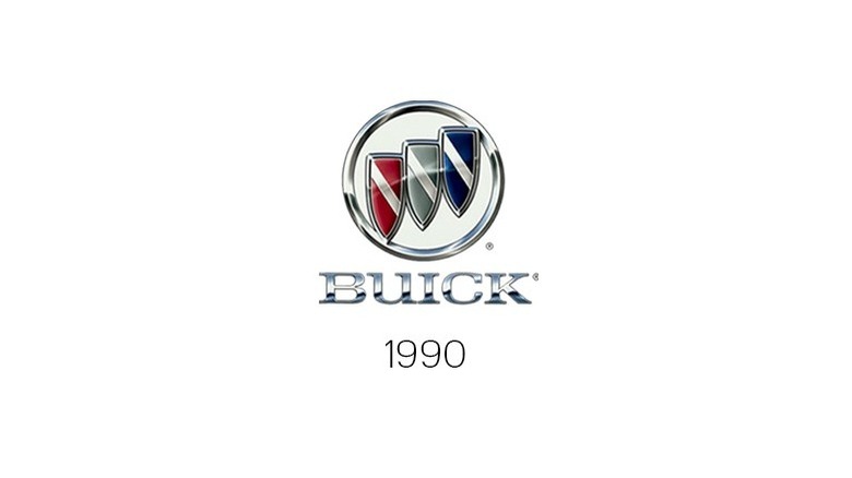
After the tri-shield was officially reintroduced in 1990, Buick entered a period of relatively strong sales but declining innovation. Models like the Roadmaster and the Century were consistent money makers for GM, but they hadn't been significantly updated in years, and were based on rapidly aging platforms. The market was also just starting to shift towards SUVs, and Buick's traditional sedan-heavy lineup didn't have a star model to take advantage of this emerging segment.
The lack of logo change between 1990 and the mid-2010s is arguably reflective of GM's attitude towards Buick overall during that period. The old motto of "If it ain't broke, don't fix it" comes to mind, but in retrospect, it seems that GM took its eye off the ball when it came to Buick's competitiveness in the American market. Nothing had broken, per se, but foreign rivals and indeed other Big Three brands all progressed much faster in terms of technology and design, leaving Buick toward the back of the pack. Over this same period, however, Buick had launched in China, opening its first domestic factory in Shanghai in 1999. The Chinese perception of Buick was one of prestige and luxury, and GM took full advantage of this. Buick sales in China quickly gathered pace, and by 2013, the marque was a key factor in making China GM's biggest market.
A simpler design: 2016-2021
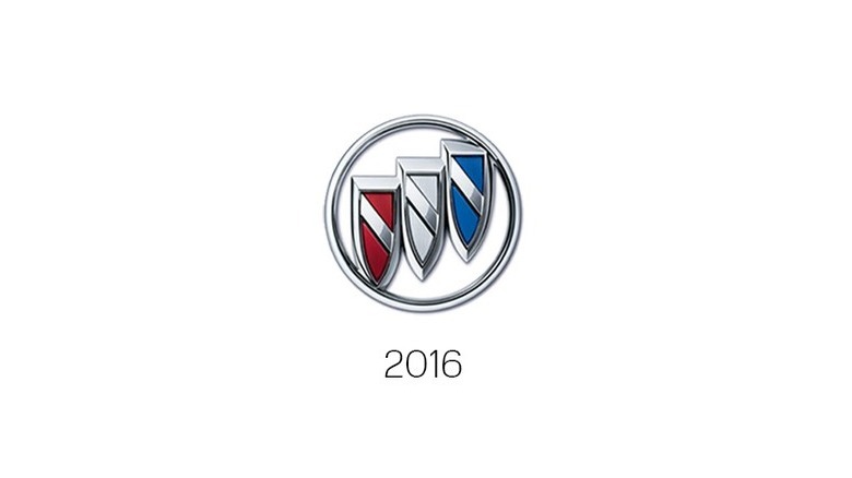
With Buick sales consistently strong in China and languishing back home in America, GM's primary concern for the brand had become appealing to Chinese consumers. A new, simpler design saw the "Buick" name removed from the logo and just the tri-shield kept, distilling the logo back down to an even simpler version of the 1960 design. Simple, perhaps, to the point of being too bland and forgettable. Buick's modern cars have often struggled to toe the line between simplicity and blandness, with our review of the 2021 Enclave Avenir praising the car's ride, space, and infotainment, but lamenting the car's lack of a unique selling point.
Even Chinese consumers that were previously enamored with the brand's history and prestige appeared to be starting to lose interest, with reports emerging that sales were slipping in Buick's biggest market. Clearly, GM needed to do something about it, and the resulting brand shake-up saw the signature badge overhauled for its first major redesign since George Bush Sr. was in power.
The revamped tri-shield: 2022-Present
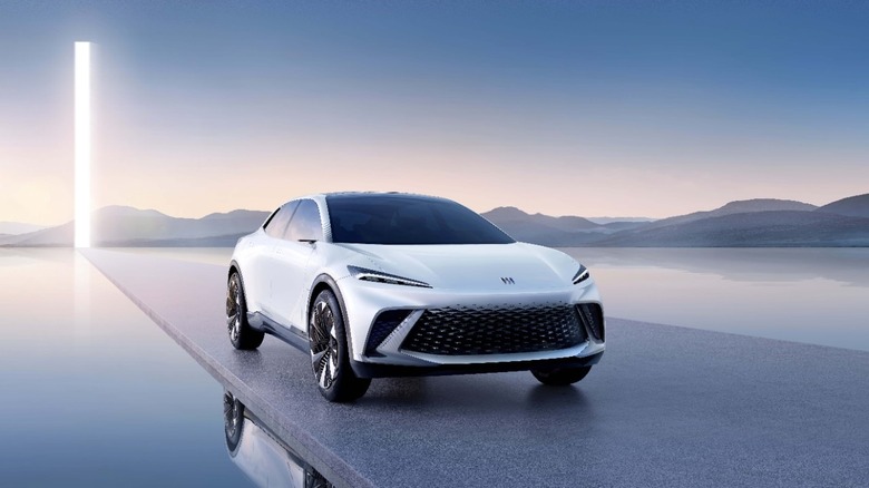
In an effort to win back Chinese consumers, Buick unveiled its latest logo change at a live-streamed event alongside a new flagship MPV tailored specifically for the Chinese market.
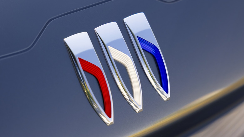
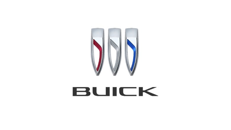
The latest iteration sports a few key differences from the previous design, most notably that the three shields are now positioned in a horizontal line, rather than diagonally. The three original colors of red, silver, and blue have been kept, albeit in a more muted form than previously. The diagonal line through each shield has been replaced with a larger "hole," and the Buick name has been reintroduced with a new typeface.
The new logo was a happy accident
While the new design is a significant departure from its predecessor, Buick's executives have claimed that the revamped logo wasn't initially planned at all. Automotive News reports that the idea came about when Geoffrey Richmond, a designer working on a project to create "the new face of Buick" for the EV era, left three colored slash marks on his sketch in place of the standard logo. Those marks would usually have been replaced with the logo before being presented to executives, but in this case, they weren't, and the accident got GM President Mark Reuss intrigued.
Further exploration of the new, accidental design was launched, and the new Buick logo was eventually formulated. In a press release, Buick claims the new logo represents "a modern expression with a sense of technology," presumably alluding to the brand's intended trajectory as an all-electric carmaker in the future. It didn't go into specifics on which new models would be the first to get the badge, only saying that it would be "mounted on the front fascia of upcoming Buick products."
