Samsung "Icon Theft" Images Shown By Apple
This month the epic court war of Apple vs Samsung is taking place and the newest battle is in: Apple is presenting a set of slides which accuse Samsung of straight up copying their designs for mobile device icons. In each of the following slides (included in this post) you'll find Apple's presentation (via CNET) to be quite convincing in some areas and perhaps a bit of a reach in others. It's all up to your own senses, of course, until the jury is able to reach a conclusion of their own in this massive and multi-faceted case.
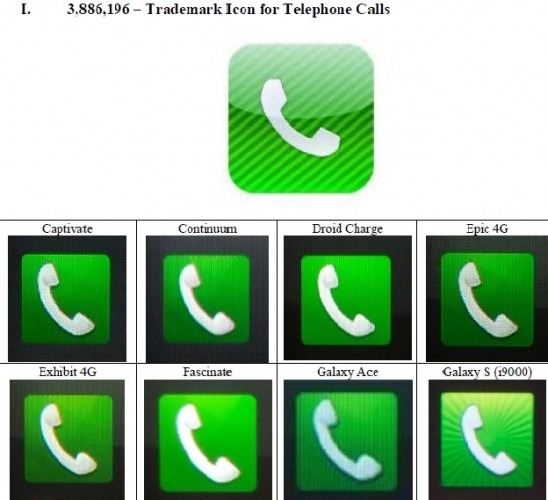
First have a peek at what could be an undeniable theft or, if Samsung is able to convince the jury, an incredible coincidence. This is the Telephone app icon for the iPhone – which still exists today – as it appeared on the first iPhone. Below the image, as it is with the rest of the examples as well, Apple shows a collection of Samsung devices with their icon of choice for the Samsung Android version of the Telephone app. Green icon with a white landline-type phone aiming upward and to the right.
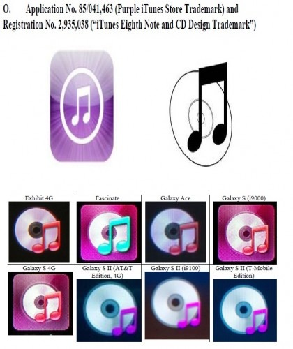
Next is the iTunes trademark as compared to Samsung's choice of a CD with a music note in front of it. This is a bit of an odd one because Apple's icon for iOS (on the iPhone, iPad, and iPod touch) is actually more of a music note in a white circle than it is an iTunes logo. Apple presents their original trademark application image for the iTunes logo to the right of the mobile icon for comparison to Samsung's collection below.
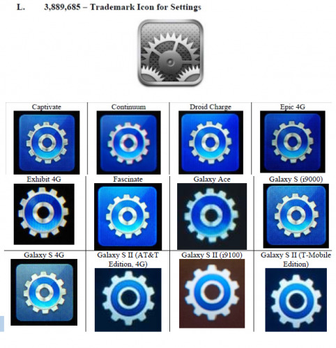
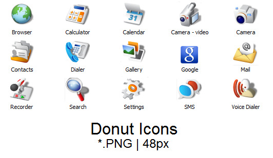
Next is the Settings icon from iOS being compared to the Samsung Settings icon on everything from the Captivate to the Galaxy S II. One might ask one's self why the gear is being claimed by Apple when it should be clear that the base Android system the Samsung devices in question were built on also had a gear for its own shortcut to Settings. Have a peek first at the Apple comparison to Samsung, then to an icons pack from an early version of Android: version 1.6 Donut.
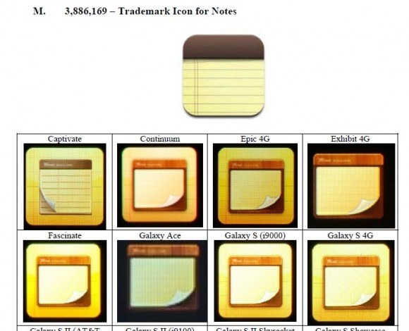
There's a Notes app in both the iPhone and each of the Samsung devices Apple is showing in this next slide. This is where things get a bit more suspicious once again as not only are the colors replicated rather closely, but the lined yellow paper looks the same as well. Why on earth neither company went for the more obvious sticky-notes type icon, we cannot say!
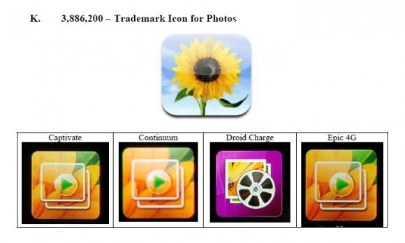
The Photos icon comparison between iOS and the Galaxy line of Samsung smartphones is a bit odd as there is indeed a flower in both of the options – but they're sized quite differently. Apple's icon is a clear image of a sunflower on a blue sky background while Samsung chose to have flower pedals shown with two photos of those pedals sitting on to, with a play button on top of the stack as well.
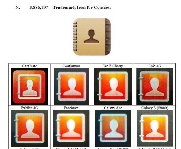
Finally there's the Contacts icon as presented by Apple (as it is with the rest of these slides) with the original iOS icon up top and a collection of Samsung Galaxy smartphones below. Though the color scheme here isn't the same, it's quite clear that both of these groups grabbed inspiration from the same source. OR that one saw the other at some point and decided to make good.
Make your own judgements here and let us know if you feel that Apple or Samsung – or both – were wronged in how similar their mobile device icons look to one another. It's no small accusation saying that a design was copied directly from your own, and we hope neither company is taking any of this situation lightly.
Have a peek at the timeline below to see additional insights into this case and stay tuned as Apple and Samsung cut each-other to shreds over the coming weeks and months.
