New Android Logo And Brand Update For 2019
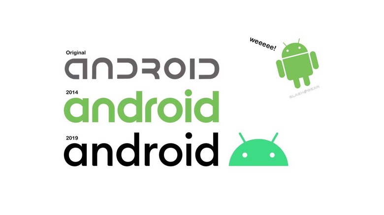
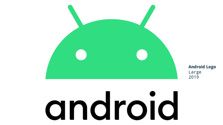
The big Android news from Google today was the change from Android Q to Android 10, and the end of the desserts. That's important – that's the fun part of the news, and the most tasty – but the part that will matter most to graphic designers is the edits made to the Android logo and design guidelines. Of import here are the adjustments in the eyes, the color shift, and the shift in aesthetics overall.
Above you'll see the original Android logo, the 2014 redesigned android logo, and the Android logo as it exists today. The three most obvious shifts come in the font change, the color change (black and a slightly more blue version of green) and the slight shifts in the shapes in the head of the "Bugdroid" mark.
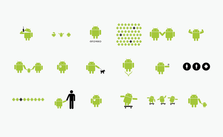
The original Bugdroid Android logo was designed by Irina Blok. "The idea was to create the open source logo (very much like open source Android platform), that was released to the developer community without regular brand guidelines." Blok's portfolio also suggested that "Initially the logo was meant for developer community, but it quickly became consumer facing." Below you'll see several iterations of the Bugdroid in different configurations – all designed by Blok.
The original Bugdroid started to fade just a bit over the past several years – it really started to phase out in late 2018 with the Pixel event where the company did not mention the word "Android" even once.
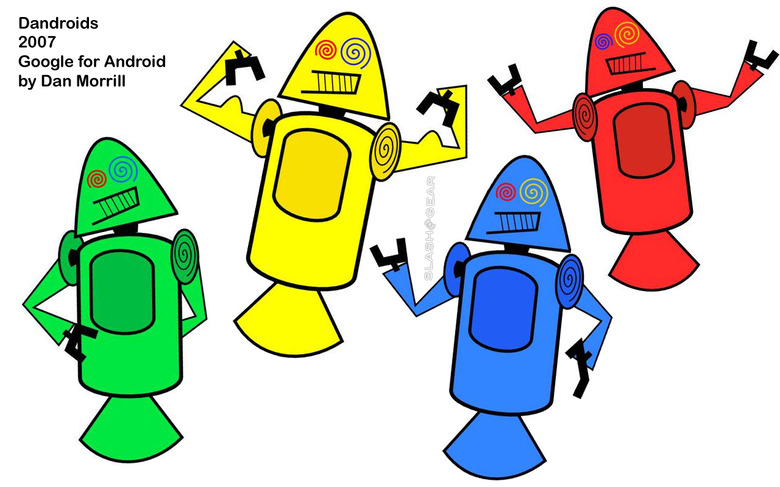
ALSO NOTE: Just before the Bugdroid, there was a very, very early iteration of the Android called Dandroid. This monstrosity didn't last long, and really wasn't meant to last long anyway – so said Google's Dan Morrill.
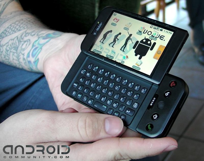
September of 2018 marked the 10 year anniversary of the launch of the first Android phone. Here in August of 2019, the next big chapter in Google's consumer-facing Android brand is about to unfold.
According to Google, they'll begin using their "updated logo" for Android in the coming weeks with the final release of Android 10. That means a likely September 2019 new Android logo launch timeframe, with a gradual change in all public faces for the brand. This includes smartphones as much as it does websites, apps, and physical representations of the system.
