MOTO 360 Hands-On: Android Wear On A Concept Made Real
It can be tough to get excited sometimes in the consumer tech world, particularly in the "me-too" wearables segment, but MOTO 360 stands out like a concept made real. Motorola's Android Wear smartwatch will follow on behind LG and Samsung's models, and isn't due until sometime over the summer, but from my first impressions here at Google I/O it may well prove worth waiting for.
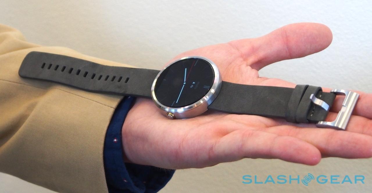
The argument over whether a watch should be round or square (or, indeed, something else) is unlikely to be settled any time soon, but there's no denying that Motorola's smartwatch feels simply more "watch-like" than its squared-off rivals.

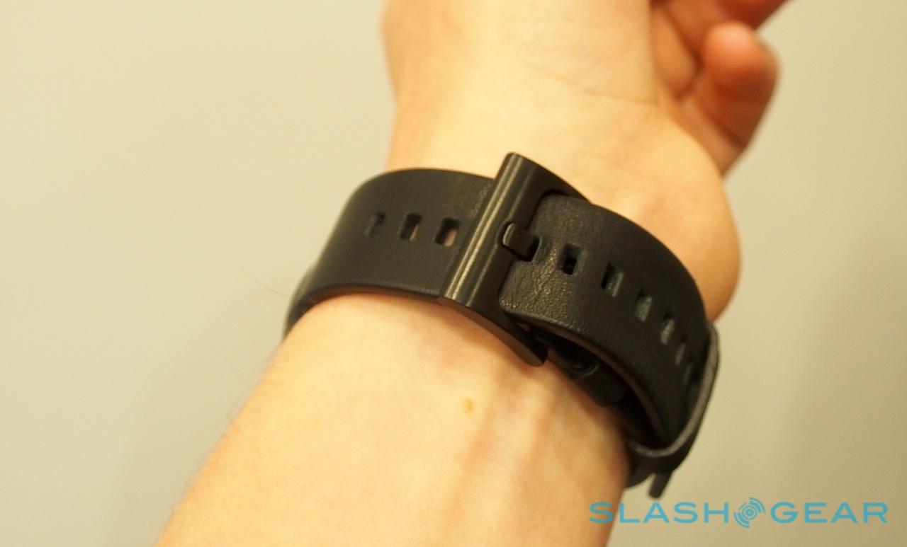
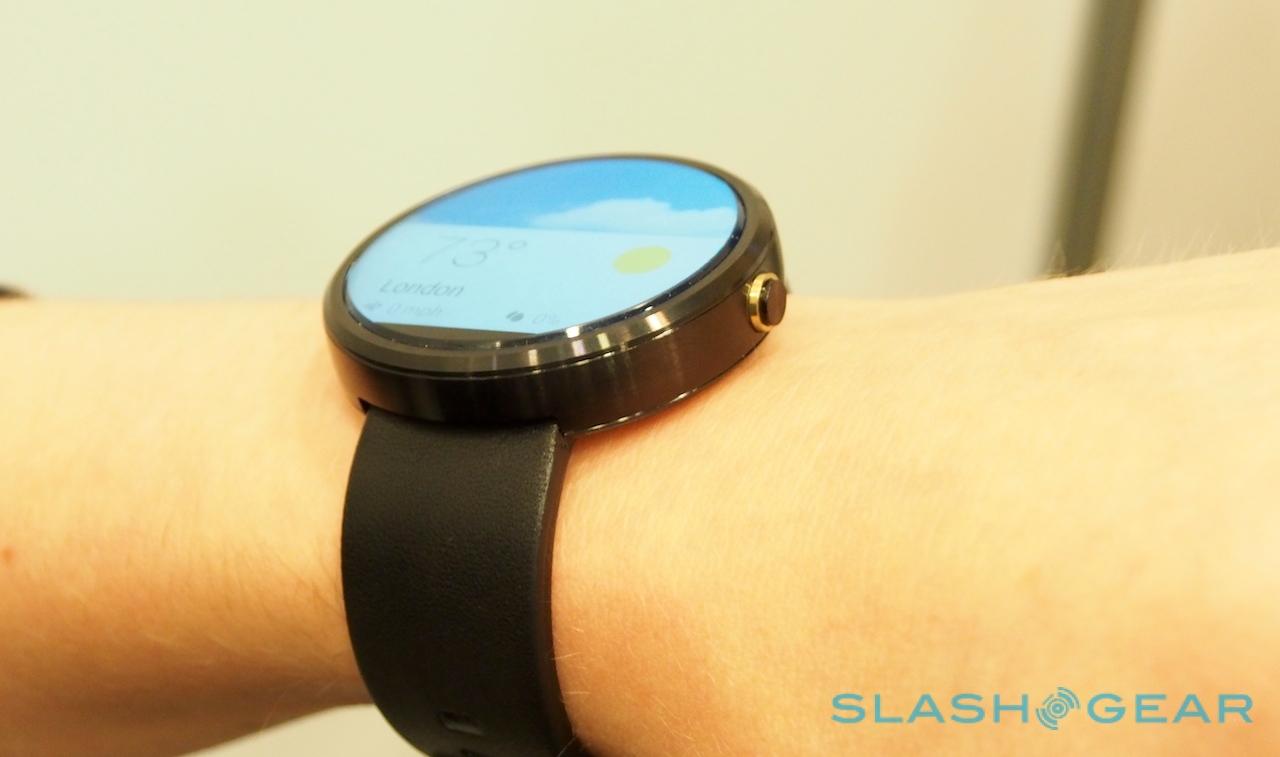
It's deceptively big, too – Motorola wouldn't say exactly how large, only that it follows a "standard" circular watch face measurement, and will also take a standard replacement watch strap – but almost shockingly lightweight, to the point where I'd have suspected I was wearing a mockup if I hadn't seen it working first. The metal casing feels solid, but it's also a minimal part of the overall form-factor, because almost the whole front is taken up with the display.
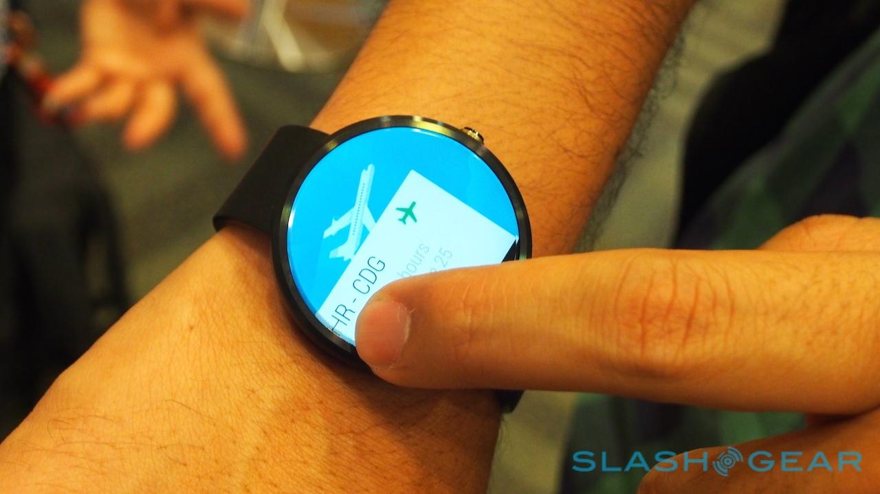
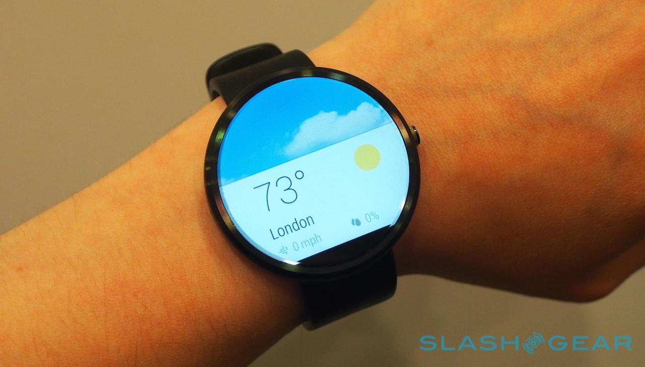
And what a display that is. Edge-to-edge, bright colors, and great viewing angles, it feels like it's swimming on top of the cover glass, not underneath it. Only a small notch out of the bottom mars the circle, where Motorola's display driver components hide, though most of the time you don't notice it.

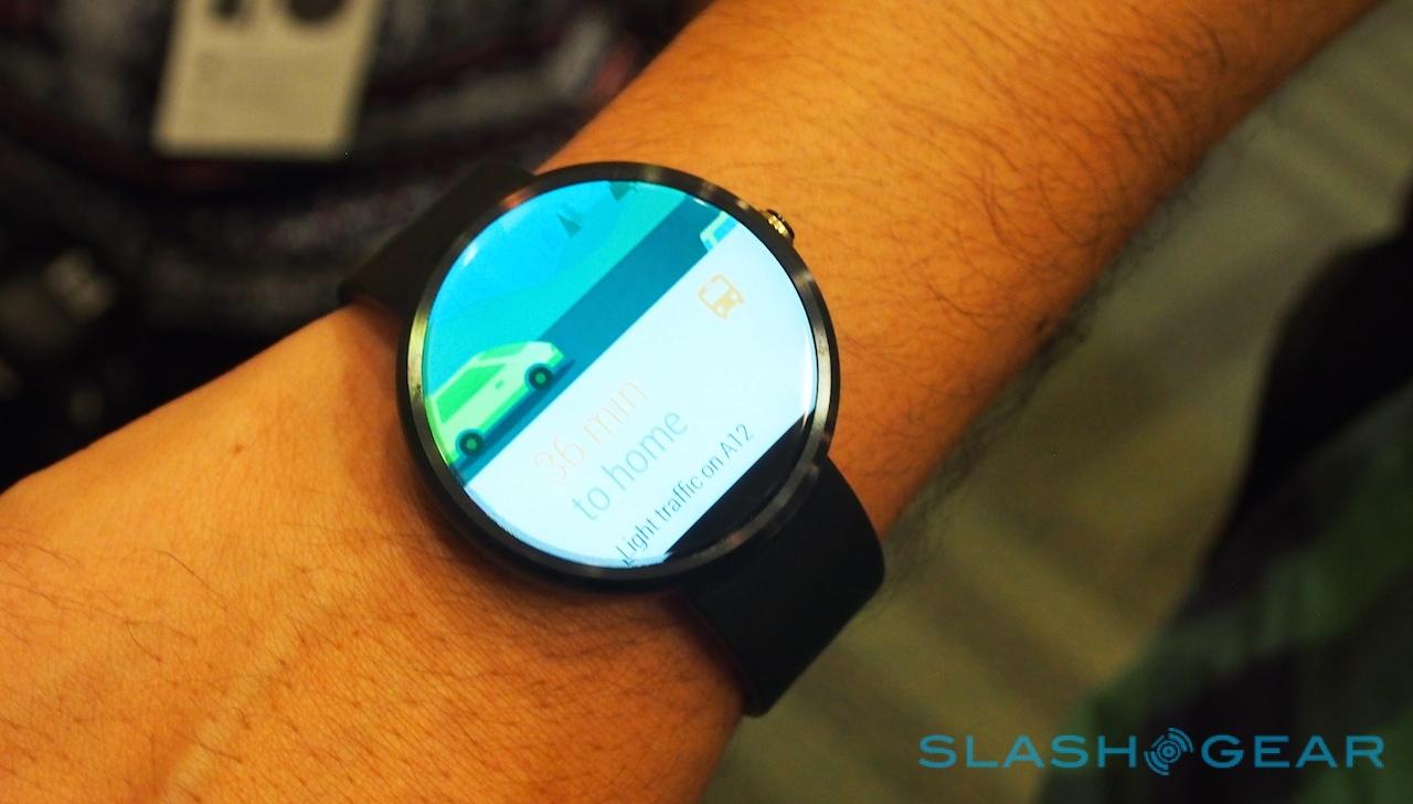
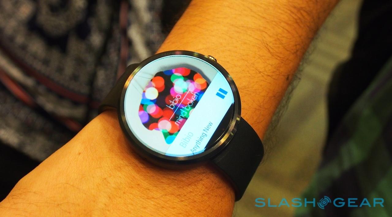
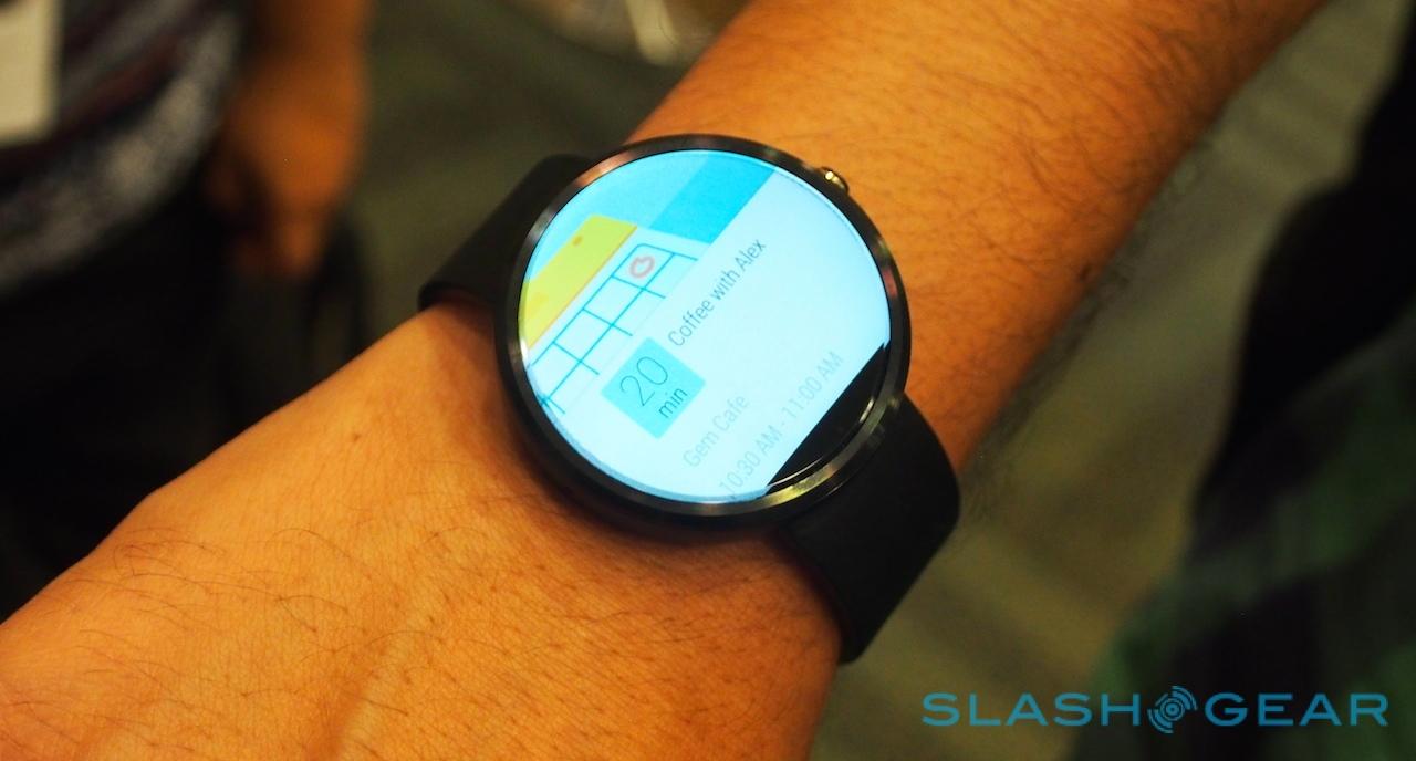
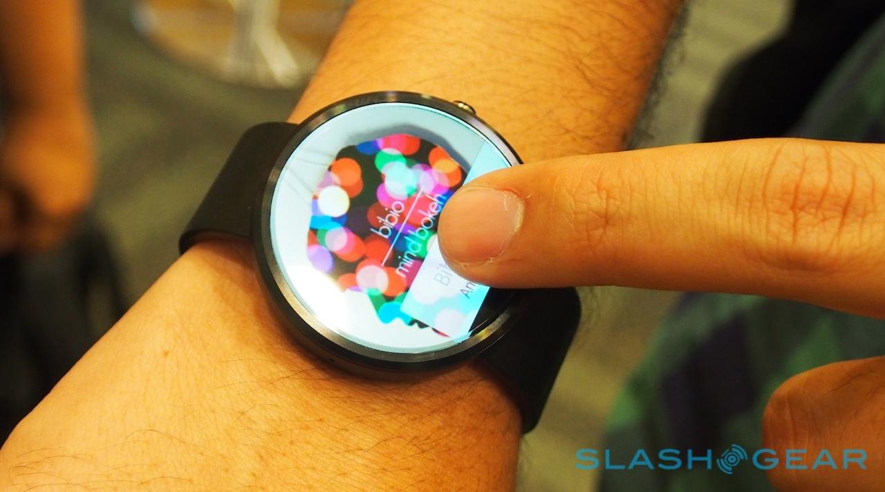
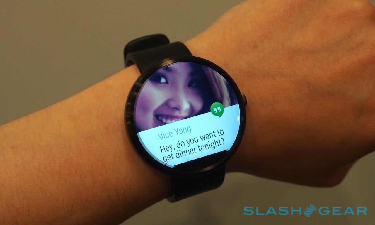
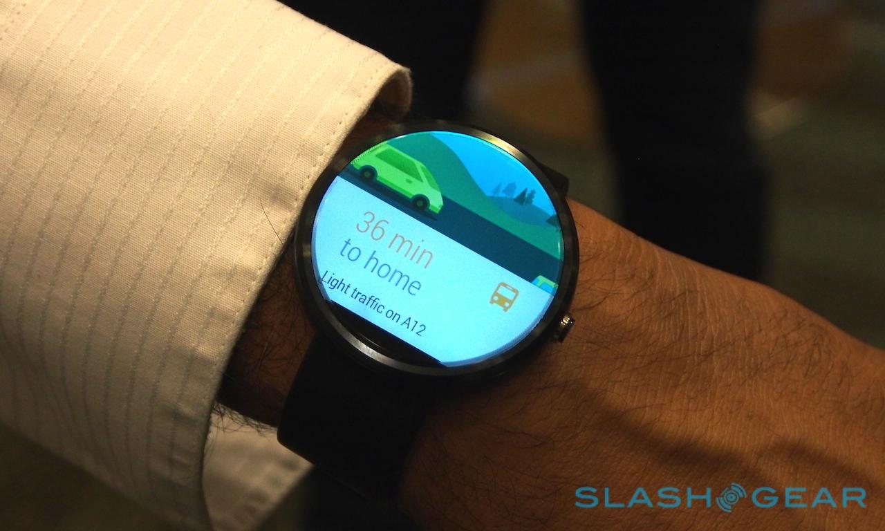
What the MOTO 360 shows you and what square-faced Android Wear devices will show is the same – Google's been careful to make sure apps for each form-factor treat the panels the same, though LG insists that a square makes for more efficient use of screen space – but the feeling is instantly more immersive on the Motorola. You have more room to swipe, too, though the prototype Motorola allowed me to play with was locked into a semi-interactive demo mode.
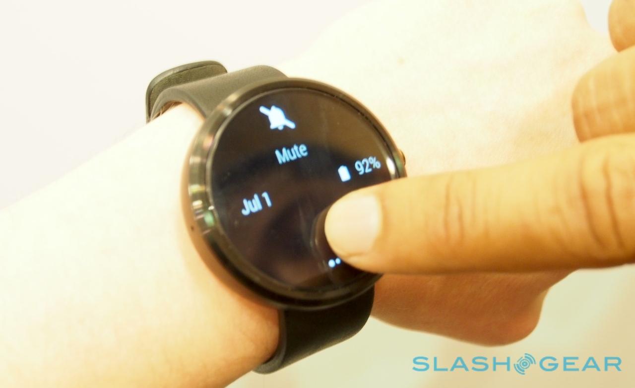
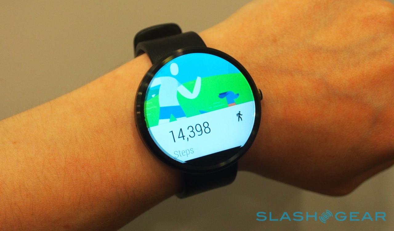
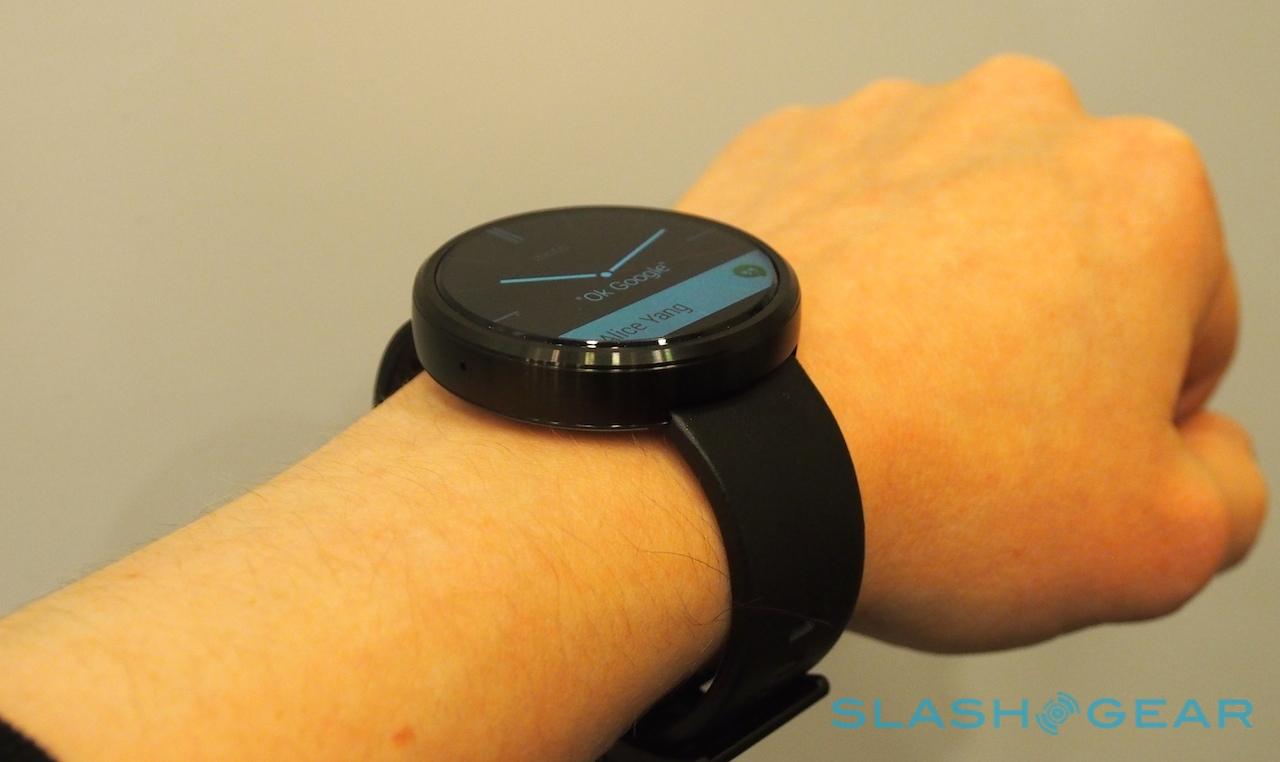
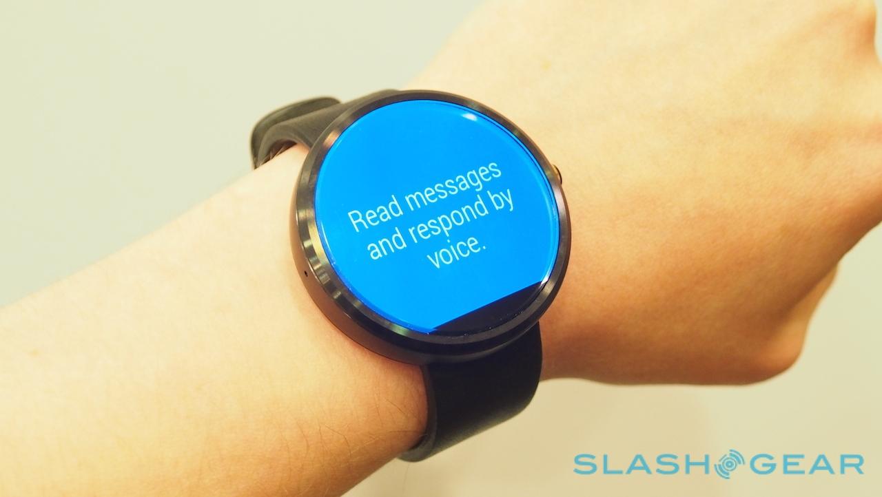
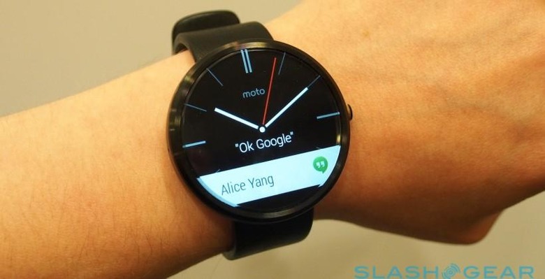
Google's new Material Design UI language works nicely, with the draggable interface elements floating on top of the underlying graphics and giving a real sense of depth. Swiping up and down scrolls through the Google Now-style cards, while swiping them to the right flicks them out of the list. From the watch-face "homescreen", dragging down from the top exposes a battery status gage as well as flipping the MOTO 360 in and out of mute mode; when muted, Google speech recognition is also disabled.

Unlike the G Watch, Motorola has given the MOTO 360 a single physical control, the button on the side where a traditional watch might have a winder. The company isn't talking about the full extent of what it might do, but for the moment we could use it to return to the standard watch-face screen. Similarly, Motorola wouldn't let us look at the back of the MOTO 360, presumably to maintain the secret of how it charges (though the cat is out of the bag there, the companion wireless charger having already been spotted at the FCC.

Motorola isn't showing much, and my time with the MOTO 360 was relatively brief; far too short to come to any meaningful conclusion either way. Yet, if the barrier to smartwatch and wearable adoption in the mass market has been aesthetics, then it's hard not to be charmed by the MOTO 360. Glance at it and you could easily assume it was a regular watch, only catching on that things were more complicated than that when the screen comes alive.
That could be the tipping point that smartwatches – and Android Wear – needs, and it sets the bar high for whatever wearable Apple and others release over the coming months.