Gmail And Calendar Refreshed With Google+ Matching Themes
It isn't just Google+ which is new from the search giant this week. The company has also kicked off a significant refresh of its Gmail and Google Calendar services, with the interfaces of both getting stripped down. According to Google, "adding countless features to Gmail has made it an increasingly powerful communication hub, but along the way the interface has also become more cluttered and complex."
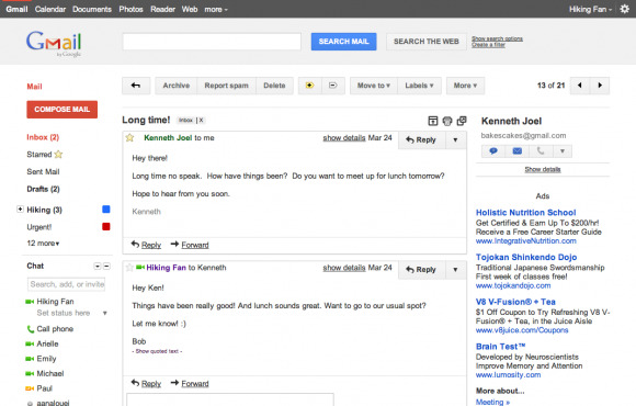
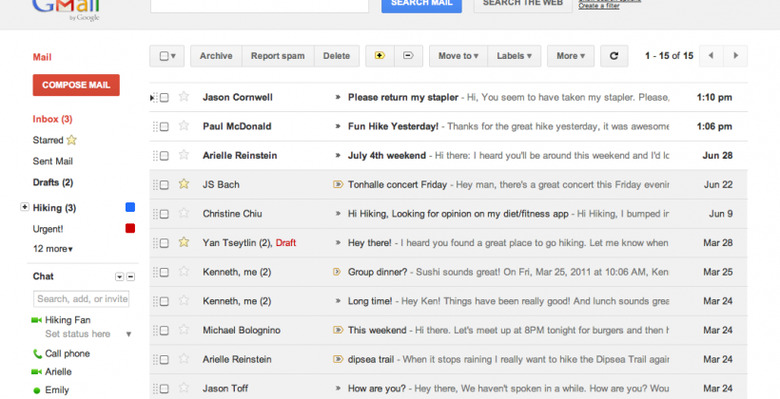
Gmail has two themes to choose from, called Preview and Preview Dense, though eventually they'll be selected automatically depending on the size of the screen you're viewing your inbox on. Just as most people have already spotted, the modifications echo the new black bar running across the top of the Google search page; there's also more use of shading and highlight to differentiate sections, and the whole thing looks cleaner.

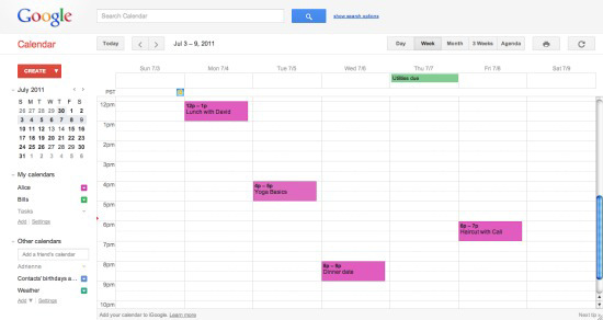
As for Google Calendar, those changes include auto-hiding of the calendar lists, the ability to collapse the mini month-view, and various buttons that were previously text being replaced with icons. Google reckons this will provide a more seamless transition between desktop and mobile use, and says there are more changes in the works.
However, it may not be entirely smooth sailing to begin with. The company warns that some of the experimental "Labs" features may not work properly with the new themes yet, and to let it know if you spot anything broken. You can prematurely enable the new Calendar view from the settings cog in the top right corner, and the new Gmail themes from the settings page.

