Dear HP: Your New Logo Is Amazing And You Should Use It Everywhere
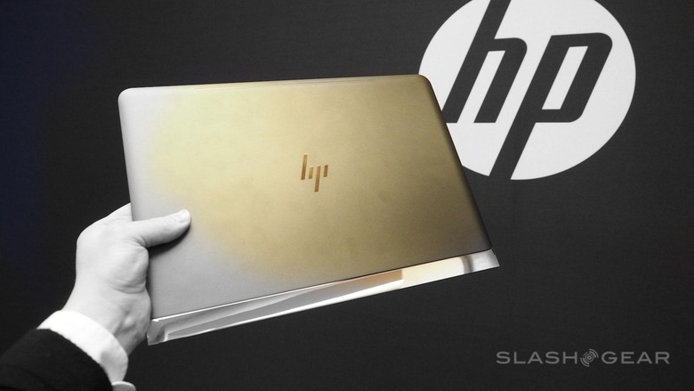
This week we got our first look at the HP Spectre 13.3 – and with it, the newest (and yet old) HP logo. This logo is fantastic. It was originally designed all the way back in 2011 by the folks at Moving Brands, and here in 2016, HP tells us that they'll use the logo for their premium products only. They also suggested that they'd also wanted to use the full "Hewlett Packard" branding on high-end machines for this year – that is, until they split the company in late 2015, and the rights to the name went in a different direction.
HP found the logo a bit divisive internally, they tell us, as some worried the logo wasn't "HP recognizable." Fah! We say to that. It's time HP worked with a logo that made people curious.

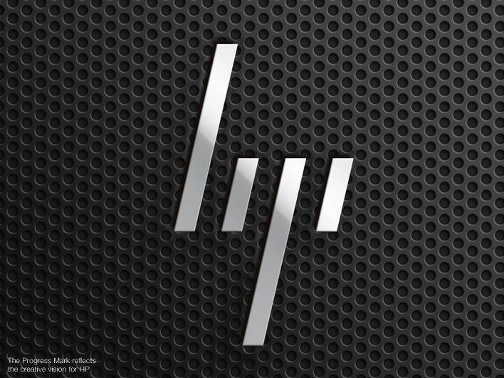
Moving Brands did a massive study on the HP brand starting in 2008, and produced the mark you see here in 2011. This is what Moving Brands called the "Progress Mark" for HP.

In the above photo, you'll see HP's logo as it exists today, on the wall on the right. On the left you'll see the newest Spectre laptop from HP with the logo they could be using everywhere – if only they would!
This is the HP Progress Mark in its simplest terms.

Imagine this new HP logo on a wide range of products. Forward-facing. Movement in all services.
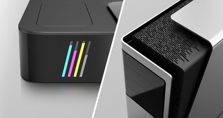
This HP mark and identity could affect all HP devices – printer ink levels to air vents.

This is the mark that I believe HP should be using for all of their products.
It'd not only bring a rebirth to the notion that HP is a brand leader, it'd make clear that HP isn't one to sit idly by while the PC industry evolves at a rapid rate.
HP's use of this logo would revitalize their presence in the computing industry and re-state their leadership role to the public.
It's simple, it's sleek, and it fits.
What do you think?
Should HP use this logo – and the entire brand identity shown above?
