Android's Google Search Looks New And Pixel-Friendly
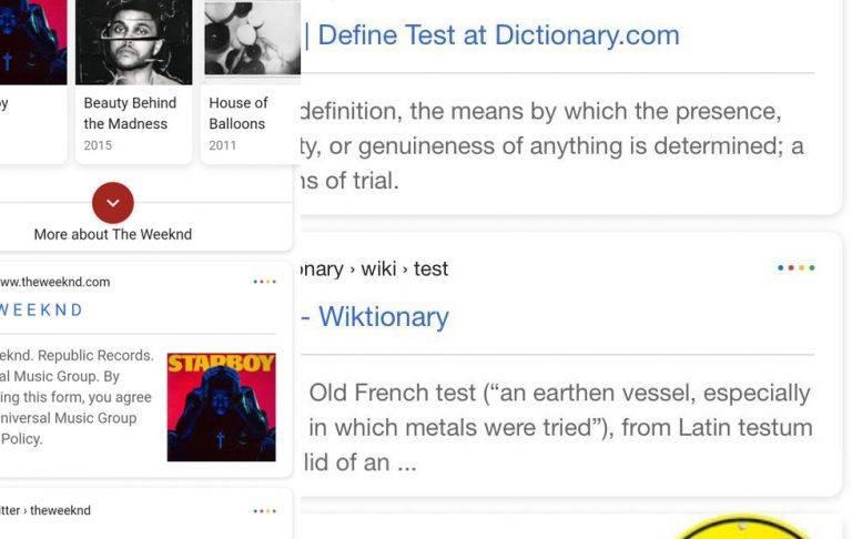
This weekend Google began rolling out changes to its mobile search results UI. Instead of flat, sharp corners, each result in Google search has a softer, rounder edge. Instead of having nothing in the upper right-hand corner of each search result, this new layout includes four friendly little dots that correspond with the 4 colors of the Google Logo and newest Android OS startup.
This new version of Google Search results appears to have very little baring on the order of results that appear. Instead, this seems to be mostly a set of aesthetic changes that'll unify the way Google has Google Search look inside Android. Of course we expect this system UI change to appear in iOS, too – but not just yet.
SEE TOO: Google Pixel 2 predictions and concepts released to excited users
This is a good sign for those looking for design one-ness amongst the Google Pixel's version of Android and the rest of the Android universe. The sharp corners and lack of color in the search results of last week are about to be gone! Vanished are the monochrome search results tested earlier this year! It's time to get back into color for the summer.
One way in which those content creators who rely on Google Search placement for any and all hits, this update may change a little bit of their game. In some cases, the change in font size and spacing between lines will turn a 1st-page read of 4 web results into just three. That can make all the difference in a first-click.
This update appears to be affecting only some users in the USA so far. If this update rolls out the same way past updates to Google Search have rolled out, we can expect one of two situations. One, we see this update by the end of the week on all devices. Two, this update disappears completely as fast as it appeared – into a puff of smoke!