iOS 26's First Big Update Brings Liquid Glass Control, But Users Say It's Not Enough
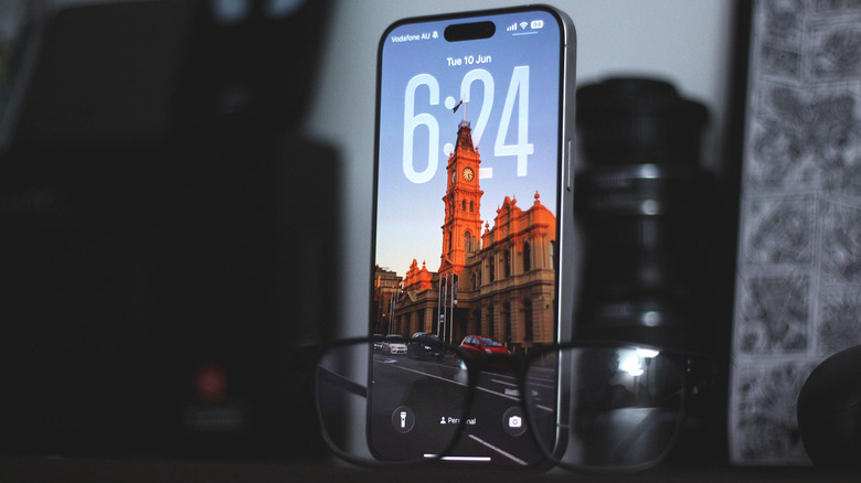
When I installed the first developer beta build of iOS 26 on my iPhone, I was surprised that Apple actually shipped Liquid Glass in all of its transparent glory. Sure, it looked amazing during the meticulously edited keynote, but the accessibility and viability of Liquid Glass could only be determined by real-world use. Performance on the first few builds was horrendous, but what caused a bigger divide in opinion was iOS 26's bold take on the design language. Notifications on the lock screen were barely visible, and the Control Center blended in with the background, making it difficult to find toggles. Apple then dramatically reduced the transparency of Liquid Glass in subsequent updates, leading to a night and day difference when you compare the first beta preview to the stable release.
Legibility was greatly improved, but this came at the cost of severely dialing down what made Liquid Glass so popular in the first place. iOS 26.1 finally lets you switch between clear and tinted glass looks, but the feature in practice doesn't do enough to keep both camps of people happy. Those who liked the extreme transparency effects aren't too delighted with all the nerfing that has happened, and people who disliked Liquid Glass from the get-go are unhappy with how bad the tinted glass option makes everything appear. Plenty of users, including me, believe that a slider to control the intensity of Liquid Glass could finally settle this debate — and I think Apple is slowly getting there.
The current state of Liquid Glass
We're now several beta and stable builds into iOS 26, and I've found it interesting just how much Apple has experimented with the Liquid Glass aesthetic. I've used developer previews of an extremely transparent and liquid iOS 26, but I've also been on builds that have dialed back the effects so much that it practically felt like I was back on iOS 18. The stable release of iOS 26 seems to have found some stability in its appearance, but users are far from satisfied, given how the Liquid Glass we have now looks dramatically different from the Liquid Glass we were shown during WWDC 2025.
If you've updated to iOS 26.1, you can navigate to Settings > Display & Brightness > Liquid Glass, and switch between a "Clear" and "Tinted" look. While testing this feature on my iPhone 15 Pro Max, it's hard to tell just how much the Liquid Glass appearance changes between the two modes. In some areas, like the lock screen, the tinted option boosts visibility by basically eliminating all transparency effects on the notifications, but other elements, like the Control Center, seem to be barely affected.
One user on Reddit expressed how they want a proper "off" option for Liquid Glass instead of this confusing mess. "Very disappointed that the toggle for Liquid Glass isn't a more significant effect," says another user. I've seen comments of people claiming that they couldn't even tell the difference the toggle made.
A Liquid Glass slider could solve it all
Once known for being practically flawless, the iOS experience has inarguably been getting sloppier by the year. There were things we disliked about iOS 18, and unfortunately, the fresh coat of Liquid Glass paint has only added to the list of complaints users now have. Apart from performance issues in iOS 26, there have been reports of the typing experience being broken. I've noticed that performance has greatly improved on my iPhone, but iOS 26 now feels like a bloated mess — especially with how inconsistent the Liquid Glass look has been.
This is where a slider that lets users freely pick the intensity of the transparency effects for Liquid Glass could genuinely fix one of iOS 26's biggest complaints. This not only helps the users who like the exaggerated clear glass appearance or those who prefer a largely frosted look, but can accommodate everyone else in between who has their own opinion on what the "correct" intensity of Liquid Glass should be.
Hey Apple, thanks for the 2 Liquid Glass options, now can we get the Slider please ?! pic.twitter.com/LiYbvwNosl
— Minimal Nerd (@minimalnerd1) October 20, 2025
Adding a slider is a no-brainer, and this has been on the wish list of many users in the tech community. Minimal Nerd, a designer, and creator, has shared a mockup on X (formerly Twitter), of how a Liquid Glass slider would look and behave in iOS 26 — and the longer I look at it, the more sense it makes.
Why I think Apple might give us a Liquid Glass slider
After years of pushing a restrictive software experience and an "if it ain't broken, don't fix it" philosophy, Apple finally opened the doors to customization in iOS 18. Sure, tinted apps may have made everyone's home screens look horrible, but the freedom of choice was appreciated nonetheless. When Apple first introduced iOS 26, I was quite skeptical about how the company would find the right balance between form and function, and expect all of its user base to simply accept it as the only look going forward.
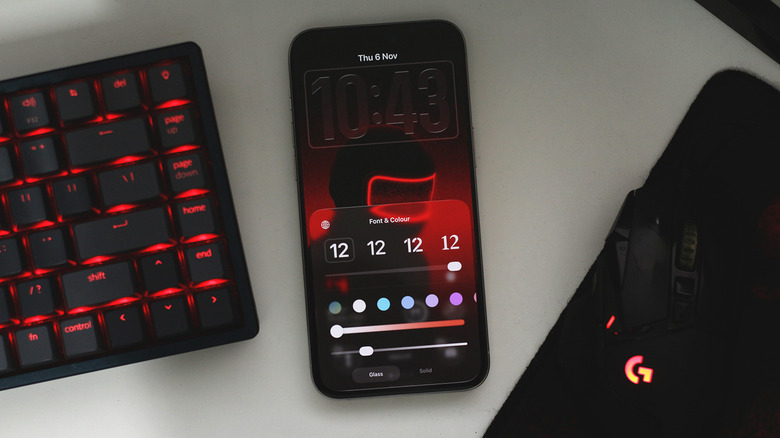
After constant adjustments, the fact that Apple shipped an option to change the Liquid Glass appearance feels like a step in the right direction — regardless of how poorly it has been executed in the current stable release. Offering a slider was not something I realistically would have expected a few releases ago — until I installed one of the newer developer beta builds on my iPhone and noticed an option that does exactly that.
With iOS 26.2, users can adjust the intensity of Liquid Glass for the lock screen clock using a slider — an option that we desperately need for system-wide UI elements as well. I'm quite hopeful about Apple giving in and letting users have full control over Liquid Glass, but only time will tell if we see such an update with iOS 26.