Why Most Video Game Controllers Use ABXY Buttons, But PlayStation Doesn't
From Xbox to Nintendo, gamepads tend to have a similar set of face buttons. A, B, X, and Y are the choice de rigueur. Early consoles like the Nintendo Entertainment System (NES) used A and B buttons, and when the Super NES added two more, the company chose X and Y. Although there's no official explanation for those choices, they make intuitive sense. In English, those letters are used in everyday speech as placeholders. We talk about getting from point A to B, or choosing X over Y. Other console makers like Microsoft followed suit. But the Sony PlayStation controller bucks the trend, stamping its face buttons with symbols instead of letters.
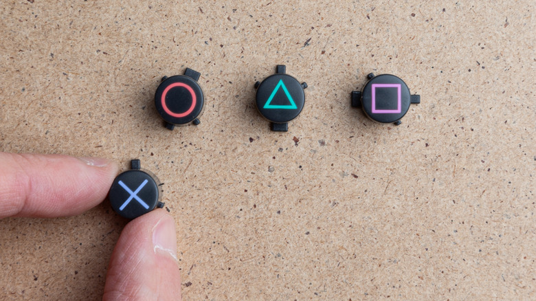
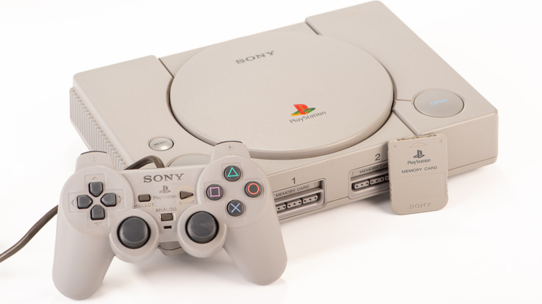
PlayStation controllers stand out from the rest thanks to their unique face buttons, eschewing letters in favor of symbols. X, circle, square, and triangle. Over 30 years after the first version of Sony's console debuted, gamers are well accustomed to this unique design language. It persists on PlayStation 5 controllers from the DualSense to the top-end DualSense Edge. Still, it's clear that the company must have had a reason to deviate from the norm. What's the story behind this iconic piece of gaming history?
The story of PlayStation's unique controller design was nearly lost. In 2010, original PlayStation designer Taiyo Goto gave an interview to Japanese magazine Famitsu, which was subsequently translated to English by the long-defunct games website 1Up. Today, the interview is accessible only through the Internet Archive's Wayback Machine. Its precarious preservation is a testament to the ephemerality of online media, as well as to the importance of organizations like the Internet Archive in preserving information and culture. So, here's how Goto conceived of the PlayStation's controller's unique face buttons.
The original PlayStation's designer wanted easy-to-remember buttons
Original PlayStation designer Taiyo Goto explained that he had been given a wide latitude when designing the PlayStation. When it came to the controller, he wanted buttons that were not only distinct from competing consoles but which were also easy to remember. "... we went with icons or symbols, and I came up with the triangle-circle-X-square combination immediately afterward," Goto explained. Today, those symbols persist on some of the best game controllers of all time.
Goto was purposeful in his choice of symbols. Each one represented a concept related to its function. "The triangle refers to viewpoint," he said. "I had it represent one's head or direction and made it green. Square refers to a piece of paper; I had it represent menus or documents and made it pink. The circle and X represent 'yes' or 'no' decision-making, and I made them red and blue, respectively. People thought those colors were mixed up, and I had to reinforce to management that that's what I wanted."
Goto believes he was able to keep his designs intact thanks to the backing of Norio Ohga, the company's president at the time. Management balked at the unique design, especially the now-ubiquitous handles Goto added for better ergonomics. They wanted a controller that copied the flattened Super Nintendo gamepad. However, Ohga was a pilot, and Goto's tactile design reminded him of a control stick, which he enjoyed. This allegedly led to a boardroom confrontation that nearly turned violent. Ohga got his way in the end, and Goto was given more leeway to focus on other elements of the controller's design, such as its symbolic face buttons.
Sony executives hated the PlayStation controller according to its designer
Taiya Goto recollects that although Sony president Norio Ohga loved his design for the PlayStation controller, the rest of the management team didn't want a gaming accessory that broke the mold. They insisted on a flat controller like that of the popular SNES. Goto complied, but Ohga hated the SNES lookalike model that was mocked up. The designer explained, "During that report, I showed off the flat controller design, explaining that this is how game consoles work right now, and Ohga was totally livid at me. 'This is no good! Change it! What was wrong with what you showed me earlier?'" But although Goto felt vindicated by the president's support, others in management remained unconvinced.
Things allegedly came to a head during a tense meeting with Goto, Ohga, and the rest of the management team, where they showed off the SNES-style model once again. In a heated moment, Goto recalls, "Ohga was about to throw the model right back at them. I was there and I didn't want him to break the model, so I stopped him, but looking back, I think that was Ohga's way of saying 'Hang in there, Goto,' to me. Management was still pretty peeved, but they felt like they had no choice but to follow him." Had things gone differently, the PlayStation would have lost one of its most iconic traits.
"Getting to use such simple symbols in a design is an extremely rare opportunity, and it was really a stroke of luck to me," Goto said. To this day, his designs are at the core of PlayStation's brand identity.


