WWDC 2025: 3 Things We Love About iOS 26's New Design
Following reports that iOS 19 may be skipped in favor of a more unified and consistent naming scheme, Apple's WWDC 25 event got us our first look at iOS 26. The jump in the version number is drastic, thanks to not just new features, but an entirely new design system.
Apple claims its previous big pivot in design language for the iPhone was with iOS 7 — released all the way back in 2013. The new iOS 26 update takes inspiration from what Apple calls "Liquid Glass" — and yes, we've made a complete 180 back to the Windows Vista aesthetic.
However, it's not just a visual overhaul that's new with iOS 26. The WWDC 25 keynote displayed several examples of how the new design aims to bring a more expressive experience when navigating around the UI, tapping on elements, and scrolling through different sections in an app. Based on our first sneak peek at iOS 26, here are three aspects of the new design that we are excited about the most.
The new Liquid Glass visuals
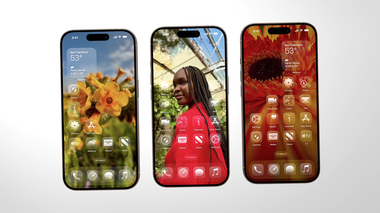
Although the event shed some light on a few compelling under the hood upgrades with key services and apps on iOS, it's fair to say that the highlight of this release is going to be the visual overhaul. Replacing the largely flat and minimalist UI, iOS 26 brings a sense of depth to most floating elements such as buttons, switches, sliders, cards, and widgets.
Most of the UI elements adopt a translucent look, which means their appearance is dependent on what's behind them — things like other elements in the background, or your wallpaper. It appears that some of the icons have multiple layers that add depth and varying levels of translucent gloss and shimmer.
Apple claims the Liquid Glass design system utilizes the powerful computational resources on iPhones and other devices to perform real-time rendering, which means no two home screens will ever look the same. The glassmorphic design also seems to play well with both the light and dark modes, with a special clear icon theme. All of the visual changes look refreshingly new, especially after years of iOS looking the same. However, we are a touch skeptical about the readability of text and elements, given the sheer amount of translucency going on with iOS 26.
Even greater lock screen personalization
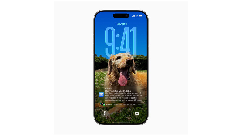
Lock screen customization isn't new to iOS — in fact, it's one of the best ways to customize your iPhone. The new iOS 26 update adds a few visual touches to the lock screen regardless. Besides the fact that all your notifications and quick access shortcuts now follow the Liquid Design schema, the clock's typeface itself can now stretch dynamically to interact with parts of your wallpaper — adding the depth effect we've seen in previous iterations of iOS.
Home screen elements including the dock, icons, and widgets have been designed in multiple layers, which yields interesting translucent effects. The tinted app icons addition was one of our most disliked iOS 18 features, and although it's still an option in iOS 26, hopefully the entire Liquid Glass aesthetic takes a few demerit points off of it. Regardless, you can simply stick with light, dark, or clear icons for a cleaner look.
Also, an addition to the lock screen is the ability to use dynamic wallpapers. Apple mentioned in the keynote that this feature uses on-device computation to turn any 2D photo in your gallery and adds three-dimensional depth to it, which reacts to your device's movement — very reminiscent of the old parallax effect. You can also preview this effect on any image within the Photos app.
Redesigns across major apps
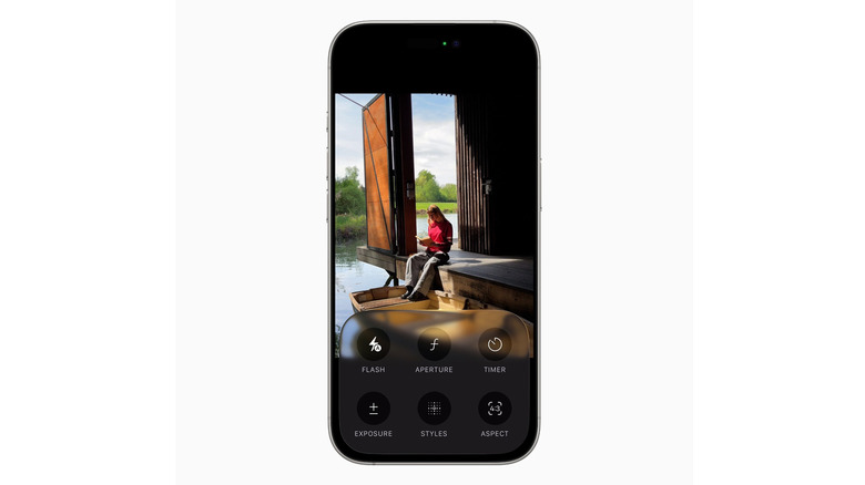
Only time will tell if and when third-party developers follow suit and start adapting their apps to the new Liquid Glass design language. Fortunately, a few of Apple's own core services have been refreshed with the new look. Most notable among those is the new Camera app — it looks much cleaner at first glance, but a few swipes reveal all capture settings tucked away neatly for quick access.
The redesigned iOS 18 Photos app was not received too well by users, so we're glad to see Apple bring back tabs that let you switch between the Library and Collections sections without having to scroll all the way down. Safari seems to have gotten a facelift with the new aesthetic as well, and all interactions now just feel a touch more bouncy and expressive. Most controls and elements that sit at the top or bottom of the screen have been rounded off to match the corner radius on the iPhone.
This is not all — for users who own other Apple products like a MacBook, Apple Watch, or Apple TV, this Liquid Glass design system carries over to all platforms. This will make the already tightly-knit Apple ecosystem feel even closer and streamlined.


