Incredibly Popular Apps That Have Terrible User Experiences
We may receive a commission on purchases made from links.
When Apple introduced the iPhone back in 2007, it revolutionized the market for mobile telephones. The novel way in which we interact with the phone opened up new possibilities of what can be done with a mobile device that continues to evolve today. With the iPhone came the first group of applications designed to run on the phone and give it flexible usability. Since then, millions of apps have come and gone. Some have made life easier while others have caused more headaches than anything, including infecting devices with viruses, malware, and keyloggers. Still, our connection to the digital world through apps is indelible.
With the proliferation of internet-connected mobile devices all over the planet, apps have become the best way for people to socialize, consume content, and connect with businesses. For this reason, it is especially important for companies with broad user bases that cross geographical and cultural boundaries to have an app that is easy to use, aesthetically pleasing, and functional.
Sometimes, though, even the largest of companies miss the mark and roll out an app that is frustrating or dysfunctional. This does not mean the entire app is a complete dud, but some parts of it should be better. I have scoured the internet to see what people have complaints about to assemble a collection of insanely popular apps that have a terrible user experience. After checking out the most common complaints and performing some hands-on trials, here they are.
Amazon Prime Video
Amazon's original programming includes some excellent shows, including Man In The High Castle, The Expanse, and The Grand Tour. I found the prime app on my mobile device to be fairly easy to use and navigate, but when I checked the app on a TV using Roku or an Xbox, the problems become apparent. Searching for a show should be more straightforward. If you search by title, it will show you every season separately instead of displaying a single link to the entire show with menus to navigate the seasons from there. The show you are looking for may also be mixed with other shows with similar wording, making the results confusing. Furthermore, navigating throughout a series is not as intuitive as it is with other apps. It can be done, but the interface is clunky.
Prime is a subscription service and comes with thousands of titles to choose from. However, not everything listed is available to watch without an additional charge. These paid titles will show up in searches and as you browse, but it is not obvious until you try to watch some of them that there is an extra charge.
These may seem to be minor things, but some of the issues with the app are not so easy to single out. Looking through comments on several subReddits, Quora, and Amazon customer reviews from its own website, I found similar complaints as these and more, with the consensus being the app is garbage overall.
Hulu

Hulu changed the way many people watch TV. It launched in 2007 as a joint venture between NBCUniversal and News Corp, per Flow Journal. The service brought mainstream TV streaming to connected devices on a large scale for the first time. Hulu is probably the biggest reason I canceled my cable TV service sometime around 2008, and I have never regretted the decision. The selection today from Hulu is fantastic, including plenty of the biggest network shows and some highly acclaimed original programming, such as The Handmaid's Tale.
The app was redesigned in 2017 and caused a lot of grief among users, but Hulu responded with another update in 2020 to resolve the issues. While navigating the app works well, I still have one huge complaint. When using the app on a mobile device, and you want to check or change something about your account, there is a tab at the bottom of the screen marked "profile," which then has a link marked "account." However, the link only brings up a bit of text directing the user to log in to the Hulu website to make account changes there, away from the app. This makes no sense. If the company can make an app that delivers thousands of titles streaming in brilliant 4K color, then it should be able to make the account accessible within the app. The fact that this isn't the case is egregious.
Netflix
Netflix may not have been the first streaming service, but it feels like it was. Starting as a mail-order video rental service with no late fees ever, Netflix later launched a streaming player to give subscribers the ultimate convenience in movie rentals. Netflix contributed heavily to the cord-cutting of cable TV. By 2019, as reported by Forbes, more customers paid for streaming services than cable or satellite in the U.S.
The Netflix app has gone through many changes since its launch. The most recent Netflix mobile app is pretty good, as are the apps for Roku and Xbox (the only ones I have personal experience with). But, searching for a show if you don't have a specific title in mind can leave you scrolling through endless titles to find something interesting, which is made more tedious if using a remote control with limited functions. The sheer amount of titles shown on-screen is also overwhelming and can create anxiety and negate the relaxation this pastime should provide. However, this is a minor annoyance compared to autoplay previews, which I believe primarily affect TV-connected devices. Hovering over a title card starts a video onscreen with audio and it is endlessly annoying.
Depending on what you have going on in the room, such as a conversation, the autoplay can graduate from annoying to downright aggravating. Perhaps these issues are worth it to be able to enjoy all this content without commercials, but, then again, changes are on the way.
Crackle
Sony's Crackle app is kind of like the forgotten middle child of streaming services. The free service mostly offers classic TV shows and movies supported by ads. It offers some old shows that will always be good entertainment, while many of them are probably not worth revisiting. Crackle also boasts of some original programming, the most successful being Jerry Seinfeld's "Comedian in Cars Getting Coffee," although it has since migrated over to Netflix.
Crappy shows are not the only thing keeping people from watching anything on Crackle. The user experience is not great. It suffers from the endless scrolling other apps do, but that's not all. Once you've picked a show, all seasons and episodes are one long line instead of being broken up by season. Crackle chose to use the text "watch now" instead of a play icon. The only video that plays in portrait view is the ads, which is confusing the first time. And the number of ads makes anything nearly unwatchable. Sure, they need to support the service, but too many interruptions may just cause viewers to go elsewhere. Crackle could be a lot better.
Blackboard

The Blackboard app and website are not going to be well known to anyone who has not attended college in the last decade or so. Modern colleges rely on web-based platforms to manage classes both on campus and off. Since the platform chosen is used for the entire institution, there are no alternatives for the students or teachers.
While it has been many years since I used it, recent reviews suggest not much has changed. One of the issues stems from the flexibility given to instructors to set up their classes. That is great for tech-savvy professors, but, for the teacher who longs for the days of typewriters and library books, their classes can be a bit of a disaster. Additionally, some choice comments from Quora have a professor complaining about wasting days just trying to fix problems in Blackboard that could have been used to grade papers, while another suggests the design is stuck in 1998. A student also wrote that discussion boards, which are often graded for participation, are difficult to navigate and the structure does not always make sense, something I experienced myself.
Most of my classes were anything but intuitive. The App Store's negative reviews are also abundant, showing an overall rating of 3.8 out of 5. One user's comment sums it up by stating it is, "useless to the point of being embarrassingly bad." College is hard enough not to have to contend with this.
Quora
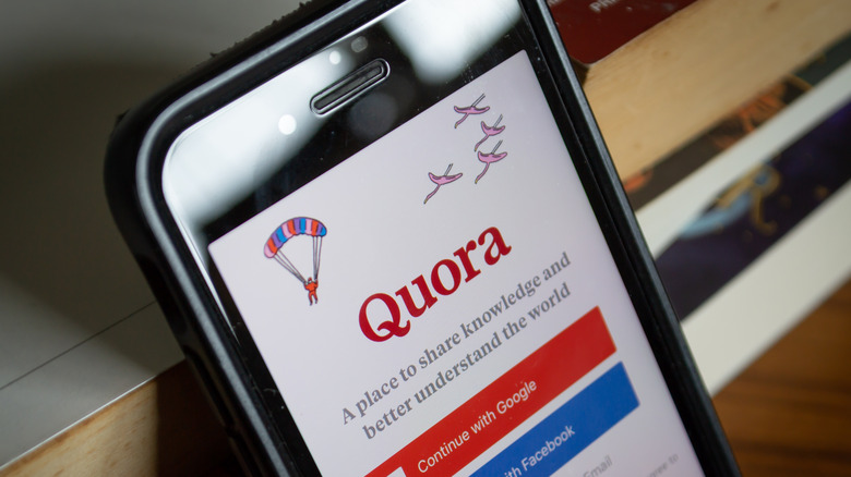
The initial launch of question and answer site Quora happened in 2010, according to Wired. It built on the popularity of information sites like Yahoo! Answers, which Quora finally killed off in 2021, and added a social media component. Quora is a place to ask questions and have them answered by users, with other users adding comments and discussions. It has grown significantly over the past 10 years, adding verified user profiles in 2014, the first one being President Obama.
Quora is a good place to find answers to questions but the way posts are presented can be confusing. Answers are ranked by an algorithm and it can often offer old information it deems to be more relevant than newer answers. The way they are listed can also lead to miles of discussion with too many "read more" prompts and sponsored content is dispersed throughout and not clearly delineated enough, such that ads look like responses.
A Bootcamp analysis suggests there could be a better sorting function and a more pronounced way to display the hierarchy of posts, such that they are not an endless list, for example. The information from Quora can be very good with enlightening discussions but it just needs a better way to sort through it all.
Zoom
The COVID-19 pandemic changed the world forever, especially the workplace. Overnight, the idea of remote work spread from those few who had certain niche jobs to wide sectors of the general public. This sudden shock to society also put one company front and center, becoming a household name instantly — Zoom. A few months into the pandemic, Zoom even added a feature to sell tickets to virtual events to help make up for the closure of public events.
For the most part, Zoom works well and performs its functions as promised. It just has a couple of things going against it. Joining meetings is not as straightforward as it could be. On a desktop, it requires clicking on a link provided that opens up a page with yet another link. Then the Zoom app can be opened, if installed, or you can continue within a browser window. If it works one way or another, why bother having both? Also, meetings can be password protected, but the host still has to authorize users to join the meeting. It could be one or the other.
In my experience, every time I join a meeting, the microphone is muted and it seems nearly every meetingsomething happens that throws off the flow. A few small tweaks could resolve all of these issues.
With a base of nearly 3 billion users according to Data Reportal, Facebook is unimaginably huge. It reaches all corners of the globe and connects people speaking hundreds of languages across nearly every country on Earth. From the early days of connecting students on college campuses, Facebook has gone through significant changes and through several updates to get is to where it is today. Facebook created a mobile site in 2006, with an iOS app released in 2009, per The Guardian. Since then, it has become one of the most-used apps on mobile devices.
While Facebook gets a lot of things right, any regular user can find some glaring flaws. Notifications seem to only alert you to some comments. If you try this same thing on the desktop, it only takes you back to the main post with no easy way of finding your previous comment. Searching your own photos is either an exercise in endless scrolling or simply not possible. Many posts offer a link to an outside website and tapping on it does nothing.
These have been my observations, but some have written entire articles criticizing the user experience. Search Engine Journal suggests that everything about Facebook is too busy and uses confusing icons. They also mention how many users hate the latest update. The other thing mentioned is that Facebook is trying to be too many things to too many people — and that is an easy conclusion to reach about it.
Weather Channel
The Weather Channel has been a fixture on cable TV for decades and started offering its forecasts online at Weather.com in 1996. It has also kept up with the times and offers an app for Android and iOS.
The primary culprit bringing down the Weather user experience is advertising. It is a free service, so relying on ads for revenue is understandable, and users are generally ok with that. It is the sheer amount of advertising that hurts the user interface. On the desktop home page, nearly half of the space is used for advertising, including several ads placed on the site as well as a large section of "sponsored content" that contains what appears to be nothing but clickbait. Using a relatively new and fast computer, it still takes a few seconds for the page to load completely. Some time ago when I had to rely on an older and outdated computer, I stopped using weather.com completely. After all, it would freeze my computer because it is just too busy and loaded with ads. Also included are too many autoplay videos, however, they thankfully do not autoplay audio.
Things are not much better on the app. The interface is ok, but being inundated with ads is kind of annoying, especially when there are alternatives that are much less cluttered.
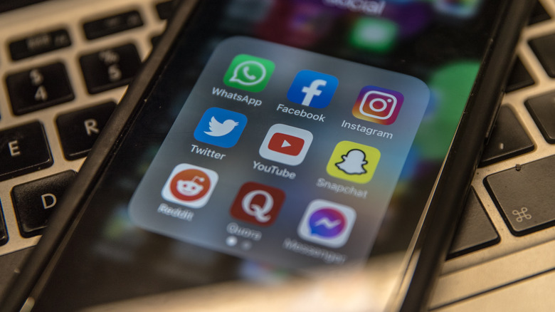
For easy and encrypted messaging, WhatsApp is a useful tool. It has a user base of 1.5 billion people, but most of them are located outside of the US (via Feedough). Of that number, a scant 50 million users are in the US, with the bulk located in Brazil and India. It also makes messaging for groups in different companies seamless. It makes sense, for example, to be used among a group of colleagues working together on different continents, streamlining all messaging on a single app not dependent on localized phone service.
The app is simple and plain, and users flock to it for its no-frills experience. Overall, users have few complaints about the app, save for one. Deleting messages has a couple of faults. Bootcamp author Sneha Gupta explains that, when messaging with a group and choosing to delete a sent message, WhatsApp shows options to delete for me, delete for everyone, or cancel. If you accidentally delete for me, the message is gone and the opportunity to delete from other users is gone. He suggests an "undo" function be added to prevent that. The other issue is that deleting an entire chat is lengthy and a bit too complicated.
UX designer Mirkka Pulkkinen also published the results of a project regarding WhatsApp in which she queried users about its UX. The biggest complaints were an overwhelming amount of notifications from groups, especially for irrelevant messages. Another main complaint was an inability to easily search for a message.
Snapchat

Most popular among younger users, Snapchat's presence is less pronounced in the social media space. However, with an estimated daily user base of 347 million, it is not a small presence. The draw to Snapchat is disappearing messages. According to the company, servers are designed to automatically delete messages once all recipients have seen a message and unopened messages will be deleted after 30 days. This function is attractive to young users who prefer to keep their messages private. The app has continued to build and update in its 10-year history, and one of the newer features is Snapchat Stories which allows users and businesses to create and share short-form videos.
The Snapchat app is innovative, but it could improve. Its desktop feature requires access to the app to log in. The Snapchat Stories tab makes it difficult to find favorite channels. It appears the only way to find them is to perform a search. There are no lists of favorites and it makes it hard to go back to see newly published stories. For full disclosure, I am much older than the average user and do not have much experience with it. Also for full disclosure, SlashGear publishes stories to Snapchat and I only downloaded the app initially to find them. Still, it looks like there is room for improvement, and hopefully some of its users will join the company with some fresh ideas.