Windows 10 Insider Preview 21327 Brings New Icons, Flat Look
The look and feel of Windows 10 is about to get more flat, simple, and beautiful, thanks to the latest update for Windows Insiders. Of interest, if you've never read into or about the Windows Insider system – this is slightly different from the Developer Preview programs that exist on other platforms, like Android or iOS. A lot of this action can be seen by developer accounts running the latest Windows 10 update, but some elements, like "news and interests" are available to Windows Insiders first, not everyone in the Dev Channel.
The new Microsoft Fluent Design style is slowly, but significantly, making the look and feel of Windows 10 more refined and sharp. This latest build includes a new look via the font Segoe Fluent Icons. The Segoe MDL2 assets included with this build are implemented in a few specific apps to start with – they'll roll out to more in the coming weeks and months.
If you take a peek at the Start menu and the Settings app in this latest build of Windows 10 insider preview, you'll find new icons aplenty. Per Microsoft, these new icon designs "have a more rounded and simplified look and feel."

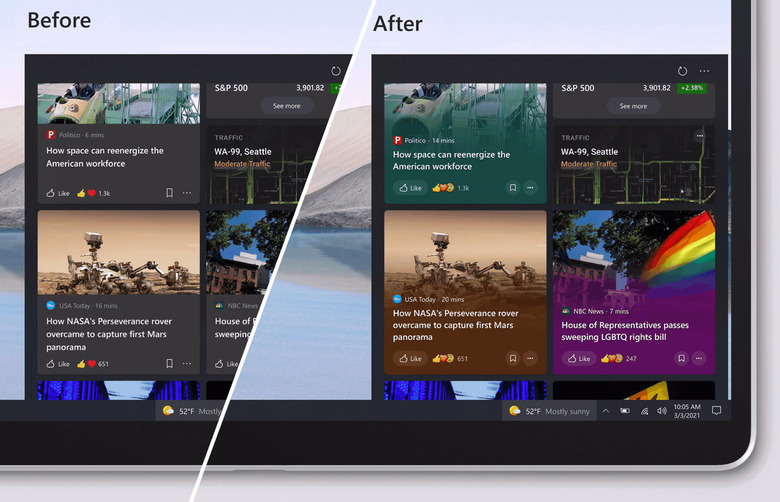
One other major realm for easy access to Microsoft's new look is in "news and interests." Imagery now "shines through with a vibrant and colorful design, making your feed more glanceable, engaging, and beautiful" Where before each story had a gray (or whatever accent you used) color behind each title, now you'll see a color selected based on the hero image for each story.
Take a peek at the latest build of Windows 10 right now through the Windows Insiders system in the Dev Channel and let us know what you think. This update with build 21327 should be available to you right this minute.
