Welcome To The SlashGear 2014 Redesign
SlashGear is changing. Overnight we hit the switch on our 2014 redesign, paving the way for CES 2014 and ushering in a site that's more usable, brings the breaking news you want to the fore, and makes it easier than ever to find the top stories of the day. With more focus on multimedia and interactivity, we're hoping you find it a more engaging place to get your tech and digital lifestyle fix, too. Read on to see how we've changed.
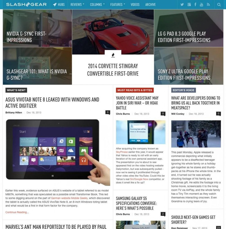
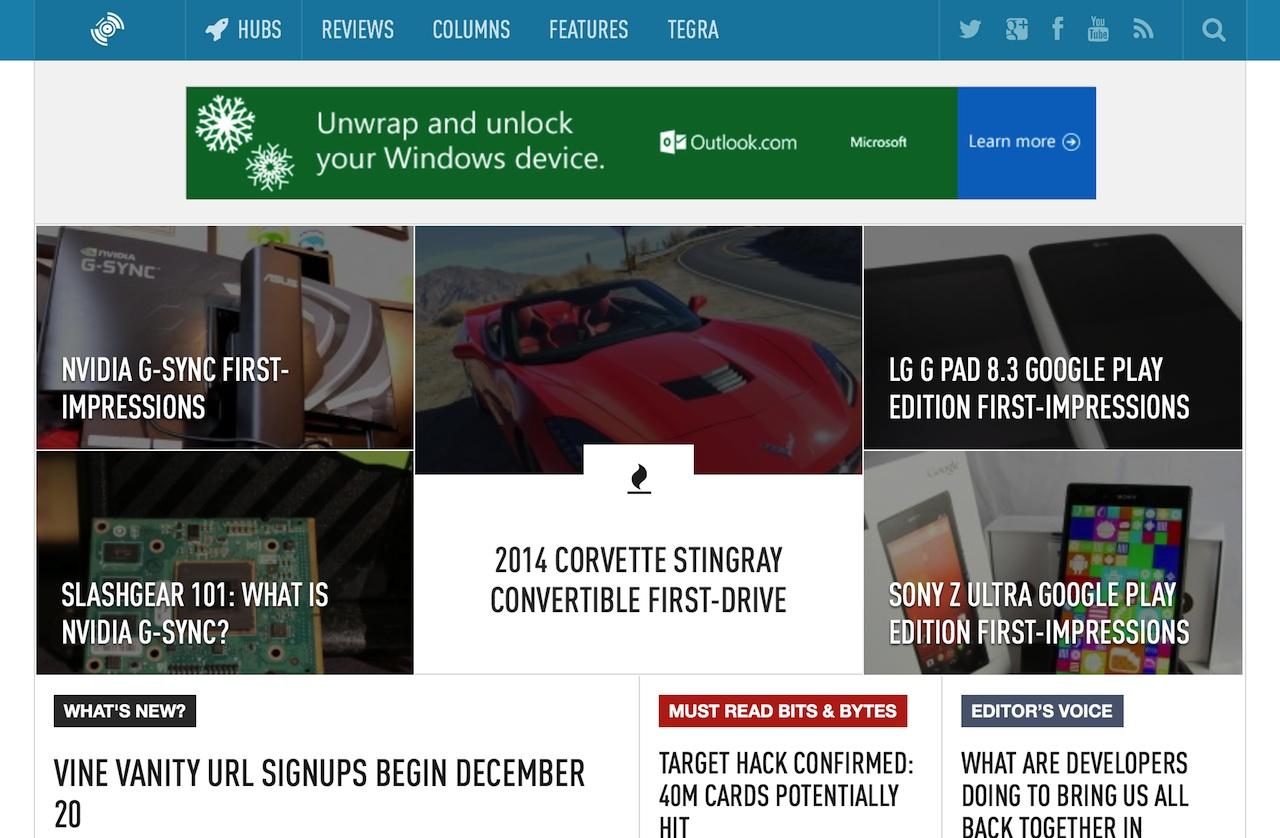
The biggest difference is to the homepage. You'll still find the latest news running down the left hand side, with the "Must Read" stories newly promoted next to them. However, we've also got more flexibility in how we organize the page as a whole, so that we can best deliver you all the stories, features, and reviews that matter: even during busy events.
As for articles themselves, they're easier to read and look better, while access to comments and related content is more straightforward. Higher-resolution displays are increasingly common, so the new site uses fonts more suited to a world with more pixels, as well as handling different screen shapes and sizes.

You told us you wanted more multimedia, so we've been investing in better photography and more engaging video, while galleries get a bigger focus in articles too. Wider images, more space for higher-resolution video, and slideshows that are easier to navigate.
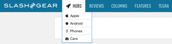
Meanwhile, we're also making our Hubs easier to find, helping you discover the content you're most interested in. You'll find quick access to some of our most-popular stores on Apple, Android, and smartphones in the drop-down Hubs menu at the top of the page.
Gaming and Cars – a section we're going full-speed ahead with (pardon the pun) into 2014 – also get key placement, as technology spreads beyond the more traditional segments. It'll also be easier to find our show coverage – like our CES hub – our reviews, and our columns in among the flow of news.

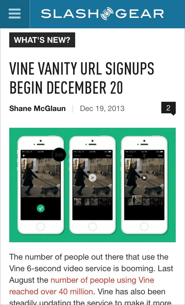
As for mobile use, we've still got dedicated apps for iPhone and iPad, Android, and Windows Phone, but we've also updated how SlashGear shows up in mobile browsers. You'll now see the latest content automatically shape to fit the device you're using, whether that's a smartphone, a phablet, or a tablet, with fuller, richer articles than on the old mobile site.
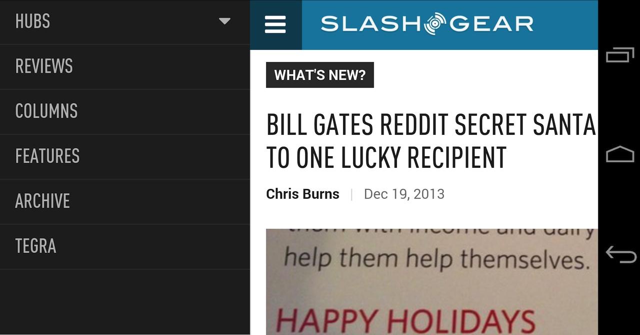


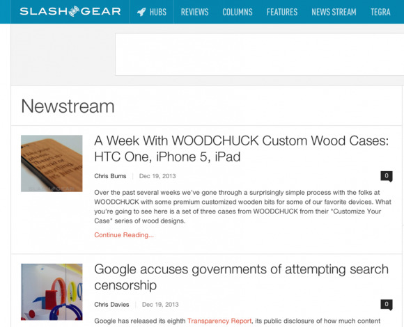
Update: You asked and we listened! Many of you wanted a way to quickly access the traditional stream of articles as per the older layout, and so there's now a News Stream button in the header which does just that. All the latest stories in chronological order.
Update 2: The feedback keeps coming in, and we're reading every comment. We've got a fresh batch of changes incoming over the next 24hrs, to try to address some of the issues people have had with the frontpage feeling cluttered or confusing. We hadn't realized so many people were so attached to the old design, but we've heard your concerns and will be trying to bring across the best of the old to mix with the best of the new.Update 3: More changes, and as promised we're streamlining things in order to make it clearer which content is newest. You should be seeing some more familiar navigation returning from the old site, as well as the "recent comments" box which quite a few people told us they particularly liked. Keep the feedback coming!
We're incredibly excited about the changes we've made, and there's still plenty more to come as we refine the site and add in more features. We'd love to hear your thoughts, what you like (and what you don't like!) and if you spot any bugs. Weigh in here, ping us on Twitter (@slashgear – follow us there for breaking news), and find us on Google+ (google.com/+SlashGear) and Facebook (facebook.com/SlashGear).