New Tinder Redesign Distracts You From Dating Hell
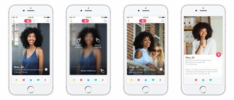
Those of you who use Tinder on the regular will notice that the app looks quite a bit different today. Tinder has delivered a new redesign that aims to make the process of looking through another user's profile even faster. Also on the docket are larger photos, putting them front and center when you're swiping through profiles.
When you're viewing a user's photos, three new tappable zones will let you navigate through the rest of the profile. Tap the right side of the image to see the next the photo, or tap on the left side to revisit the previous one. Tap on the bottom of the photo, on the other hand, and you'll be able to view their full profile.
This, of course, is where you'll be able to see their user bio, shared connections, and Anthem, among other things. These changes were made to give photos more screen space while keeping profiles somewhat easy to navigate. "It's all part of an ongoing effort to make our app as fun and attractive as the community it serves," Tinder said, in a questionable bit of praise for its users.
Jokes aside, the new app seems fairly clean, and that's exactly what Tinder was going for. Naturally, you'll still be able to swipe right or left on the screen to log your interest or disinterest, and since that's such a big part of the Tinder brand, we'll probably never see that go away. One has to wonder if these new tap controls will conflict with swipes, though.
In any case, this redesign should be going live on the iOS and Android versions of Tinder shortly. The Android version was actually updated today, but there's nothing in the "what's new" section on Google Play to suggest that the redesign has gone live. While we wait for this redesign to officially land, tell us: what do you think of the new look?