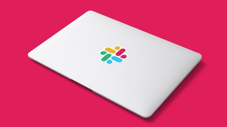
New Slack Logo Gets A Pentagram Design Reboot
A new Slack Logo appeared this week, courtesy of a design language made to take on the future. The new logo is simpler, the new logo is more flat, the new logo is far more versatile. According to Slack PR, "A good reason to change a logo is that it's not doing the job you want it to do—and because a simpler, more distinctive evolution of it could do that job better."
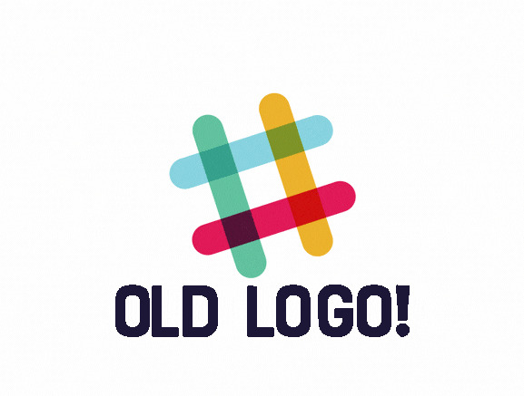
The original logo was created "before the company launched," said a Slack representative. "It was distinctive, and playful, and the octothorpe (or pound sign, or hash, or whatever name by which you know it) resembled the same character that you see in front of channels in our product." It was also very, very easy to mess with.

People using the Slack Logo would very easily place said logo on colors that'd throw the eye askew. With 11 different colors, it was thrown in all sorts of different directions – blue made part of the logo disappear. Red made part of the logo disappear. Gold, yellow, green, pink, and blue all made part of the logo disappear. The logo was meant to be displayed at 18-degrees rotated off its flat axis – and that was messed up REAL often.
So the folks at Slack went to the monster boss of all graphic design masters, Michael Bierut and his team at Pentagram. They worked with the in-house design and brand team at Slack, and they made something far more magical.
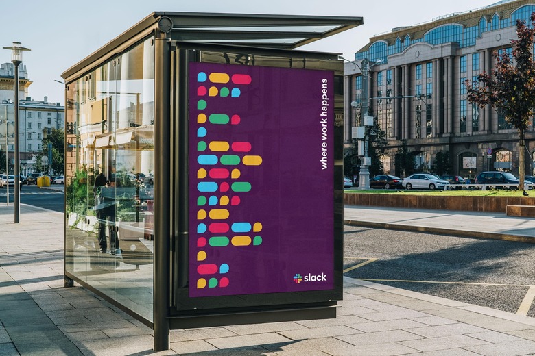
"It uses a simpler color palette and, we believe, is more refined, but still contains the spirit of the original," said Slack PR. "It's an evolution, and one that can scale easily, and work better, in many more places." This is the new octothorpe.
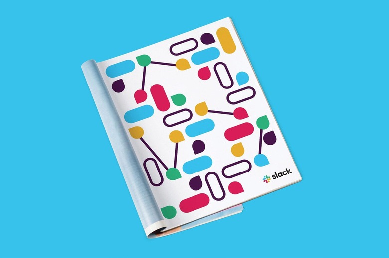
According to Pentagram, Slack will roll out the new logo and the new design direction "will roll out across Slack and its brand expressions, including the website, in advertising and in some places in the software itself."
