iPhone X : How Do I Deal With The Notch?
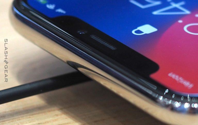
The iPhone X's notch sparked a conversation this week between designers, users, naysayers, and notch-lovers alike. What we've done here is explore some of the first reactions to the notch's now-official presence on the iPhone X. We've also taken a brief look at what Apple has announced as Human Interface Guidelines for the iPhone X – and the notch specifically.
The first reaction to the notch we're looking at today is from designer Mike Rundle. He (and others) have suggested that because Apple's opted for the OLED display (with blacks that are extremely black), the following design should work fine. As you'll find in Apple's Human Interface Guidelines in the bottom half of this article, Apple is not onboard with this design – not even a little bit.

Above you'll see Apple's mention of the area notched into the display. This clipping comes from Apple online, where the company has not only opted to speak about the unique design, they've made an effort to draw attention to it. Apple's aim here seems to be emphasizing the space as the most unique element in the device, filled with some of the most powerful technology Apple's ever put in an iPhone.
I think this is the best way to deal with the notch and massive corner radii. On an OLED screen these regions will completely blend in 👌 pic.twitter.com/yUgi0PmXe1
— Mike Rundle (@flyosity) September 14, 2017
William Van Hecke decided to take a chomp out of Apple's logo with the notch. Because a chomp is a notch, and a notch looks almost like someone took a bite out of whatever it's inside of.
sorry pic.twitter.com/aeE5nI99dw
— William Van Hecke (@fet_complains) September 13, 2017
Below, a very similar take on the notch in the Apple concept. This one comes from our own pal Nate Swanner.
— nateSwanner (@NateSwanner) September 14, 2017
Steve T-S shows how the software design in the iPhone X may make vertical space smaller when in landscape mode. The Home Indicator pushes up the rest of the content just a bit – while the left and right get wider, of course.
Tradeoff: in landscape mode, you get less vertical screen space on the iPhone X than on previous iPhones because of the home indicator pic.twitter.com/XLNsT4lm4v
— Steve T-S (@stroughtonsmith) September 13, 2017
Software engineer Vojta Stavik believes he's found the solution for the "notch issue" as he sees it. Congratulations, it's perfect! For this one list, that is.
I think I've fixed the notch issue in landscape 🍾 #iphoneX pic.twitter.com/hGytyO3DRV
— Vojta Stavik (@vojtastavik) September 13, 2017
App developer Alex Devarty's first solution suggests that the notch is best for portrait mode. Devarty's solution hides the notch only when the phone is in landscape mode.
Landscape Notch – Show/Hide? pic.twitter.com/09VfVCMP3w
— Alex Devarty (@devarty) September 14, 2017
Mihir Joshi has a pretty interesting idea – albeit right up against Apple's Human Interface Guidelines as set forth below. Buttons in the space are not OK – unless Apple's rules are bent a little.
Quick mockup of using the iPhone X "ears" as buttons in say iBooks for example. cc @stroughtonsmith pic.twitter.com/ckWX93VT3d
— Mihir Joshi (@riffola) September 14, 2017
Analyst Niel Cybart has perhaps the most astute observation of all. With the new notch in place, Apple no longer uses the home button as the main branding differentiator for iPhone. Instead, it is all about that notch.
Good way to see how the notch replaces the home button as iPhone branding. pic.twitter.com/JNEtXq3Mcd
— Neil Cybart (@neilcybart) September 14, 2017
While some smartphones already have a notch of sorts, no company has the exact same notch as the iPhone X. Apple's likely applied for all the patents in the world surrounding this new design.
Apple says: Don't touch that notch!
According to the Human Interface Guidelines set forth by Apple this week on the iPhone X, the notch is not to be touched. A designer should not touch the notch, nor should they ignore the notch. Think of the notch like a benevolent god full of powerful technology bits, but do not praise the god in a way that brings attention to the god.

In Apple's own words: "Don't mask or call special attention to key display features." The full paragraph comes from Apple's page on Human Interface Guidelines for the iPhone X as of September 14th, 2017.

There's also a bit of a suggestion on that same Apple developers page which suggests that most app-makers reconsider the way they've designed their apps. "If your app currently hides the status bar, reconsider that decision on iPhone X," said the document.
"The display height on iPhone provides more vertical space for content than the displays of 4.7" iPhones, and the status bar occupies an area of the screen your app probably won't fully utilize. The status bar also displays information people find useful. It should only be hidden in exchange for added value."

Above you'll see a comparison between the 4.7-inch display of the iPhone 6, 7, and 8 compared to the iPhone X. These images are from Apple (save the red ghost of the rectangle, which I added to further visualize the difference). Notice how Apple's comparison does not reach all the way to the bottom of the display shape on the right.
Apple notes that the iPhone X has the same width as the 4.7-inch display of the iPhone 6, 7, and 8, but also has 145pt more display height-wise. Apple suggests that this ads "roughly 20% additional vertical space for content."

Future Considerations
We've seen the notch this week already – and we're going to see the notch again soon. Have a peek at our iPhone X hands-on to see more of the notch up close and personal. And stay tuned as we get an extended look at the notch (and the rest of the iPhone X) in our upcoming iPhone X review!