iCloud Beta Update Brings iOS 7 Design To The Public
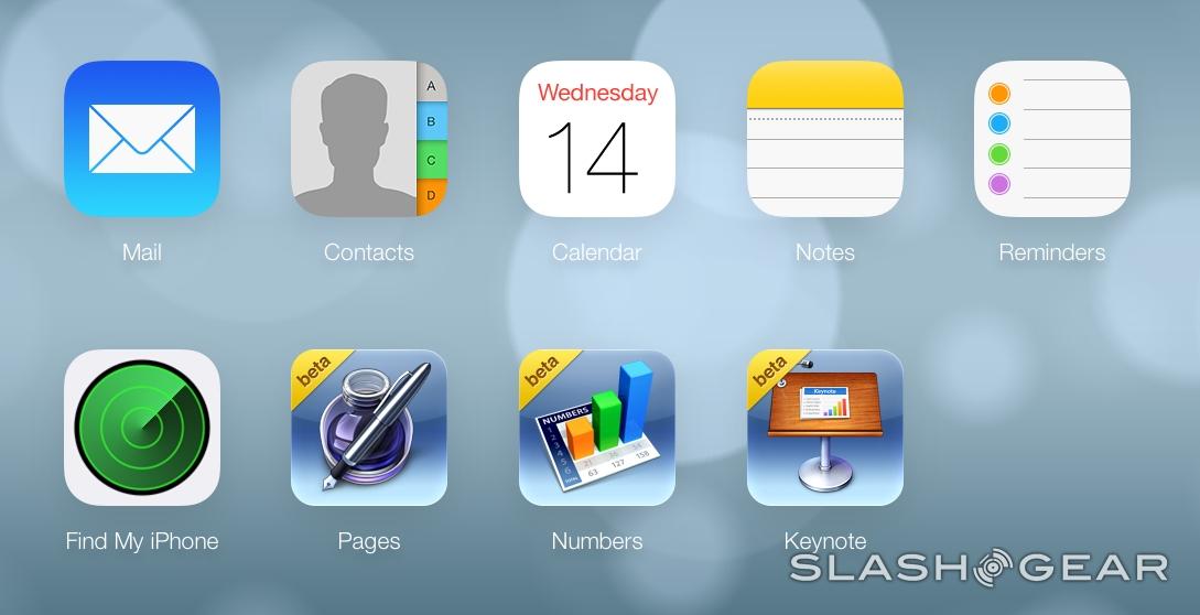
The public beta iteration of iCloud for iOS device of all sorts has been given a reboot today, bringing with it a full user interface redesign to match iOS 7. This is the first time the public – most of the public, that is – will get a hands-on experience with the look and feel of iOS 7, not to mention the relatively sizable move in UI elements to a more flat-faced layout.
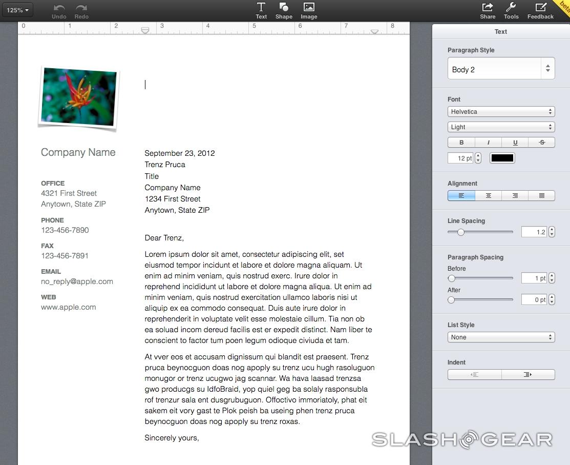
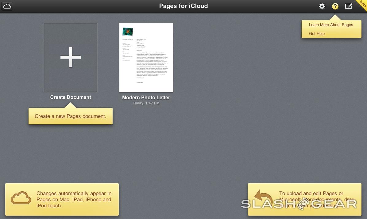
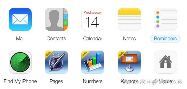
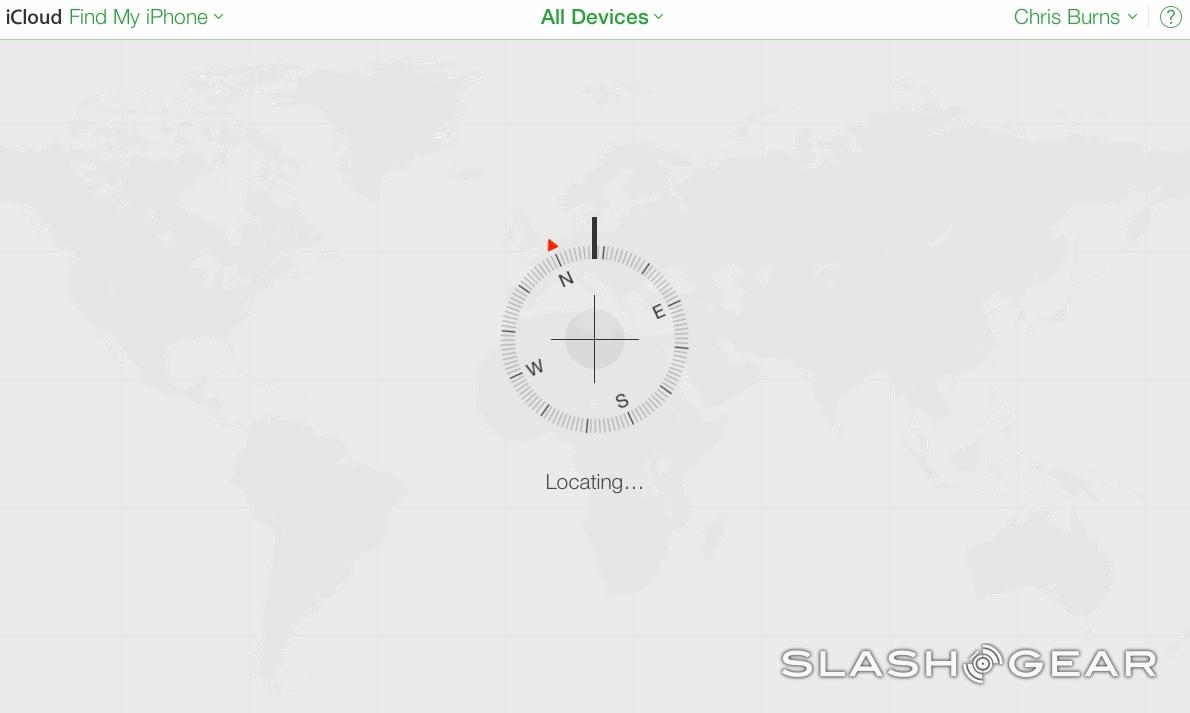
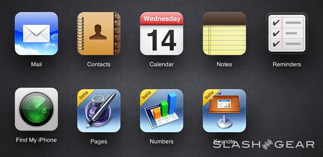
This change-over affects each of the 6 primary iCloud-friendly apps: Mail, Contacts, Calendar, Notes, Reminders, and Find my iPhone. At the moment it would appear that the beta versions of Pages, Numbers, and Keynote remain their former selves, the same as they appear in the non-beta edition of iCloud as such.

Above: non-Beta iCloud Below: Beta iCloud

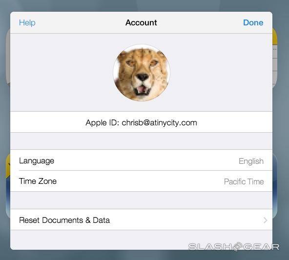
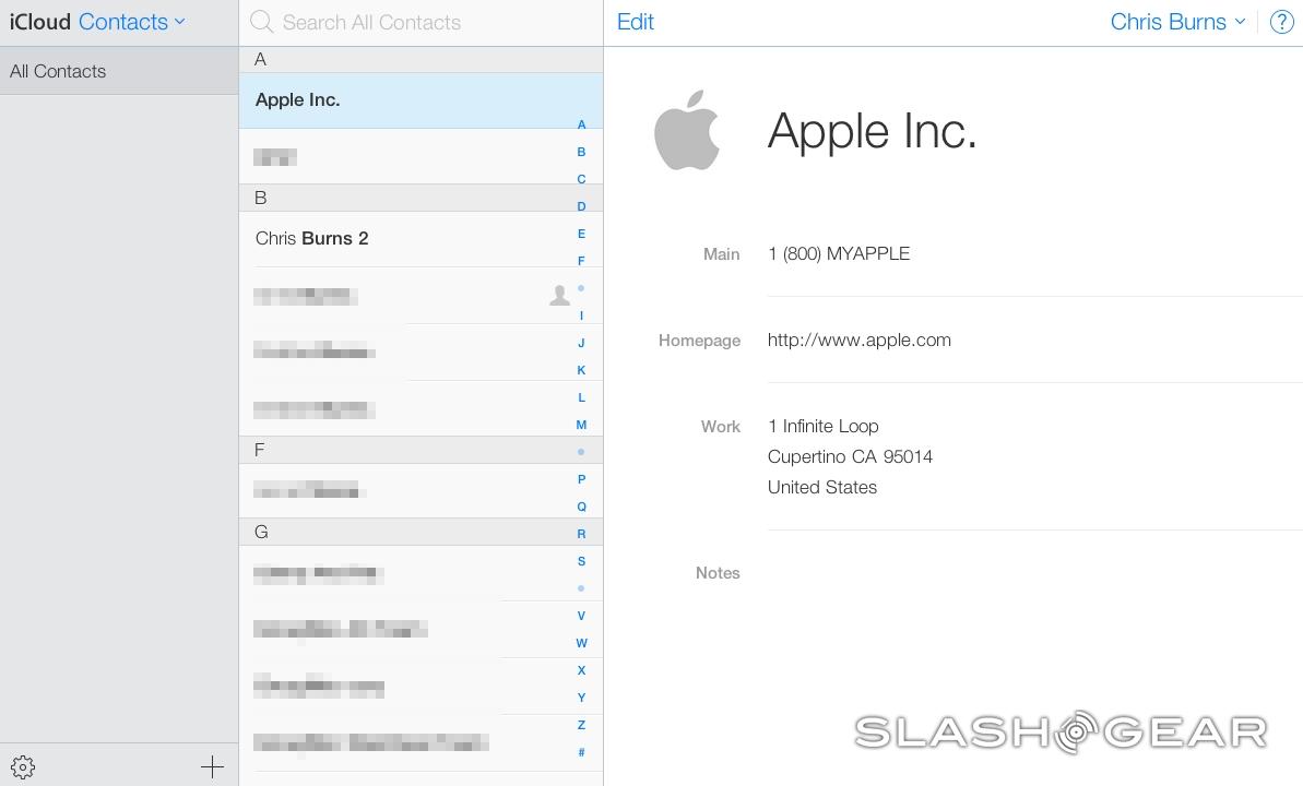
Adding a new contact to your list of contacts includes First and Last name, Company, Phone, Email, Homepage, Address, and Notes, as well as a circular space for a headshot. In order words, it's the same – but it looks a whole lot different. Viewing contacts also works with a circular contact image and has a layout rather similar to the entry page.
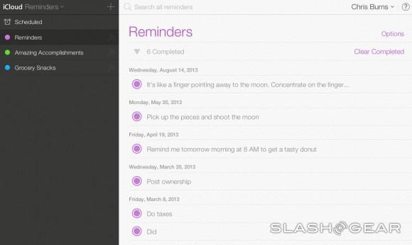
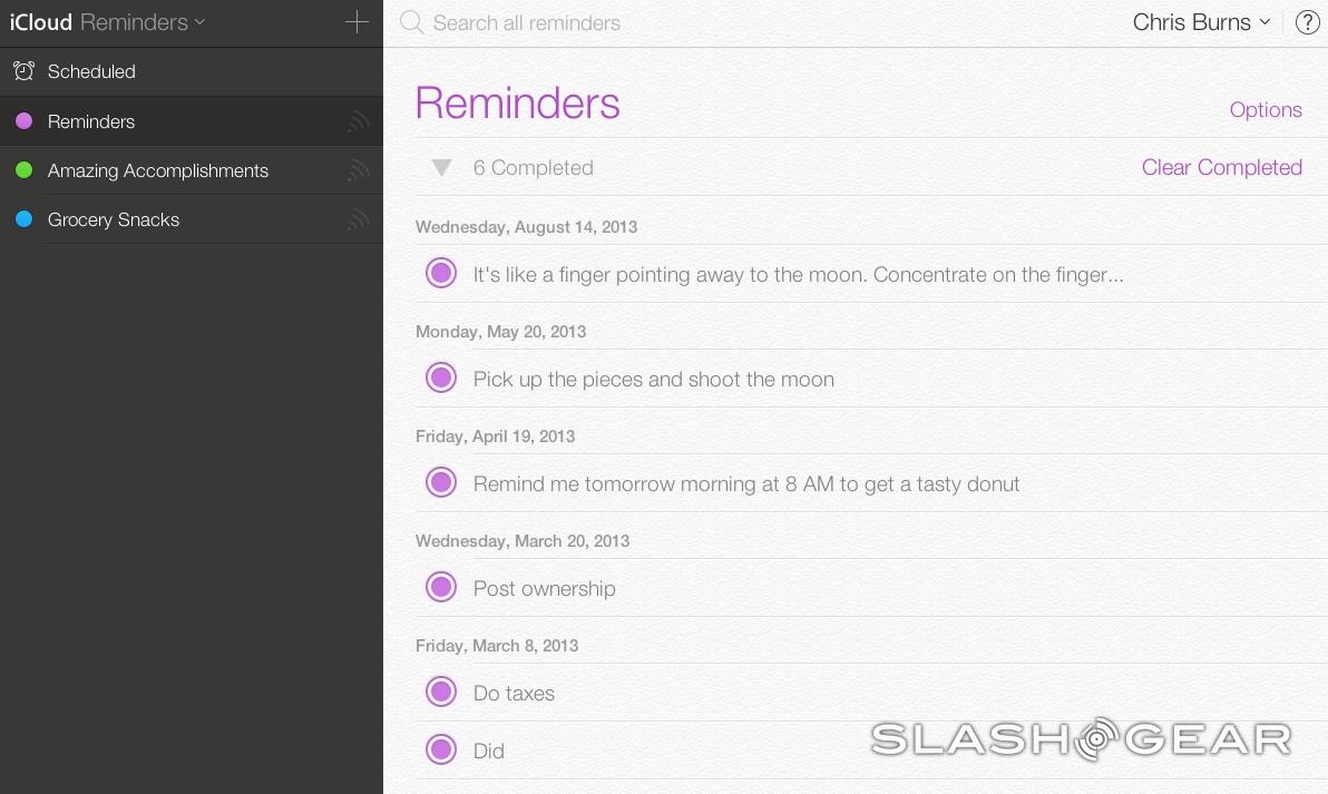
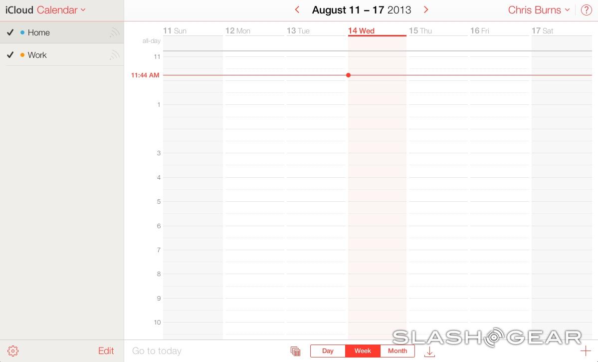
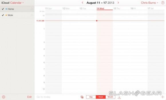
Reminders works in a smoothed-out list format with the same bright color pallet included in iOS 7. Calendar is significantly simplified with – again – the same color pallet, doused with red at first and separated by flat blocks of color and typography for ease on the eyes.
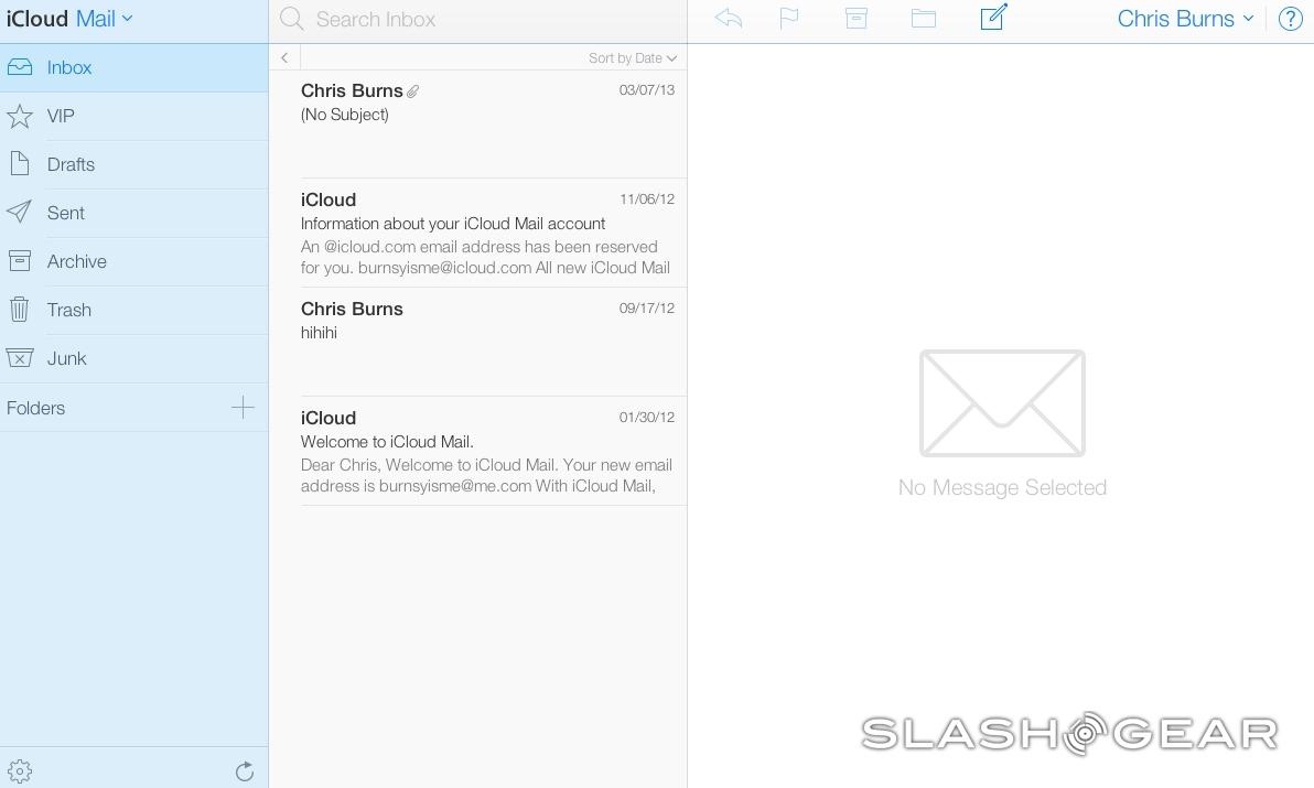
The same is essentially true of iCloud mail, appearing here quite similar to past iterations of the app, coming up with a slightly more subdued color collection than every before.
Have a look for yourself at beta.icloud.com – it's not necessarily turned on for everyone at this very moment, but chances are it will be soon. Stick around as we continue to dive in and have a peek through the gallery as more screenshots are added throughout the day. Be sure to let us know if you find anything particularly odd or interesting, too!

