Google's New Logo On Android And Everywhere: Identity Evolved
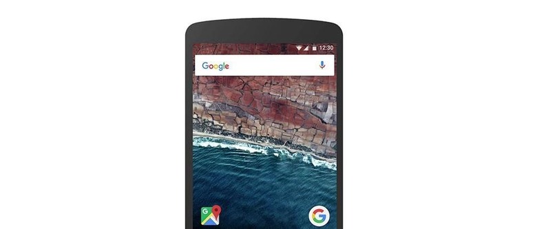
This morning Google revealed their new logo and design language evolution, complete with Android implementation. We're having a look with what Google describes as "designers from all across the company, including Creative Lab and the Material Design team" at what it took to design this logo and this new look. We'll see first how the new look will appear in a web browser on your desktop or notebook computer. We'll also see how it'll appear on Android – colors, animations, and everything in-between.
Google designers Alex Cook, Jonathan Jarvis, and Jonathan Lee spoke up today in the Google Design blog on what it took to create a new brand identity for the company. "Google is not a conventional company," they said, "our mission – to take the world's information and make it universally accessible and useful – continues to evolve."

Many considerations were taken in creating this new identity. One of the most interesting to us and, perhaps, most universally transferrable to the everyday user was the challenge of making the logo accomplish being the following:
"A refinement of what makes us Googley, combining the best of the brand our users know and love with thoughtful consideration for how their needs are changing."
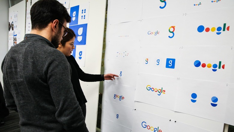
Above you'll see some of Google's many identity considerations. Notice how abstract the logos and marks became before they returned back to a super-simple, flat, colorful design.
Below you'll see the three main elements that make this new identity work. You'll see these bits appearing throughout Google's product line, online and off, through the foreseeable future.
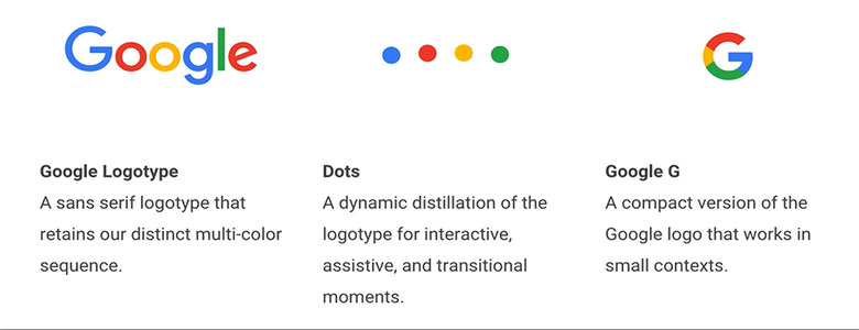
The video you see here distills the many ways in which the brand identity is personified. Everything from the Google "G" mark to the Google Dots in Motion.
You'll see how SVG files were used for base assets to make graphics that are prepared for low bandwidth users – while before you'd have seen a completely different Google logo, now it's all unified.
The old logo, says Google, was around 14,000 bytes in size at one of its smallest iterations, while the new logo (at that same size) is just 305 bytes.
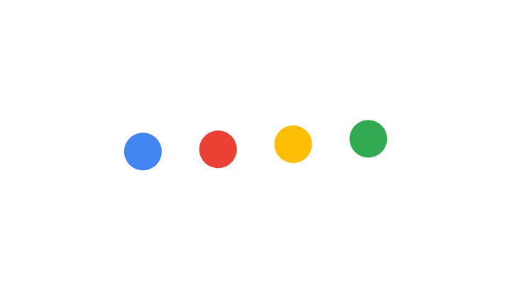
We'll see this identity take hold on Android devices, Android TV, Google search, and in Google apps throughout the mobile and non-mobile universe over the next week and well on into the future.
Let us know if you see the new G pop up!
