Facebook Redesign Released: How To Use It And What To Expect
Today Facebook launched "the new Facebook.com" in full, and it's a bit cramped. This new version of Facebook will have all the same content as before, but it'll look just a bit different than you remember. On the web, that is. The app versions of Facebook are not changing this week. The newest iteration of Facebook will appear for you in a web browser, more than likely when you're visiting Facebook on your desktop or laptop device.
Per the official Facebook announcement on the subject, the past 16 years of Facebook's operation have included quite a few updates. The most recent mass of these were focused on the social network's mobile app ecosystem. With this newest update, Facebook is saying that they "realized our desktop site had fallen behind" and that "people need it to keep up."
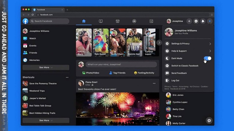
This new version of Facebook has a Dark Mode, right out the gate. When you activate the New Facebook.com, you'll immediately be asked if you want to roll with Light Mode or Dark Mode. This new version of the site places greater focus on "Facebook Watch" for videos of all sorts. It also focuses on Groups, Pages, and Events.
If you choose to activate the New Facebook.com, all you'll need to do is go to Facebook.com, and hit the GO button. You'll see a notification that You are Invited to the New Facebook. Or, if you're reading this article in the distant future, you'll just get the newest version of Facebook by default.
It's cramped
Much like the Facebook app, the new Facebook.com throws negative space out the window. You'll see a little bit of space to the right of your Facebook sections linked on the left, and maybe a bit on the right of your contacts list, otherwise you're JAMMED in there.
It's like this version of Facebook was designed by a committee, rather than a designer of modern websites. Cross your fingers they allow a little more breathing room in the near future, or there may well be chaos incoming. Watch out for the hashtags this afternoon!