Budget Tool Concept Maps Energy Use With Physical Bar Chart
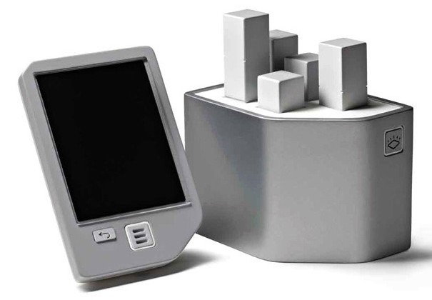
Smart energy meters are great for helping people conceptualise their use of energy in real-time, rather than being faced with a nebulous bill every quarter, but what if rows of numbers leave you equally non-plussed? Swedish designer Hampus Edström has come up with an alternative: his simply titled Budget Tool consists of a wireless PDA-style controller that links up with a physical 3D bar chart.
That chart, then, can show five different factors in a far more tangible way than a column of numbers on-screen. It could be as simple as income versus outgoings – with the two bars getting worryingly close as your frivolous lifestyle exceeds your meager wage – or energy use at different times of the day.
It would take some investment from energy providers, naturally, but given that we're constantly being told to turn down thermostats, be more frugal and generally live more mindfully of the environment, perhaps they'll see fit to give us the geekily interesting tools that should help that happen.
