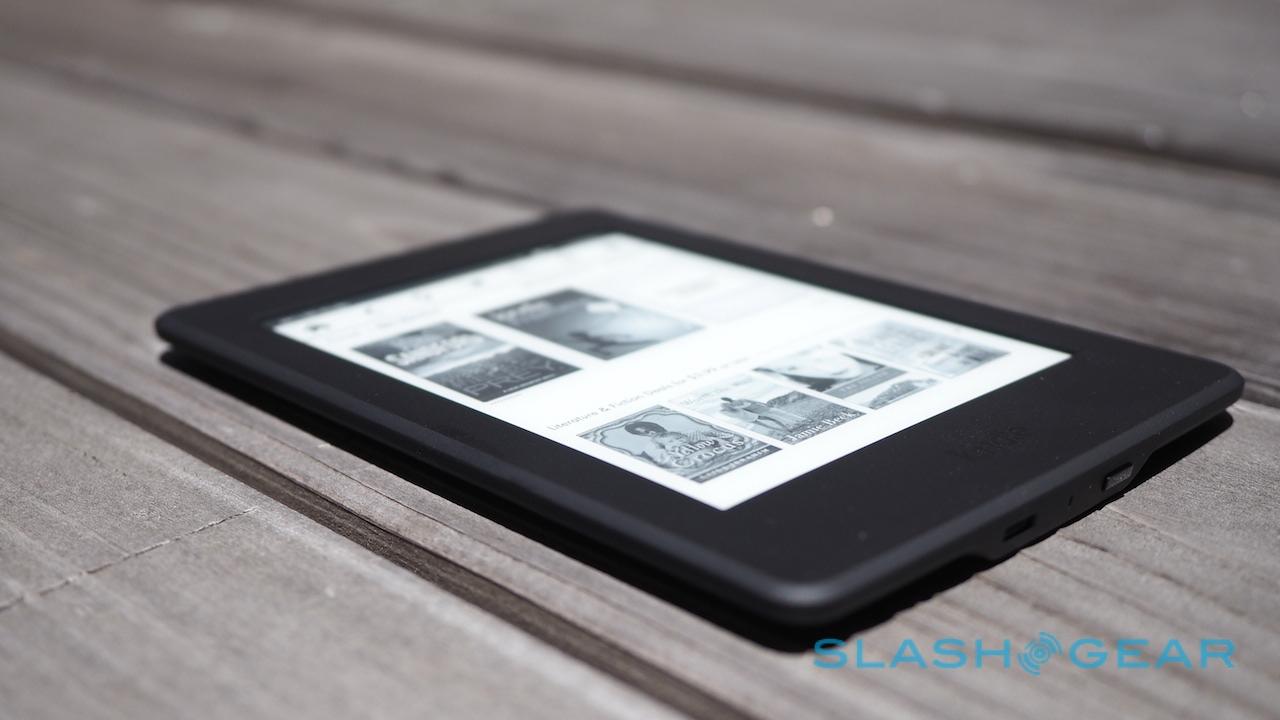
Amazon's 300dpi Kindle Paperwhite Is Testing My Ereader Loyalties
It can be tough being the middle child, but Amazon's Kindle Paperwhite is having its moment in the sun by copying the best parts of its more expensive sibling. Revamped today, the new Paperwhite gets a 300dpi e-paper display like the Kindle Voyage we reviewed last October, as well as Amazon's new typesetting engine and the company's specially-created font, Bookerly. While the refreshed Kindle Paperwhite isn't expected to ship until the end of June, but I've been playing with one in advance.
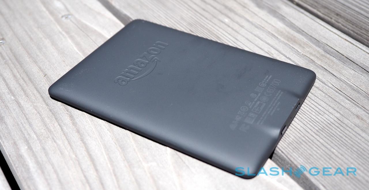
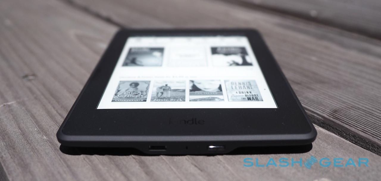
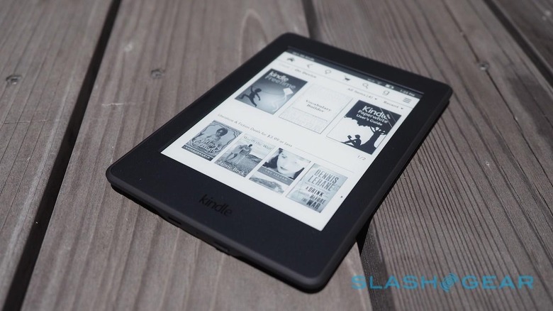
Outwardly, there's not much to differentiate it from its Paperwhite predecessor. On the back, the embossed Amazon logo is now matte-finish rather than glossy, but otherwise the whole thing is a relatively unadorned black block with a recessed 6-inch display on the front.

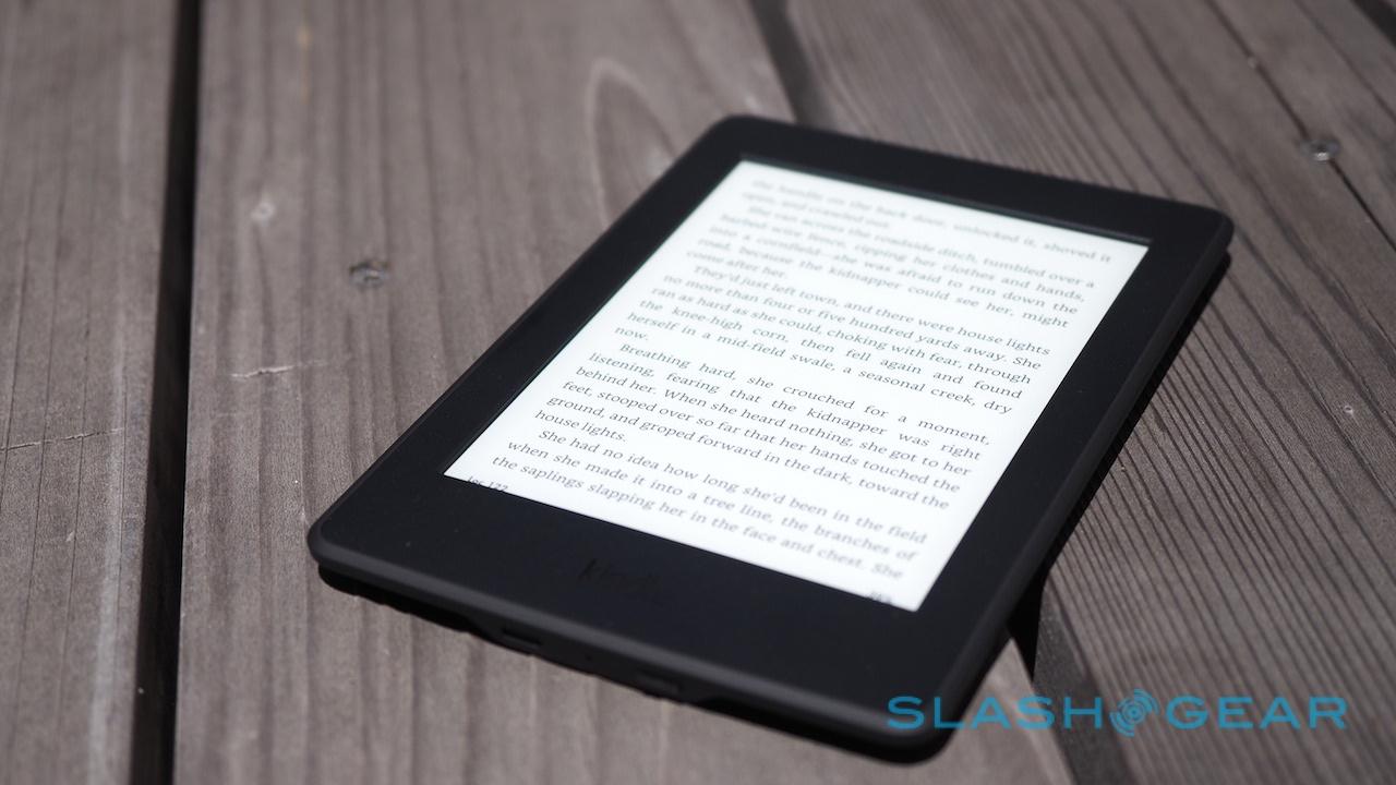
It's that display which makes the new Kindle Paperwhite special. Twice the resolution of before, meaning less pixelation around text, though unlike the Voyage it doesn't step up its contrast game.
The more expensive Voyage will crank up brighter, too, though the Paperwhite's edge-lighting system seems good enough for my eyes.
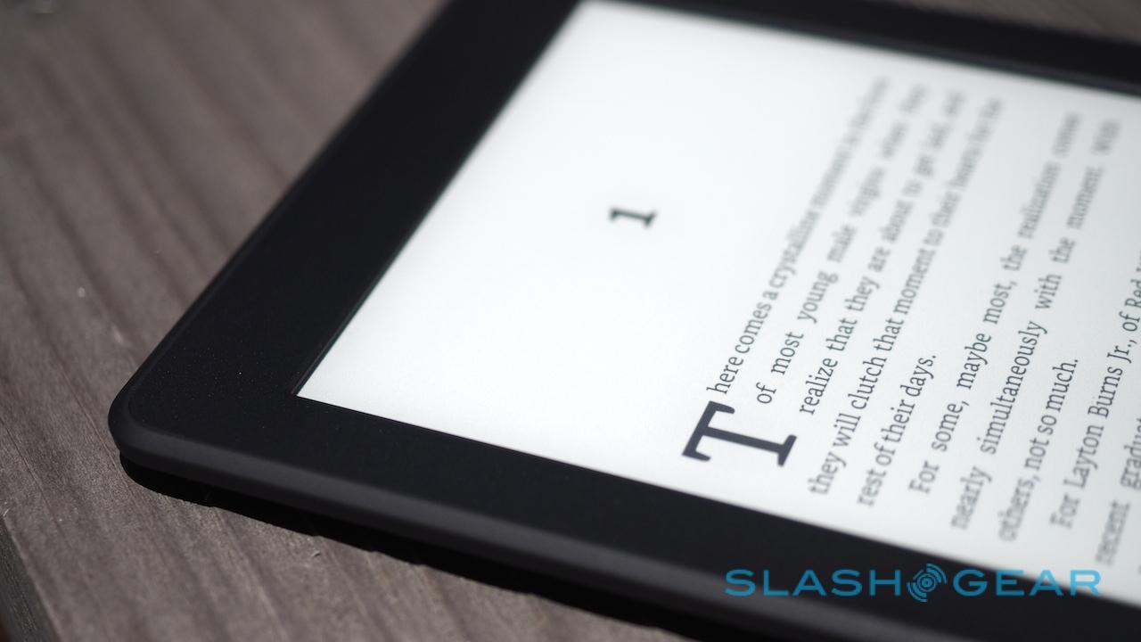
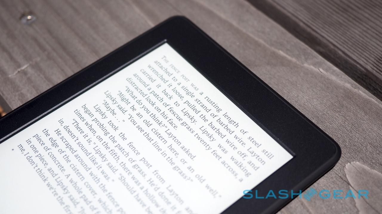
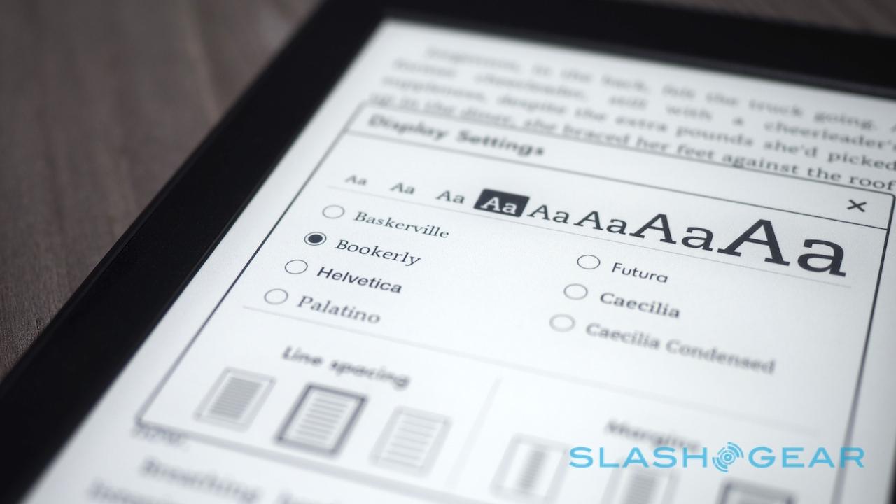
What I'm really interested in, though, isn't so much the hardware as the software. Amazon delivers the Kindle Paperwhite with Bookerly set as the default font, unsurprising since it created it itself to look better on e-paper screens.

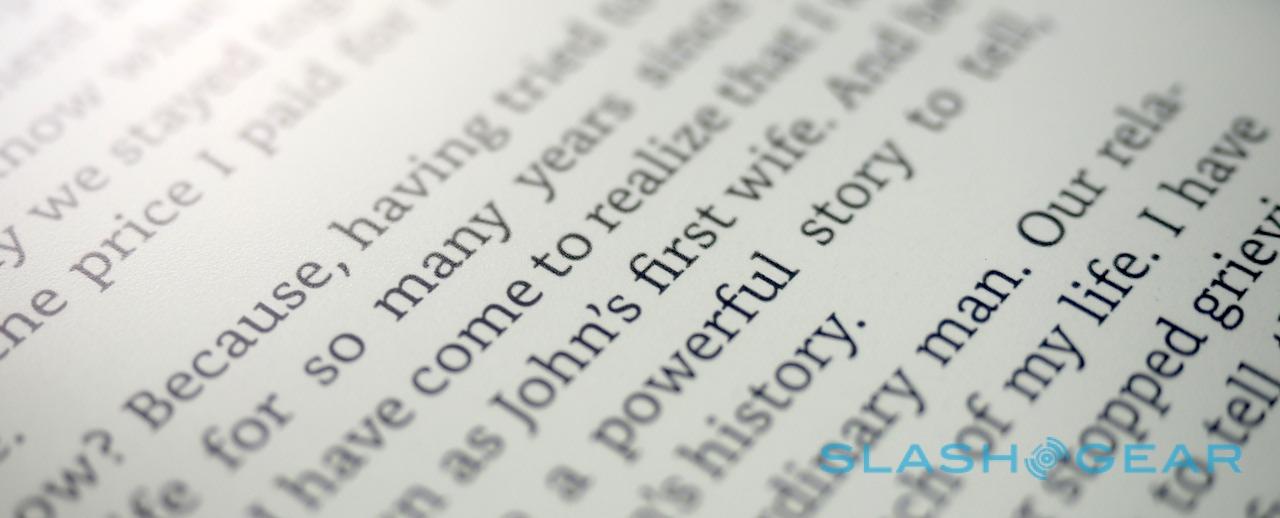
Bookerly isn't just about different shapes to the letters: the very way they co-exist on the digital page has changed thanks to the Paperwhite's brand new typesetting engine.
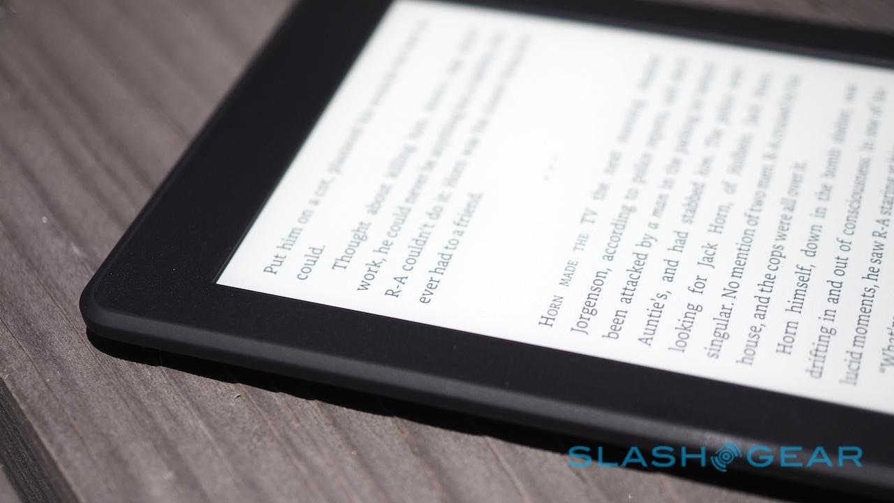
That brings with it better word and character spacing, though that's really just the start of it. Keen readers will probably be more excited by the improved hyphenation and justification, which looks less ramshackle around the edges at all but the largest font sizes, while ligatures and kerning have been refined, too.

If you're not a type geek, kerning is the space between characters. In effect, it allows the Kindle to slightly condense the space between each letter: the looped tail of a "y", for instance, can tuck neatly underneath the character preceding it, bringing them both closer together and thus being easier on the eyes.
Ligatures, meanwhile, are combined letter pairs. In the example below, for instance, the "f" and "i" of "first" are joined, ditching the dot in the process, and relying on your brain's learned ability to comprehend such pairs more readily.

It's still early days for my time with the new Kindle Paperwhite, but already I'm questioning my loyalty to the Kindle Voyage. At $199, the Voyage does have touch-sensitive page turn buttons built into its bezels, not to mention automatic screen-lighting adjustment, but you're paying an $80 premium for them.
In contrast, the updated Paperwhite (which is $119 in WiFi form with Amazon "Special Offers" subsidization, or $20 more if you want to ditch the lockscreen ads) gets much of the best of the Voyage but at a price which seems more befitting for a reading-dedicated gadget.

I'll be putting it through its paces over the next few weeks to see if the good first-impressions stick around, in advance of a full review.
Meanwhile, the Kindle Paperwhite is available to preorder now. Amazon says shipping will begin from June 30th.