The Story And Evolution Of The Iconic Firefox Logo
Mozilla Firefox, the beloved open-source browsing software, has gone through many iterations over the years. The company was founded by a group of former Netscape employees who banded together to release their first browser — Mozilla 1.0 — in 2002.
It was originally called Phoenix 0.1 but had to change its name because another company had the same name. Users loved Mozilla's hot new features like bookmarking, tabbed browsing, and pipelining, which allowed users to download multiple images on a page quickly. Plus, the internet browser could block pop-up ads (via New York Times).
In its heyday (circa 2009), nearly 32% of people favored Mozilla as their browser of choice. However, the company was not able to hold on to its share of the market with the arrival of the rival browser Google Chrome (via TechSpot). Their popularity tanked afterward, and they have not enjoyed the level of dominance they once did. Today, they have less than 4% of the market (via Oberlo).
The company is evolving and has even recently changed its official Firefox logo. In the past, it was not always the instantly recognizable fox, as the first logo was a phoenix. But, after the previously mentioned name change, that logo went out the window, and instead, the company's creators decided that a red panda would be its new image. The iconic Firefox name is derived from one of the red panda's nicknames, "firefox."
The Firefox logo is evolving
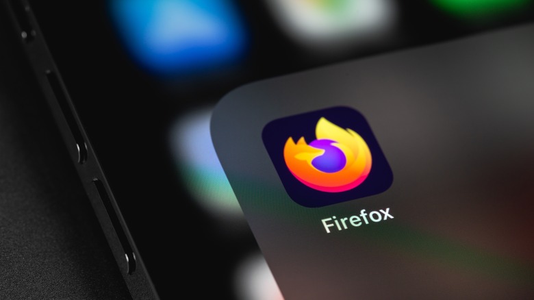
Since the first browser logo was unveiled in 2004, it has remained pretty much the same except for a few slight changes to simplify the design. However, in 2019, Mozilla showed a new look to the public that featured a brand redesign. According to Mozilla, its logo change was to reflect the software company's aspirations to offer more products and services, rather than just a browser alone.
Starting in 2018, the company deployed design teams to focus on three Firefox themes: fire, fox, and free. It relied on user feedback to guide its creation process which typically doesn't happen when businesses are in the process of changing their logos. Initially, people left comments on its blog complaining about why the company could not leave the logo as it was. This feedback turned out to be valuable in many ways as people pointed out that one of the logos they planned on using looked a lot like a competitor's logo. According to Mary Ellen Muckerman, Mozilla's VP of brand strategy and marketing, "We got a very clear signal that we didn't actually have to show a fox for people to know that it was Firefox." And that's how Firefox's new logo was born (via Firefox).
Today, the Firefox logo is abstract and doesn't look like a fox at all. The company's family of logos also features a gradient color system in a bid to make the brand more accessible to all its users. Although, users will find that the iconic flaming fox still lives on in the Firefox Browser logo.

