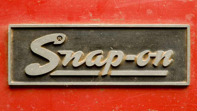
How Snap-On's Iconic Logo Has Evolved Over The Years
If you're a mechanic, or perhaps you just like working on your car or other mechanical projects in your spare time, then there is no doubt that you'll be familiar with the brand Snap-on. Sure, there are cheaper alternatives to Snap-on, but very few enjoy the same reputation for quality and reliability as the famed toolmaker. This reputation hasn't appeared overnight either, as Snap-on boasts a history that dates back over 100 years now. The company's story starts in the 1920s, when the automotive industry was really starting to boom. The initial idea was simple: five hand tools that could do the work of 50, thanks to interchangeable socket attachments. From here on out, the company grew and grew, and as it expanded, the company logo changed with it.
The initial logo, a simple underlined script in red, ran from the company's outset in 1920, all the way through to 1944. It was actually one of the longest-serving logo designs for the brand, but as the 1940s dawned, it was looking a little out of date, so a revamp was called for. It is still possible to find tools out there which function perfectly from this initial era, which serves as a real testament to the quality of these earliest Snap-on tools. In 1944, a new logo was introduced. By this point, Snap-on had grown significantly, and had proven valuable in the war effort. The durability of the hand tools had also improved, thanks to the adoption of nickel alloy steel, which came as a response to military requirements. The new logo in '44 saw the brand name depicted in an italic script, in white, against a red background.
How the Snap-on logo evolved in the post-war world
That particular logo only stuck around for a few short years, so it will probably prove quite tricky to get your hands on Snap-on tools from that precise era, with a new logo arriving shortly after in 1948. The logo that followed lived a similarly short life, serving only until 1953, although the style of it was undoubtedly '50s. It was finished in a much bolder font, possibly to stand out more in physical adverts, and the curved font was, if anything, a little more playful than previous iterations. It was still finished in white and depicted against a solid red background.
A following revision in 1953 saw the colors reversed once more, back to the original design of red text against a white background. Interestingly, this was the first and only time that "tools" also made its way into the logo, with the script now reading "Snap-on Tools." This logo served for a long time, until 1981. The fact that hand tools from this era can still be purchased in functioning condition and used today serves as a reminder that, despite their high price, Snap-on tools are worth the expense if you value quality.
1981 saw that logo and the "tools" disappear. In its place came a simpler design in the font that closely resembles the logo we see on Snap-on tools today. A playful touch incorporated here is the wrench-shaped cutout in the "S," a feature still seen in the blocky logo today. The colors were once again reversed, but then reversed again in '95 when the next and current logo debuted. The final iteration saw the text become blockier, but the brand identity remains present from that first design over 100 years ago.

