Why Kia Has Had So Many Different Logos (And Why The Current One Looks Like KN)
A prancing horse. A leaping jaguar. A three-pointed star. Most of us not only recognize these symbols and the brands they represent, we likely have an emotional reaction (good or bad) to them. Logos are more than just a cute or interesting hood badge. They're a visual representation of a brand, helping to promote the company's tradition and history, and creating a bond between the consumer and that brand. Of course, labeling vehicles is also a marketing ploy that manufacturers hope will help boost sales.
Changing a logo can confuse consumers and alienate loyal customers. Kia has redesigned its look several times to reflect its gradual yet steady growth since the 1950s, from a bicycle manufacturer to a relatively small automaker to a major brand in the U.S. However, many people think that its current logo, which looks like "KN" rather than "Kia," has missed the mark. It is intended to convey its transition to a modern carmaker with a strong EV commitment, but instead, it has caused confusion and generated a lot of Google traffic as people search for the brand behind the "KN" car.
The history of the Kia logo
Kia was originally named Kyungsung Precision Industry and was established in South Korea in 1944. The company changed its name to a more familiar moniker, Kia Industries, in 1952, and its original logo featured gears to represent its bicycle business. It used that symbol until the 1960s, when it branched out into the automotive industry. The second logo looked like an upside-down green "Q" and represented the company's growth. From the late 1980s through the early 1990s, Kia used a purple logo with a blue wave, which feels very indicative of its time. In 1994, Kia introduced a logo that many still associate with the brand — the name in block letters surrounded by a red oval. This design received minor tweaks to modernize it until 2021, when the current logo debuted.
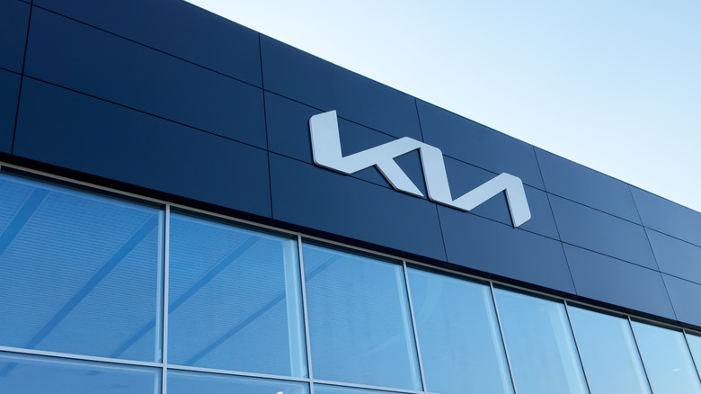
The divisive current logo, which we listed as one of the 10 worst car rebrands ever, features stylized lettering resembling a handwritten signature. The enduring oval is gone, and the modern design is meant to showcase themes of symmetry and rhythm, illustrating Kia's slogan, "Movement That Inspires." Unfortunately, the font is difficult to read, and the abstract shape is perplexing and memorable for only the wrong reasons. Many see it as "KN" rather than "Kia," despite the fact that the N appears backwards, and it diverges too significantly from the well-known oval. Some people, on the other hand, liked the bold new design. Whether you love it or hate it, you have to admit that people have taken notice.