Nothing Phone (2) Hands-On: First Impressions With A Few Key Details
The Nothing Phone (2) has been revealed, and it's an exciting piece of hardware. Last year's Nothing Phone (1) was an example of a 1.0 product that carried some promise of refinement and advancement — and that's just what you're getting here. This phone steps up just about every aspect of last year's phone, making it a true flagship phone, instead of a midrange phone with a fancy backplate. Indeed, the upgrades start with that backplate bringing more segments of the Glyph interface (the lights on the back) and continue to the cameras and the display.
A bit of insight and a few impressions about this device can be shared before SlashGear's full Nothing Phone (2) review. Aside from a few camera samples, today we can share that Nothing's phone has evolved into an overall better product. Here you'll find basic details on what has improved over the first Nothing smartphone and a preview of what's coming soon.
Hardware design and specs
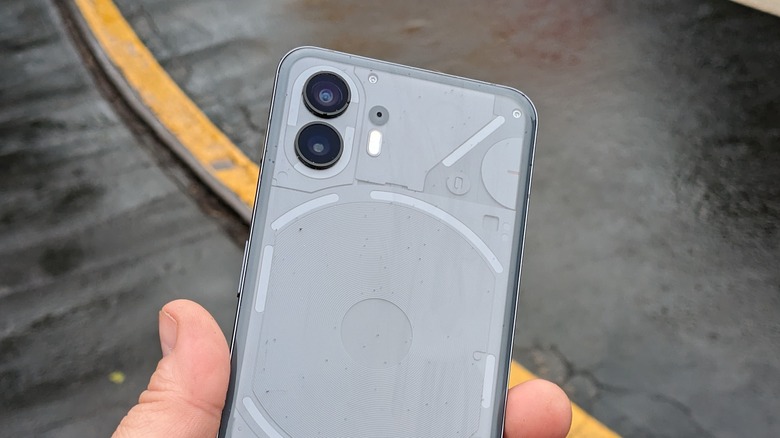
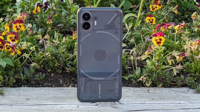
The Nothing Phone (2) looks very much like its predecessor with a similar Glyph on the back, but there are upgrades throughout the phone worth talking about. The most notable of these is the Snapdragon 8+ Gen 1 processor. While last year's Snapdragon 788G+ processor wasn't bad, it was certainly not a flagship-grade processor, nor terribly future-proof. Another improvement comes in the availability of a 512 GB data storage configuration.
The next upgrade comes in the cameras. While the camera modules are the same as last year's, there's a new 18-bit image signal processor this time around. That, along with some additional tuning, makes Nothing confident the camera should yield better results in the "edge cases." According to Nothing (and verified by every camera review ever), images taken in great lighting environments stand a good chance of turning out great. It's when the lighting is not great that things fall apart. Nothing is confident that the camera should perform better in all lighting scenarios — our full review will discover whether that's the case or not.
It's all about the back
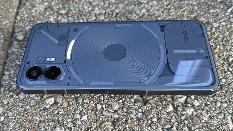
If you carry a Nothing Phone, prepare to answer questions about the back of the phone. The transparent architecture visible through the backplate continues, but with a new color — gray — which makes the details and ridges in the texture much more visible than last year's black. Plus, last year's back pattern was a printed image, while this year's pattern is comprised of actual pieces that provide depth and overall just look better. It's definitely an upgrade.
Additionally, the glyph itself is more segmented which gives a new versatility to the light show on the back. You can activate the entire glyph on the back by long-pressing the flashlight quick setting, which gives you a much softer and more filling light. The glyph has added more capability in that it acts not only as a notification light, but you can segment your notifications into priority notifications with a long tap on the notification shade. Only those priority notifications will activate the corner LED, meaning your other notifications can safely be ignored. Nothing is focusing on intentionality with this phone as you'll see again later.
The glyph LED strips are also made up of more LEDs than the last model so you can monitor the progress of things like timers and even Uber notifications using the long curved bar of the glyph. The glyph progress bar will indicate how close your Uber is. It accomplishes this by reading Uber's notifications and translating them to the glyph — Uber did not need to do anything to make this work.
The same glyph segment can also monitor especially set timers in the settings app. It doesn't work for normal timers in the Clock app which is disappointing, but the capability is still there.
Nothing OS 2.0
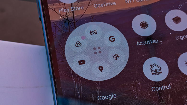
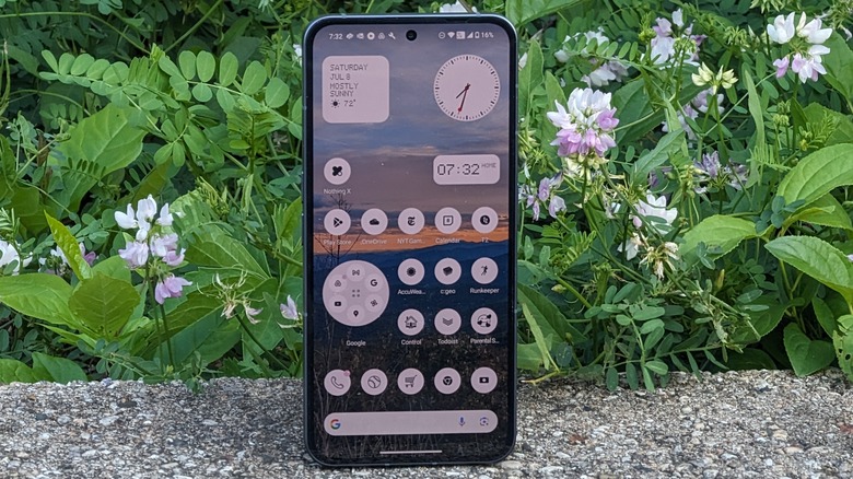
The software that comes with this device is called Nothing OS 2.0 — built by Nothing's in-house development team. The focus here is on a great experience using the phone, and Nothing has done a lot of fun things here. First, like the original Nothing Phone, you can expand apps and folder icons to make them take up a 2x2 area instead of the normal 1x1. But when it comes to folders, Nothing goes a step further, and it's honestly something Android should adopt wholesale.
Nothing allows you to assign a "cover graphic" to the folder. Rather than the normal 4 icons you'd see inside a folder, you can choose a custom image that Nothing provides (in its familiar dot matrix style) or you can choose any emoticon as the cover. You can choose a baseball for your "sports" folder or a heart emoji for your "Family" folder.
Of course, if you don't want to assign a cover graphic, you don't have to, but expanding the folder to a 2x2 configuration gives you even more choices. You can arrange the top icons in a circle, in a 3x3 grid, or use the default view. One great thing about expanded folders is that top icons can be selected without entering the folder, making it even easier to organize and quickly launch icons.
Digital Wellbeing
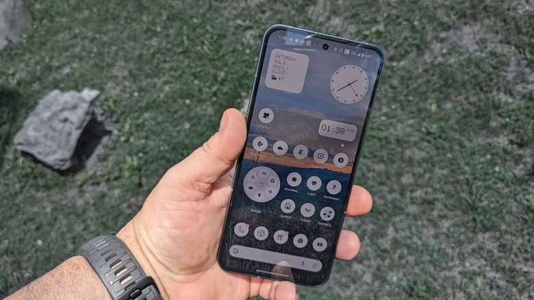
The most noticeable part of Nothing OS 2.0 comes in the icon pack available for the launcher. You can choose to have normal colors for your icons, choose uniform colors for icons, or you can go monochrome. You may wonder why you would want monochrome icons. Turning all the icons to a single black color is boring and that's exactly the point.
Once again, Nothing is focused on aesthetic design options that can, potentially, affect the way you perceive and interact with your phone. By eliminating colors from your icons, you're removing the temptation to get distracted when you pick up your phone. Rather than picking up your phone to check your email and getting distracted by your Instagram app, monochrome icons allow you to tap your email icon without other icons catching your eye, thus reducing the likelihood of distraction. Anecdotally, I can say that it works, for the most part, but the side-effect here is it makes it harder to find the app you're looking for in the first place. But there is a second reason you set your apps to monochrome.
It looks cool. When you're moving into the phone and using the Nothing aesthetic of the dot matrix style of writing, having a sea of monochrome icons blends really well with that same aesthetic. Your mileage will vary, but overall, it's pretty neat.
A very solid second generation
This phone is better in basically every way than its predecessor. Unfortunately, it's catching up quickly to what other flagships are doing these days, which means there will be less to impress on the hardware side going forward. Fortunately for Nothing, that means significant improvements in the future will likely be driven by software, and Nothing has shown that it knows software pretty well.
This phone is full of fun and unique traits that are baked into the software that users will legitimately miss when they use a different phone. The only other phone maker that can make that boast is Motorola, and that's a powerful position to be in. The software is the core of the user experience and Nothing has demonstrated that software is its strongest suit. That bodes very well for future generations of this phone.
As for the rest of the phone experience, we're still wrapping up our full review, so you'll be able to see how the hardware and software work together in a more complete package soon.
Nothing Phone (2) will have a starting cost of $599, and pre-orders start now. The release date for Nothing Phone (2) is July 17, 2023.