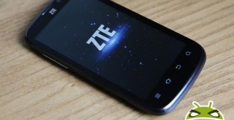
ZTE Shakes Up Its Brand With New Logo Design
If something isn't broken, don't fix it. Or thusly the saying goes. That doesn't mean one would be ill advised to refine whatever has already proven long effective, and that seems to be the mindset behind ZTE's recent decision to change it logo. The new version is hardly different than the previous version — it is still a simple "ZTE" logo mark, after all — but the subtle refinements do lend an element of modern flavor to the otherwise minimalist brand mark.
ZTE revealed the new logo mark on its Facebook page this week, showing off the new version — featured below — alongside the original version. The new one brings with it a slash of color and somewhat thinner letters with the most notable rounded edges.

Said the company, "ZTE's new corporate identity is epitomized by "Tomorrow never waits" slogan as ZTE focuses on transformative M-ICT innovations for consumers, carriers, enterprises and organizations."
The new design also aims to be appealing to the younger generation a bit more, hinting at the company's goal to produce "innovations that are dynamic, youthful and compelling to users," among other things.
SOURCE: Facebook
