YouTube's Old Desktop UI Design Is Going Away For Real Next Month
Google isn't traditionally known for changing the design of its websites and even its apps regularly but ever since it launched its Material Design language, it has shifted UI appearances and behaviors more frequently. This is perhaps seen the most on YouTube, which has undergone several iterations in the past decade or so more than any other Google site. It won't be getting a massive facelift yet but, starting March, users will no longer be able to hold off from switching to the latest version of that design.
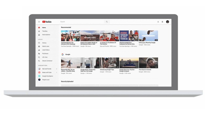
Unlike Google's other Web services, like Gmail, Drive, or Docs, a user interface is probably the least noticed on YouTube, at least until it changes significantly. After all, you go there to watch videos or search for them, not to fiddle around with menus, panels, etc. As they say, content is king, which is why the latest iteration of the YouTube desktop website emphasizes exactly that.
That said, aesthetics can be a very personal thing and not everyone gravitated towards the new YouTube's clean and white look. At least not until it finally introduced Dark Mode for the browser version of the site. Until recently, switching to the most recent design has been optional. In a few weeks, it will no longer be.
YouTube has announced that starting next month, the only version available on the desktop will be the latest Material Design-based user experience. It clarifies that the change isn't simply visual. The "classic" versions of YouTube on the desktop also lacks several new features, some of which may or may not be important to users who have held off from switching.
It doesn't say when that switch will be flipped once and for all. Users still on the old design will see a notification to switch to the new YouTube. It is probably something they need to get used to now that the change is inevitable. Or at least until someone devises a hack or extension that will bring back the classic UI, hopefully without any negative consequences.