YouTube TV Gets A Facelift
If you watch YouTube on your smart TV or via a set-top-box device, you'll be familiar with YouTube's TV interface, one that differs in significant ways from the desktop and mobile versions. The interface is designed to play well with TV navigation, more so now that YouTube has refreshed the TV design with small but significant changes. Among other things, it is now easier to browse YouTube content on the big (living room) screen.
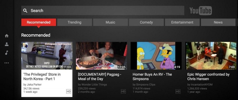
The new interface is dark and blocky with different types of content split up under a banner of selectable categories. If you're looking for news clips, for example, click "News" and you'll see the most recent and notable ones. The same goes for things like Comedy, Entertainment, Trending, Music, Recommended, and more. Rather than being nestled into the sidebar, these categories are front and center at the top of the app.
Whatever category you do select, you'll then be given the option to further refine it. Clicking on "Comedy," for example, presents video results that are scrollable both vertically and horizontally. First scroll up or down to a subset of videos like "Today's Funniest Clips" or "Sketch Comedy." Once you settle on one you like, scroll horizontally to see the top selected videos in that category.
The content presented to these users is mostly of the short-form variety, so you're still going to have to search if you're looking for a specific show or long-form videos. The sidebar, meanwhile, has been whittled down to only three options, including accessing your profile, navigating back to home, and music.