You're Wrong About The Windows 11 3D Emoji Bait-And-Switch
Microsoft presented final emoji graphics for Windows 11 this week, and some users are displeased. It would appear that Microsoft's earlier presentation of emoji design changes for Windows 11 wasn't entirely on-point. It wasn't particularly accurate, if we're talking about the presentation matching the final product – and we apparently were not.
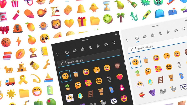
As presented today by Microsoft, Windows Insiders will have access to "New Fluent Emoji" in Build 22478. This build can be downloaded this week. This update also delivers support for Unicode emoji up to Emoji 13.1. Once updated, users will be able to access all emoji with the standard Windows key combination (WIN and .) – that's the Windows button and a period at the same time.

It was back in July that Microsoft presented a redesign of emoji for Windows 11. At that time, Microsoft presented new emoji imagery as surprisingly 3D, shaded, lively, and bright.
So, wait a minute, you might be saying. Why are these new emoji so much flatter than what was presented back in July?
Part of the reason we don't see the same imagery in emoji with this latest update is the fact that the original presentation was a bit... overzealous. These graphics were apparently meant to be sort of like the animated, cartoonish, social media-friendly representations of the emoji that'd actually be being used.
It's sort of like what we see with Mojang (also part of Microsoft) presenting Minecraft Live 2021. They're still using pixelated graphics, but it's not exactly like what we actually see in the standard game version of Minecraft.

Or... at least that might've been the extent of the truth if it weren't for commentary from Microsoft this afternoon. According to Windows Inside's Brandon LaBlanc, as recent as October 8, parts of Microsoft were using the "wrong graphics" for presentation of these emoji to the public.

On yet another hand, noted by @TheActualTech, Windows 11 may eventually use 3 iterations of this new set of emoji. One is Flat (like you see by default), one is High Contrast (black lines style), and one is "Shaded". The Shaded version still isn't exactly the same as we saw presented back in July, but it is closer to that style than the Flat or High Contrast versions. Also see a post back in July about the design of the emoji showing each of the three, here: Microsoft design on Instagram.
So don't fret! We SORT OF have slightly more 3D-ish emoji in Windows 11. It just... not quite as 3D as was implied back in July.