Yahoo Updates Search With Google-Like Redesign
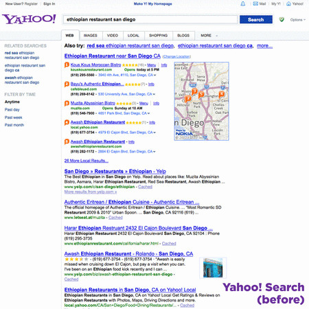
With Google's dominance in the search engine realm, it's hard to compete, but Yahoo's trying their best and they think a redesign will do the trick. The company outed a new look for their search page in the US, claiming that it "puts your results front and center," getting rid of a bit of clutter and introducing a new Google-like navigation bar at the top.
Yahoo says they also focused on getting rid of things that "stand between you and your results," placing them "higher on the page" this time around. The company also made some performance improvements all around, so users should experience an overall boost in page-loading and such.
Of course, the new navigation bar at the very top looks a lot like Google's own concoction, allowing users to browse to other Yahoo sites and services. The new navigation bar isn't available just yet for all of Yahoo's web pages, but they be rolling it out soon to more of their services in the future.

Our only major beef with the new design is that there's now a lot of blank space on the right side that could easily be used for some things. Google uses their Knowledge Graph to display relevant information on the right side of search results, but Yahoo doesn't have anything quite like that.
Overall, the new search results page has more of a modern feel to it now, and Yahoo even notes that they designed it so that it would match their home page, but can't help but feel that it looks a lot like Google's own search results page, but without the left sidebar and such. In any case, though, we can't say it's a shot-for-shot remake, as Yahoo still keeps some of its original touch.
VIA: Yahoo Tumblr Blog
SOURCE: Yahoo Search
