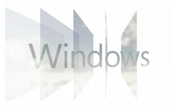
Windows 8 Logo Shows Microsoft's Back To Basics
Refined, minimalistic or just plain bland: Microsoft's new logo for Windows is prompting far more reaction than you might expect from four skewed squares. Revealed yesterday after a spate of low-profile leaks, the logo is – according to Microsoft's Windows team itself – as much an homage to the earliest, pared-down graphics of Windows 1.0 as it is a nod to the Metro UI that has become the theme of Windows Phone, Xbox LIVE and, soon, Windows 8 itself. Complaints about the new logo have generally centered on its insipid lack of distinctiveness, but according to the designers themselves this is merely the first step of many incoming changes.
Microsoft used external design agency Pentagram to create the new logo, and according to that team the sharp-edged icon should be seen as the first of a new language. The existing flag-like shape has been flattened out and made crisp, and other Microsoft products and services will make similar evolutions too. "Marks that fit into this perspective have been created for other Microsoft brands and programs," Pentagram reveals, "but have not yet been implemented."
Ironically, while Microsoft's Principle Director of User Experience Sam Moreau argued that the old Windows logo had become bloated and distracted by the lure of 3D graphics, garish colors and unnecessary animation, the new logo is most convincing when it's in motion. Pentagram created various video clips and motion studies to show how that could work – as well as convince Microsoft execs that the logo was more evolutionary than revolutionary.
One of Windows Phone's quieter pleasures is its slick use of animation. Page transitions, drop-down logos and notifications, even the multitasking app-switcher interface all move cleanly and smoothly; it's far more consistent than Windows Mobile, and leaves the interface feeling modern and responsive. Unfortunately it's one of those aspects that really requires hands-on time to appreciate, hence Microsoft (and Nokia) putting so much of its smartphone marketing focus for 2012 on encouraging in-store play by potential consumers.
Microsoft describes Metro as "Authentically Digital" – shedding the faux-metal finishes, the artificial textures and fake shadows – and it's a clarity and cleanness that Windows on the desktop (whether regular PC, notebook or tablet) has needed for some time. If the company can transition some of Windows Phone's smooth charm in motion to the PC, along with Metro, as the thinking behind the new Windows 8 logo suggests is the intention, then the refreshed OS may just achieve exactly what it needs to: looking not just polished in screenshots, but feeling genuinely cohesive at the hands of its users.
