Uber Decides To Rebrand Itself, Unveils Trippy New Icons
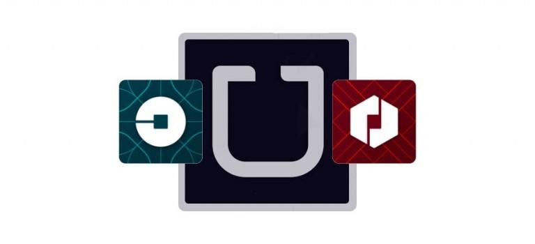
If you picked up your phone today and spotted an app you didn't remember installing, you might have been surprised to find out its Uber, which has announced a rebranding today. In the past, riders and drivers alike were presented with the dark blue icon with a light gray "U" inside. Now riders and drivers will see different icons, depending on which designation they have with the service, neither of which resemble the old design.
Of course, this isn't the first time Uber has rebranded itself, and it probably won't be the last. The blue and gray icon so many are familiar with today was introduced back in 2011, and it replaced the former and less familiar red magnet icon. Though Uber CEO Travis Kalanick had called the new (now old) logo "distinguished" at the time, he now feels it is dated and reminiscent of a company different than Uber's present-day self.

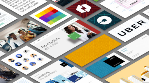
In a statement today, Kalanick introduced rebranding that features "a new look and feel that celebrates our technology, as well as the cities we serve."
The company's new designs are tailored to one's location based on culture and Uber's own research. Ireland is heavy on the green colors, for example, while Mexico has a lot of pink and India a more even mixture of colors. These are joined by various patterns that hint at both the location and transportation routes in general.
First among the change is the Uber logo itself, which is now bolder, tighter, and a little more rounded. While many users probably won't notice that change, they will notice the new app icons, which are drastically different from the previous iteration.

The new icons are much brighter with designs heavy on abstraction. Drivers will see a red app with sharp patterns, and riders will see a greenish-blue app with smooth, rounded patterns.
SOURCE: Uber
