Twitter's Latest Redesign Brings New Font, High Contrast, And Less Clutter
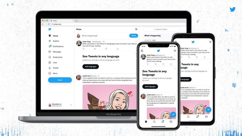
Twitter is rolling out its latest redesign on mobile and the web, tweaking the familiar appearance so that it offers greater accessibility and less clutter. If you spend enough time on the platform, you'll likely immediately notice the font change. More subtle adjustments include adding greater contrast to some colors, getting rid of visual clutter, and more.
Back in January, Twitter detailed its new font called Chirp, the company's first proprietary typeface. The company said it designed the font to meet multiple goals, including offering a distinctive look that would be legible enough for everyday reading.
In its update today, Twitter said that it is rolling out Chirp font and that going forward, all Western-language text will be aligned left. Beyond that, the update brings high contrast elements and a reduction in the blue colors typical of the platform, which Twitter notes will make tweeted content stand out more.
In the near future, Twitter will also roll out new colors, "giving you a fresh palette," the company said in a tweet. Newly added buttons feature the same high-contrast appearance, reducing the amount of time spent looking for the buttons you want.
Beyond that, Twitter notes that its latest redesign also "cleaned up a lot of visual clutter" for a simplified appearance. Unnecessary divider lines have been scrubbed and you'll notice fewer gray backgrounds going forward. Twitter likewise boosted the amount of visual space so that, it explains, users will be able to more easily read text.
The changes will appear on both mobile and web, with Twitter indicating that it has additional design updates in the pipeline for future rollouts.