Twitter's Android App Is Testing A New Design
Brace yourself Twitter users, more of the thing you fear the most might be on the way — the much dreaded changes. The social network has begun testing some design and layout adjustments, as they've been known to do, but specifically within the beta version of the Android app. So far, the changes mostly focus on the navigation bar at the top of the screen, making it easier to switch between the main sections.
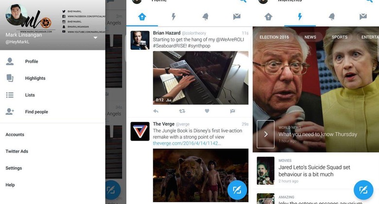
The main navigation bar now has four tabs for Twitter's primary sections: the timeline, Moments, notifications, and direct messages. Users can switch between them by simply tapping on the desired tab, or by swiping from one section to another. This cuts down on the time and effort needed to change tabs in the current design, which requires multiple taps just to see something other than the main feed.

This new design also features a profile pane that can be swiped out from the left side of the screen, offering access to settings and Highlights as well. More screen space is given to tweets and other content by eliminating the tweet buttons at the bottom, replacing them with a single floating button that's consistent with Google's Material Design language.
The new design seems to be popular with Twitter's beta app users, with many saying they prefer it to the existing version. Unfortunately, as is the case with Twitter's app tests, there's no word on when this might see an official roll out, if it even gets released at all.
VIA The Verge