Symbian UI Refresh Previewed On Nokia N8
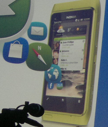
What looks to be the new Symbian homescreen layout has been briefly previewed, ahead of the promised Nokia update later in 2011. Shown briefly during a presentation by Nokia SVP of smartphones Jo Harlow, the refreshed UI – demonstrated on an N8 – has a slimmed down status bar with Android/iOS-style operator, battery, signal and time iconography, and a much narrower call/menu/options bar at the bottom.
In-between there are new widgets, no longer imprisoned by the traditional blocks fitting six to a screen. Instead it all looks more flexible and streamlined, taking a leaf out of Android's book. The end result is a far more modern looking smartphone, with a UI that actually begins to live up to the N8's slick aluminum chassis.
Now, it's not 100-percent clear that this is the actual refreshed UI that will be going out to Symbian^3 devices in the coming months, but Harlow has previously committed to a significant attempt to improve "the visual feel of the graphics" and this would be a big step in the right direction. Still, despite the fact that Nokia envisions millions of new Symbian device sales before the platform is phased out in favor of Windows Phone, we can't help thinking that all this is all a little too late.
[via My Nokia Blog]