Seeing Climate Change: This Map Shows Your City's Hot Future
A new interactive map aims to push an understanding of the near-future in climate change here in the United States. What once was difficult to comprehend for the average person can now be visualized with great ease. Not that you wouldn't be able to understand climate change otherwise – it's just a whole lot more visceral once you can visualize what it'll be like to live in your city in the near future with climate change in play.
"A major challenge in articulating human dimensions of climate change lies in translating global climate forecasts into impact assessments that are intuitive to the public," said the authors of a research paper on visualizing climate change. "Climate-analog mapping involves matching the expected future climate at a location (e.g., a person's city of residence) with current climate of another, potentially familiar, location." With this way of depicting the information, these researchers show "a more relatable, place-based assessment of climate change."
ALSO OMG: Climate change may bring about BEER SHORTAGES
The main objective of the map we're reporting on here is to show citizens what their city will feel like in the year 2080. The change in climate is increasing in speed at an alarming rate. With the map, clicking on one city shows an array of dots and lines, each dot representing an analog city that shows a current climate that matches your city in 2080.
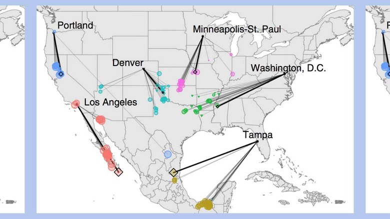
Imagine your surprise if you got knocked out today and woke up in the year 2080 in the exact same physical location. You could be in Washington D.C. and feel like you were in NE Texas. You could be in Portland and feel like you're even further south – all the way into Mexico. Minneapolis and Saint Paul (the Twin Cities, Minnesota) are finding themselves in Oklahoma's climate from 2019.
ABOVE: "Variation in climatic analogs by future climate scenario. For each of the six example cities, colored triangles and circles indicate the location of the best contemporary climatic analog to 2080's climate for the 27 future climate scenarios for RCP8.5." Per the research presented this week, [ABOVE IMAGE] "Triangles indicate representative contemporary analogs (<2σ) and circle size indicates increasingly poor analogs. Colored diamonds and bold lines indicate contemporary climatic analogs for the ensemble mean across the 27 individual projections."
The webpage with the interactive map app is at UMCES' Shiny Server – but be aware: it's been down most of the day, today – if today is still the day this article was first published. It's likely they'll have the app back up and running soon. It's just sort of inundated with attention right this minute due to the publishing of the research paper and the resulting press.
If you'd like to seek out the same source for raw data used by the researchers in this project, head over to the CCAFS-Climate downscaled data portal. There is a fantastic source for information on our global climate, including global and regional current and future high-resolution climate datasets. According the CCAFS and GCM, this data portal is generally used for research on agriculture, agro-climatology, ecosystem functionality, biodiversity and genetic subject matter, and for teaching and demonstrating with classmates and students.

For more information on this subject, head on over to the research paper Contemporary climatic analogs for 540 North American urban areas in the late 21st century. This research paper was published on the 12th of February, 2019 under code DOI:10.1038/s41467-019-08540-3 and authored by Matthew C. Fitzpatrick and Robert R. Dunn. This paper was published in the scientific journal Nature Communications and can be found online right this minute.