Opera Neon Hands-On: "Concept Browser" Hits More Than It Misses
Opera is looking to change the state of internet browsers, and it has launched a new browser called Neon as the first step in realizing that vision. Starting today, Opera Neon is available to download on Mac and Windows, and it's the culmination of a year and a half of work by Opera's design team. As everyone knows, competition in the web browser space is stiff, so I downloaded Opera Neon and took it for a spin to see how it stacks up to more traditional browsers.
Though Opera Neon is labeled as a concept at this early stage, it still seems fairly fleshed out. In truth, browsing with Neon isn't much different from surfing the web with other browsers – the main difference here is that Opera Neon makes a few interesting design decisions to make itself stand out from the rest.
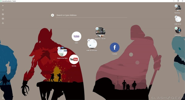
Chief among these design decisions is making your desktop background part of the show. Instead of showing you a blank white page or a home page like many other browsers, Opera Neon instead integrates your desktop background. In this way, Opera Neon feels almost like an overlay for your desktop rather than an separate app.

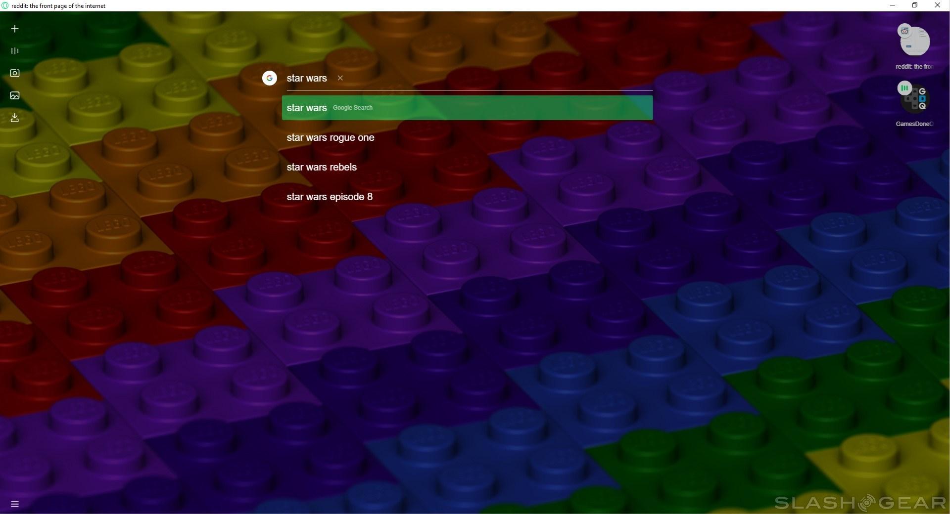
When you first boot up Opera Neon, you'll see a number of quick links that are presented as a collection of bubbles. These are positioned underneath a URL/search bar, with left and right sidebars bookending the content in the center. When you open a new tab, its bubble will take up residence in the right side bar, giving you a small snapshot based on what's being displayed.
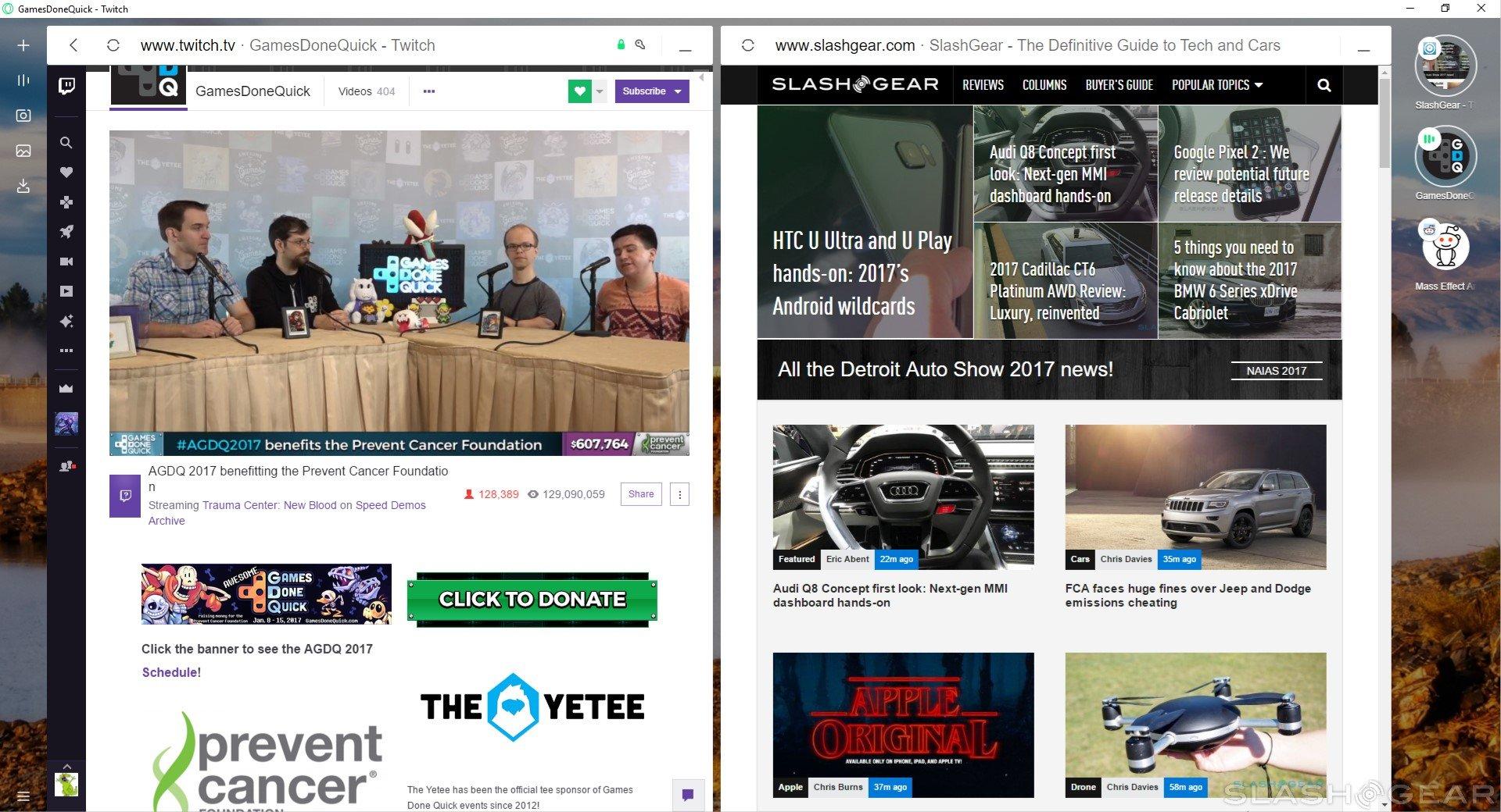
The way Opera Neon handles tabs is both unfamiliar yet refreshing. We're used to tabs being situated at the top of the page, so seeing the bubbles in the right sidebar takes a little adjusting. However, arranging them vertically allows for some cool functionality: frequently used tabs rotate to the top of the column, while ones you're using less drop to the bottom.
This, by extension, makes finding tabs you keep coming back to easier, and it solves the problem of losing something important in a sea of dozens of tabs (looking at you, Chrome). Smaller bubbles on these tabs show which ones are playing audio, and you can close ones that are no longer needed from the sidebar.

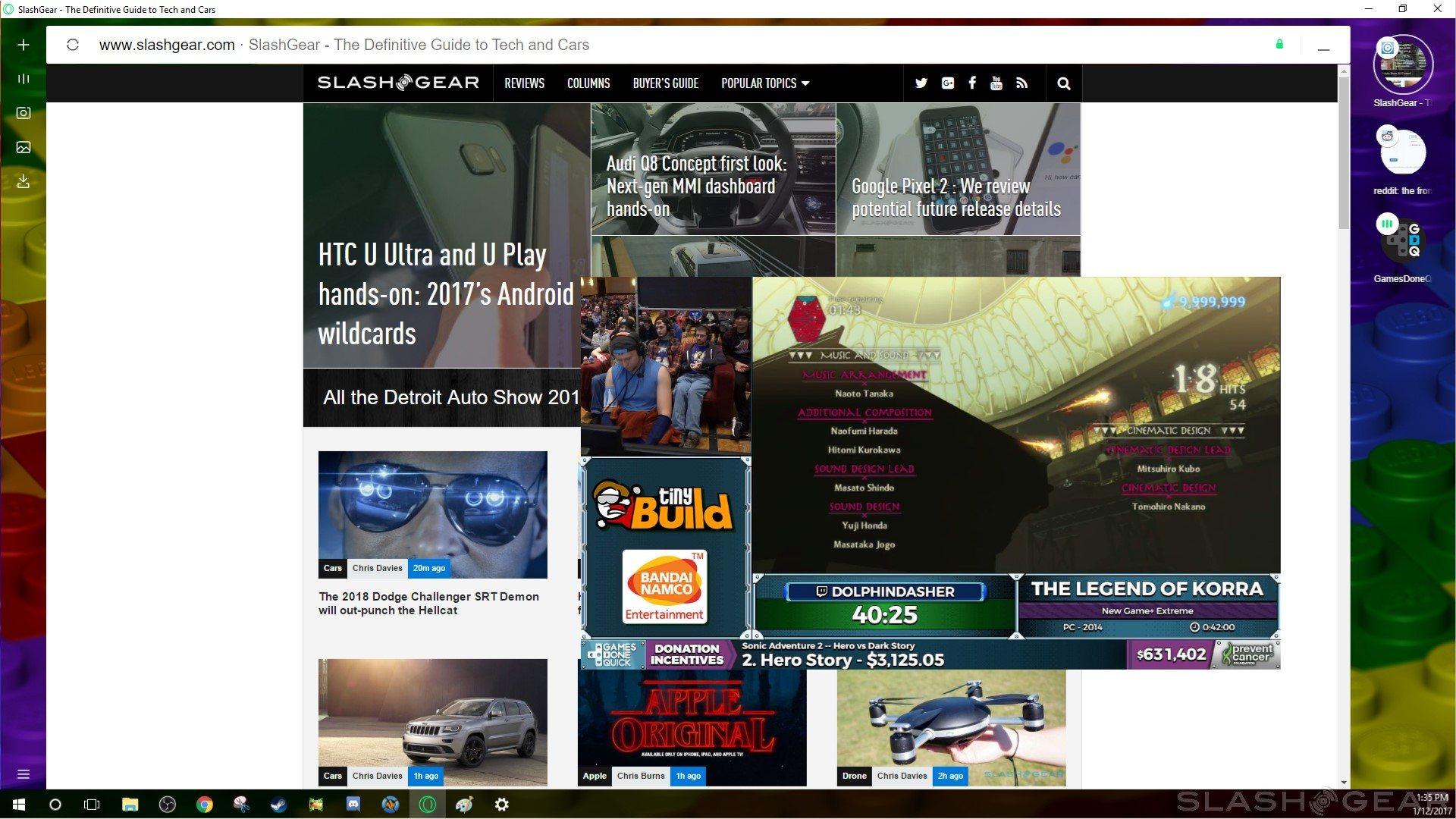
Jumping over to the left sidebar, we have a few different tools at our disposal. The first icon in this column takes you back to the main page so you can enter another URL or search to open a new tab. Beneath that, we have a tray that holds all of our currently playing videos. It's here that we can use Opera Neon's pop-out video feature, allowing you to keep a video from another tab floating above the webpage you're currently looking at.
The pop-out video player works well enough, but honestly it'll probably only be a feature used by those with a lot of screen real estate. For those with smaller displays, the video player will likely take up too much room, though it is worth noting that you can resize the video panel to get to the perfect size.
The next two icons in the left sidebar go hand-in-hand. The first is the Snap-to-Crop tool, allowing you to quickly snap an image of the webpage you're viewing. It works a lot like Windows' Snipping Tool in that it has you drag your cursor to capture a rectangular image, but one distinct advantage is that Snap-to-Crop allows you to scroll, letting capture a full snapshot of a webpage with ease.

Once you've captured your image, it'll be saved in Opera Neon's gallery, which be accessed by clicking on the next icon in the left sidebar. In here, you'll be able to view the image you just snapped, as well as open it in a tab to save it in an easier to find location – screenshots, by default, are saved to your AppData folder, which makes tracking them down a little difficult.
Finally, we have a tab in the left sidebar dedicated to any downloads you might have. This works similarly to the downloads menu in Chrome, allowing you to open Windows Explorer and go to its saved location. Unlike Chrome's download menu, however, it gives you a small preview of what the download is, which means you can find the download you need at a glance.
One of the more interesting Opera Neon features is its split screen mode. Gone is the need to open multiple windows and snap them to your display – now you can just open two different tabs and have them open side-by-side in the same browser. You can drag to adjust the size of each window right there in the browser, or close one to make the other full-screen.
For now, the only real complaint I have is that there isn't any obvious way to save bookmarks. I would imagine that such support is coming soon, but it's possible that the bubble quick links on the main page are meant to take the place of bookmarks. As a Chrome user, it would be nice to see support for plugins as well, but the plugins I generally use can't be considered essential, so I can live without them for the purposes of this test.

At the end of everything, I find myself quite surprised by Opera Neon. I'm tempted to argue that the "concept" title is almost a little misleading, insofar as it seems to offer an experience that's mostly complete. I'll keep using Opera Neon to see if my opinions change, but first impressions are good, and I'm excited to see where Opera takes Neon next. If you'd like to take Opera Neon for a spin yourself, you can find a download here.