Netflix TV Interface Simplified With New Navigation Sidebar
Netflix has simplified its TV interface by adding a new sidebar with quick access icons. The redesign somewhat resembles the YouTube TV interface, making it easier to access the items you'd previously have to scroll to the top to find. The company is rolling out its new interface to subscribers around the world while teasing similar future updates that are already in the pipeline.
The Netflix TV interface is presented when the service is accessed using a smart TV, set-top box, or streaming stick device. Unlike smaller devices, such as a smartphone, a TV has a large amount of screen real estate, making it possible to show more information at any given time while also potentially complicating navigation.

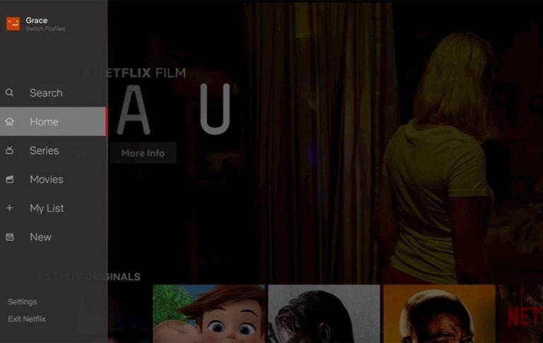
Until now, Netflix's TV users had to scroll all the way to the top of the screen to reveal an otherwise invisible row of tools, such as search and accounts. That wasn't intuitive for many users who may be unfamiliar with navigating within apps like this. The redesign eliminates that invisible top row by adding a new navigation sidebar.
"The new interface was based on rigorous research and testing," Netflix explained today, "around how we can make it easier to find titles on TVs, where navigation can feel a bit tougher when you are restricted to just a few buttons on a remote control."
The navigation bar provides fast access to My List, a watchlist where content can be saved for later viewing. The sidebar also simplifies browsing for a TV show or a movie with dedicated menu options for both. As well, Netflix has added a "New" option to the interface, providing direct access to new content. Finally, the search and settings menus are now found within this new sidebar.
SOURCE: Netflix