Mobile Facebook Pages Redesign Targets Yelp
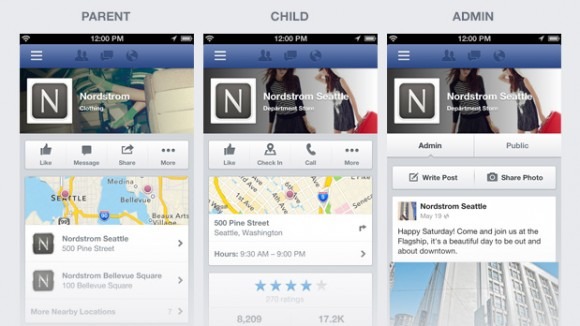
Facebook is rolling out a revamp to its mobile Facebook Pages today that will bring a new layout designed to get more information to you with one glance. The new design layout is aimed towards businesses and it makes all of the business's important information pop-out, including the business's address, hours, price range, and more. It also brings forward a more noticeable star ratings system, similar to Yelp, to let you know what others think of the business.
The new redesign also conveniently places action buttons, like the "like", check-in, and call button all at the top of the Facebook Mobile page for easy access. Before, Facebook's business pages were a jumbled mess. A business's address, and description were all displayed in a small, easy-to-miss font, and information was all over the place. Users would have to dig around to find important business information, like the business's hours.
However, one thing that Facebook's new design doesn't have over Yelp is its huge database of reviews. Sure, it still has the star system showing how users have rated the business, but the only reviews you will see of the business are the ones from your friends. It will take Facebook a little while to implement public comments into its system. Nonetheless, this new layout will make Facebook Pages more appealing to users, and may even be enough to steer some users away from Yelp.
The new changes isn't just beneficial for users. Page owners also get some new perks. Page admins can pin posts that they believe are important, including posts with coupons, specials, announcements and more. Admins are also able to easily switch back and forth from public and admin view to see how changes will look and to make changes if need be. So far, the new design is only available for iOS users and through a mobile web browser, however Android users will receive the update in the near future.