Google Redesigns Navigation Bar For Consistent User Experience
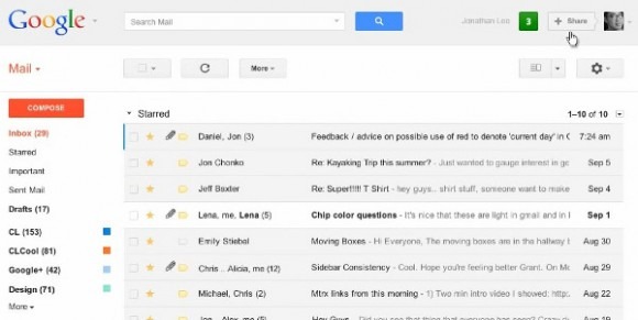
Search giant Google's just announced a completely redesigned navigation bar that aligns with the redesigns we've already seen for Google Search, Maps, News, Reader, and Gmail. The dark gray on top has finally been removed, the redesigned bar opting for a light gray tone across all Google products for a more consistent user experience. Hovering your mouse pointer over the Google logo drops down a menu with links to Google+, Image Search, Maps, and other products, gone are the static links for Google Calendar or Docs. The Google+ push clearly continues here with a share button integrated across all Google properties (something that Google is seemingly trying to do with every Google product they've introduced).
We're now ready for the next stage of our redesign—a new Google bar that will enable you to navigate quickly between our services, as well as share the right stuff with the right people easily on Google+.
The official Google+ account notes that the new bar will start rolling out today for users and should be complete during the next few days. To find out more information about the new Google bar, check out one of the always informative and playful videos for the newly redesigned navigation bar we've linked below provided by Google.
What do you think, SlashGear readers? Like it? Dislike it? Enhances your Google experience? Mars the experience? Well, it's rolling out soon, so don't worry, you'll get it anyway. At least we can say that everything will look the same now, as long as it's made by Google. Is that a good thing? Leave your thoughts in the comment section below.
[via Official Google Blog]